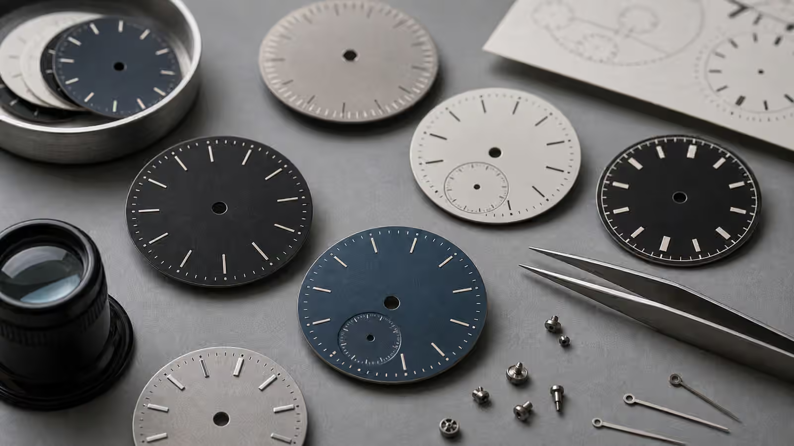
Legibility is one of those watch qualities people mention quickly and understand slowly. A watch can look perfectly clear in a product photo, then become fussy at dusk, useless under a restaurant table, or strangely hard to read during a quick glance while walking. Another watch may look plain in photos but tell the time instantly in a hallway, an airplane cabin, or the first gray minutes before sunrise. The difference is not only lume. It is the whole dial system: contrast, hand shape, marker size, crystal reflection, color, spacing, and how much information the watch asks your eyes to sort.
Lume gets the romance because it glows. It is also easy to judge with the wrong expectations. A bright first burst after a flashlight charge is not the same as lasting usefulness through the night. A large glowing plot may be easier to photograph than to read if the hands are too similar. A vintage cream color may look wonderful in daylight while contributing almost nothing after dark. Good low-light design is not a trick material. It is a set of choices that support one quiet job: letting you know the time without negotiation.
Legibility starts before the lume
The best readable watches do not wait for darkness to become useful. They are easy to read in ordinary, imperfect light. That usually means strong contrast between dial and hands, hands that are long enough to reach their tracks, and hour markers that give the eye a clear structure. A black dial with pale hands is a classic tool-watch solution because the shapes separate quickly. A white dial with dark hands can be just as readable, especially when the crystal stays clean and reflections are controlled.
The mistake is assuming that more detail means more information. A dial can have beautiful texture, applied markers, polished hands, a date window, several lines of text, and a minute track, yet still be harder to read than a plain field watch with bold numerals. Decoration competes for attention. Polished hands can vanish against a glossy dial at certain angles. Skeletonized hands may look technical but disappear when the background below them is busy. Tiny markers may feel elegant in a display case and irritating on the wrist.
This is why The Dial That Told a Story matters beyond aesthetics. Dial design is not separate from use. The same applied index that creates depth can also catch light and help the eye. The same sunburst finish that makes a dial feel alive can throw reflections that reduce clarity. The same printed minute track that looks precise can become visual noise if it is too heavy. Legibility is the practical side of dial design.
Lume is charged light, not a battery
Most modern luminous watch material is photoluminescent. It absorbs light, then releases that energy as a glow. The common owner experience is familiar: the watch shines brightly after a strong charge, fades during the first part of the night, and eventually settles into a softer glow. That fading is normal. A watch that looks dramatic under a flashlight for the first five minutes is not necessarily better than one that remains readable, if dimmer, hours later.
The amount of luminous material matters. Thick, broad applications usually store and emit more visible light than thin printed strips. A dive watch with large plots and broad hands has more surface area to work with than a dress watch with pin-thin markers. The binder, pigment, application quality, and color can also change the result, but for most buyers the visible lesson is straightforward: if the hands and markers do not contain much luminous material, the glow cannot do much work.
Color changes perception too. Greenish lume often appears very bright to the human eye. Blue lume can look cooler and sometimes more refined, but it may not seem as intense to everyone. Faux-aged cream lume is mostly a daylight design choice unless the material beneath it is strong. None of this makes one color automatically better. The question is whether the glow helps you read the watch at the moments you actually need it.
Hands do more than point
Low-light readability depends heavily on hand design. The hour and minute hands should be easy to distinguish, not only in shape but in length and luminous area. If both hands are narrow sticks with small glowing strips, the watch may make you pause at exactly the wrong time. If the hour hand is broad and shorter while the minute hand reaches confidently toward the minute track, the reading becomes faster.
Tool watches often exaggerate this difference for good reason. A broad arrow, sword, baton, or syringe hand can carry enough luminous material to remain useful. A distinctive hour hand also prevents a common low-light mistake: seeing two glowing lines and needing a second to decide which one is which. The goal is not theatrical brightness. The goal is shape recognition.
Seconds hands are different. On many watches the seconds hand is not important in the dark. On a dive watch, a luminous seconds pip can confirm that the movement is running, which is useful when timing in poor visibility. On a dress watch, the seconds hand may be purely aesthetic. A bright seconds marker can even distract if the watch’s main job is quiet time reading. The right answer depends on the style and purpose, which is why the broader Complete Watch Styles Guide is worth reading beside this one.
Markers need orientation, not just brightness
A readable dial gives the eye a map. The twelve o’clock marker is often different from the others because orientation matters. A triangle at twelve on a diver, double batons at twelve on a sports watch, or oversized Arabic numerals on a field watch all serve the same basic purpose: they tell you which way is up before you interpret the hands. In darkness, that reference becomes more important because the dial loses many of its daylight cues.
Symmetry can be beautiful and still create hesitation. If every marker is identical and the hands are similar, the watch may become a floating pattern of glowing dots. A different twelve marker, stronger cardinal markers, or clear numerals can make the display settle immediately. This is especially useful when you wake in the night and glance at the watch from an awkward angle, or when you are reading it while moving.
Bezel lume belongs to the same system. On a dive bezel, a luminous pip at zero helps connect elapsed-time reading to the minute hand. On a GMT or timing bezel, markings may be more about daylight function than dark use. Watch Bezels and Scales explains those outer rings in more detail, but the low-light point is simple: a glowing bezel marker is only useful when it supports the way the watch is actually read.
Crystals and reflections can defeat a good dial
A strong dial can still fail if the crystal turns into a mirror. Low light often includes point sources: a lamp across a room, a car headlight, a bright phone screen, a window, a candle, an airplane reading light. Those reflections can land directly on the hands or markers and erase contrast. Sapphire crystals are valued for scratch resistance, but their reflectivity can vary depending on profile and anti-reflective treatment. Acrylic domes can look warm and vintage, yet distort the edge of the dial. Mineral glass sits somewhere in the middle, depending on execution.
This is where Watch Crystal Materials connects directly to legibility. The crystal is not only protection. It is an optical part. A flat crystal with well-handled reflections may make a simple dial feel crisp. A tall dome may add charm but bend markers near the edge. A strong anti-reflective coating can make the dial seem closer to the eye, though exterior coatings may show marks over time. The best crystal choice depends on whether the watch is meant to be a precise instrument, a vintage-flavored object, or a dress piece that lives mostly in controlled light.
Vintage lume asks for a different kind of respect
Older luminous material is a subject where appearance, function, and caution meet. Many vintage watches no longer glow meaningfully, even if the plots have aged into attractive cream, tan, or orange tones. Collectors often value that color because it gives the watch warmth and evidence of age. It should not be confused with modern night readability. A vintage watch can have beautiful patina and poor lume at the same time.
Some historical luminous materials, especially radium, require respect. The owner should not scrape, relume, open, or disturb old luminous material casually. If a vintage dial or hands matter, use a qualified watchmaker who understands older watches and can advise on safe handling, preservation, and replacement questions. Tritium-era lume also ages and may no longer glow strongly, though its handling context is different from early radium. The practical buyer’s lesson is to separate the daylight look from the night function.
Reluming is a values decision, not just a repair. Fresh lume can make a watch usable again, but it can also change originality, collector interest, and the visual relationship between dial and hands. On a daily wearer with little collector sensitivity, that trade may be reasonable. On a historically interesting watch, original dead lume may be part of the object. As with polishing a case, discussed in Watch Case Materials and Finishing , making something look new can remove part of what made it itself.
Testing a watch for real readability
The best test is ordinary life. Read the watch indoors, near a window, outside at dusk, in a car at night as a passenger, and beside a bed after the lights have been off for a while. Do not judge only by a dramatic flashlight charge. Give the lume a realistic exposure, then see whether the time is still readable after the first bright phase has faded. Notice whether you read the time instantly or need to search for the hands.
Also test angles. A watch is rarely read perfectly straight on. You glance while typing, walking, carrying a bag, or sitting with your wrist turned. If the hands disappear whenever the dial tilts, the watch may be less legible than it first seemed. If the minute hand is too short, if the polished hands vanish into the dial, or if the crystal reflection constantly blocks the center, those issues will not improve after purchase.
This kind of testing belongs with the practical habits in the Complete Watch Buying Guide . Specifications can tell you that a watch has luminous markers, sapphire crystal, or a certain case diameter. They cannot tell you whether your eye reads that exact dial quickly. Legibility is experienced in glances, not spec lines.
Choose the glow that matches the watch
Not every watch needs to glow like a dive instrument. A dress watch may be at its best with slender hands, a clean dial, and no lume at all. Its job is refinement, not nighttime utility. A field watch, diver, pilot watch, or travel watch carries a different responsibility. It should remain easy to read when light is poor, because that practicality is part of its identity.
The healthiest approach is to match expectations to purpose. If you want a daily watch you can read in parking garages, early trains, dark restaurants, and quiet bedrooms, prioritize contrast, hand shape, marker orientation, crystal behavior, and enough luminous material to last beyond the first glow. If you want a vintage watch, decide whether patina matters more than function. If you want a dress watch, accept that elegance may mean less low-light performance.
Lume is a pleasure, but legibility is the deeper quality. A readable watch respects your attention. It does not ask for a second glance when one glance should do. It lets the dial, hands, crystal, and glow work together instead of competing. When that system is right, the watch feels calm in the exact moments when light is not.