
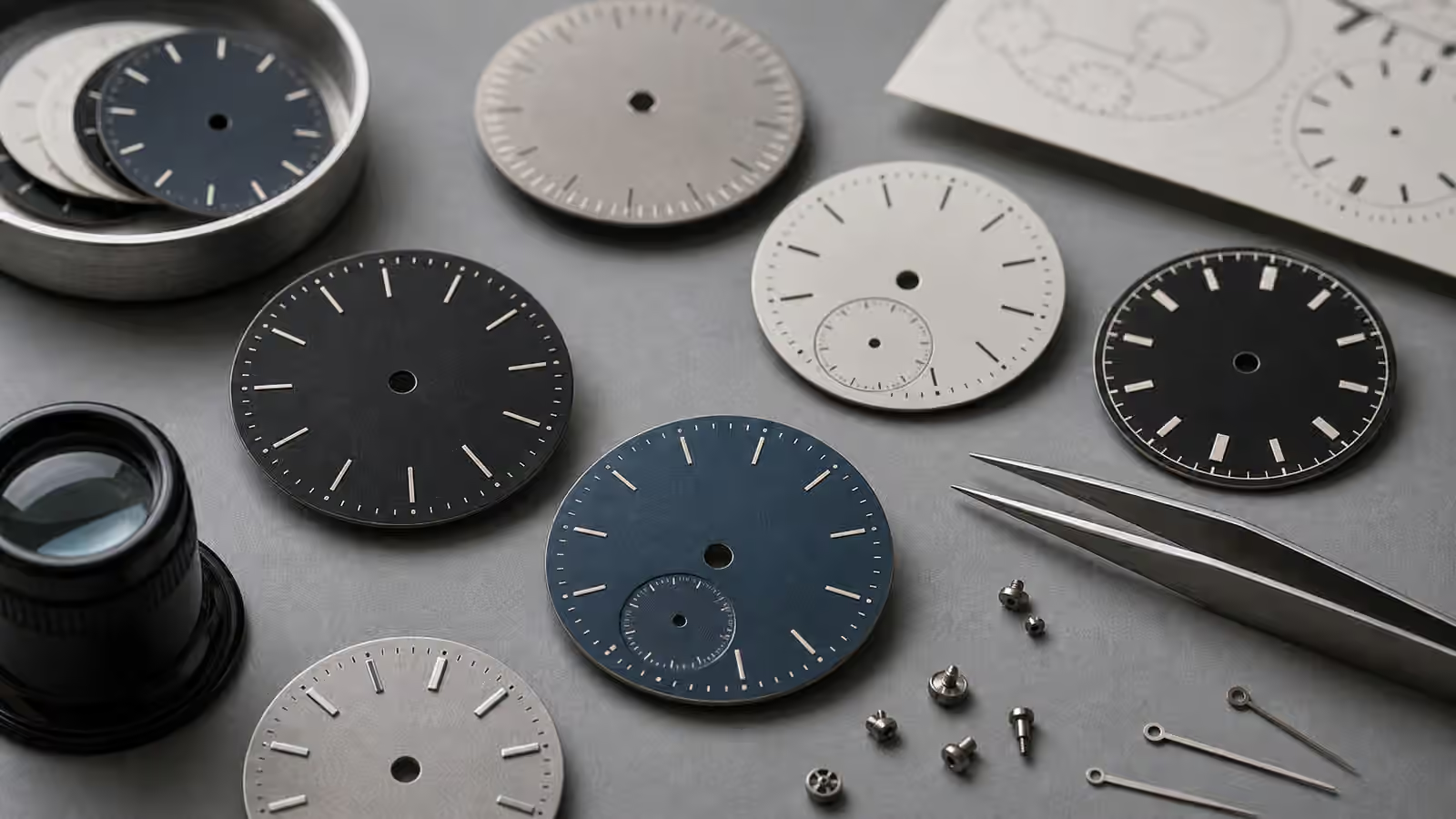
The smallest marks on a watch dial often do more work than the largest ones. A case can catch the light, a movement can earn the admiration, and a bracelet can decide comfort, but the dial is where the watch becomes readable. Typography, printing, minute tracks, applied markers, and the spacing around them give the watch its voice. They tell the eye where to look first, how formal the watch feels, and whether the design was resolved patiently or assembled from attractive parts that never quite agreed with each other.
This is why dial details reward slow looking. A watch may seem simple from across a room, then reveal a careful hierarchy once it is on the wrist. The logo may sit lower than expected so the upper half breathes. The minute track may be fine enough to disappear until needed. The date window may be aligned to a marker rather than dropped into open space. The best dials do not shout about this work. They make time easy to read while leaving the owner with the sense that every mark has a reason.
Printing is part of the watch’s construction
Dial printing can sound cosmetic, but it is a manufacturing detail as much as a design detail. The ink or lacquer has to land cleanly on a surface that may be matte, glossy, grained, brushed, lacquered, or textured. A flat white dial and a deep sunburst dial do not accept marks in the same way. A fine seconds track near the edge of a curved dial can reveal small registration problems that a bold marker would hide. When printing is crisp, the watch feels intentional even before the owner names why.
The goal is not microscopic perfection for its own sake. Watches are worn objects, and magnification can turn ordinary tolerances into drama. What matters is whether the visible result matches the watch’s character and price of ambition. A rugged field watch can have sturdy printed numerals that are slightly more about utility than elegance. A formal dress watch with thin markers and spare text asks for a lighter hand. A chronograph with multiple scales needs more discipline because every extra mark competes for attention.
Watch Dial Legibility is the natural companion here. Legibility begins with contrast and hand shape, but printing decides the supporting rhythm. A minute track that is too heavy can distract from the hands. A logo that is too large can pull the eye away from the time. A date label or depth rating placed without restraint can make a balanced dial feel nervous.
Typeface choices change the temperature of a watch
Collectors often talk about case size and movement type before they talk about type, yet the shape of numerals can change the whole watch. Tall, narrow numerals can make a dial feel technical or military. Rounded numerals can make it feel relaxed. Roman numerals can suggest formality, tradition, or sometimes clutter, depending on execution. Simple batons avoid the issue by making the dial more architectural than typographic. Applied markers add shadows and depth, while printed markers keep the surface flatter and often more direct.
The important point is coherence. A watch with a cushion case, vintage-colored lume, modern block numerals, a polished dress bezel, and a sporty minute track may have individually attractive details that do not share a language. A watch with plain printed batons, a clean handset, and a restrained logo may look quieter but feel more resolved. Typography is one place where restraint often reads as confidence.
This is especially useful when judging newer independent or microbrand watches. Watch Microbrand Buying notes that specifications can sound convincing while the object remains unsettled. Dial typography exposes that problem quickly. If the numerals, logo placement, date window, hands, and minute track seem borrowed from different watches, the design may not age well in your eye.
Minute tracks are small promises
The minute track is easy to ignore until it is wrong. It frames the dial, gives the minute hand somewhere to land, and helps the eye judge exact time. On a dress watch, the track may be almost invisible, a ring of fine hashes that preserves the dial’s calm. On a field watch, it may be bold and practical. On a chronograph, it may become part of a larger system of seconds, fractions, elapsed minutes, and outer scales. The track tells you how precise the watch wants to feel.
Alignment matters because the minute track sits near other reference points. If a rotating bezel marker lines up poorly against it, the mismatch is hard to unsee. If applied indices are not centered on the track, the dial feels slightly restless. If the minute hand is too short to reach the track, the watch may look decorative rather than functional. These are not always defects. Sometimes they are design choices. The owner has to decide whether the choices support the watch’s role.
Watch Bezels and Scales helps explain this outer-edge relationship. Bezels, chapter rings, minute tracks, and rehaut markings all live in the same visual neighborhood. When they agree, the watch feels like one instrument. When they fight, the dial may feel busy even with very little actual information.
Date windows disturb the grid
A date window is useful because it answers a daily question quickly. It is also one of the easiest ways to disturb a dial. The window cuts into the surface, interrupts markers, and introduces a second color and typography system through the date wheel. If the date disc color matches the dial, the window may sit quietly. If it contrasts strongly, it becomes a graphic object. Neither approach is automatically right. The issue is whether the decision feels deliberate.
Placement is equally important. A date at three can replace an hour marker and keep the dial familiar. A date at six can preserve symmetry. A date between markers can feel casual or awkward depending on the dial. On small watches, a date window can crowd the furniture. On larger watches, it can float too far from the edge if the movement is small for the case. Once you notice this, you start seeing why two otherwise similar watches feel different.
Watch Calendar Complications covers the function side. Dial typography adds the visual side. The date is not only a mechanism. It is a small printed display inside a larger printed display, and that relationship deserves attention.
Aging changes the meaning of printed marks
On vintage watches, typography and printing are also condition evidence. Original dial printing may soften with age, discolor slightly, or sit on a surface that has developed spots, fading, or texture. That can be beautiful. It can also hide moisture damage, refinishing, or mismatched parts. A dial that looks charming in a photo may deserve a slower look under angled light.
Reprinted dials are not automatically worthless, but they should be understood for what they are. A redial can make a watch more wearable to one owner and less desirable to another. The clues often live in the same details this guide has been describing: letter spacing, minute-track regularity, logo placement, ink thickness, and whether the printing style matches known examples from the period. Vintage Watch Condition and Patina gives the broader condition framework, while Watch Authentication and Red Flags explains why no single detail should carry the whole decision.
Modern watches can age too. Glossy dials can show dust or handling marks under the crystal. Printed markers can be damaged during poor service. Lume plots can discolor. The dial is protected, but it is not imaginary. If a watch has signs of moisture or careless opening, the dial often tells part of that story.
Good typography disappears into trust
The point of studying dial typography is not to become impossible to please. It is to become more articulate about why a watch works. A dial with good spacing, clear hierarchy, and suitable printing makes the watch easier to live with. You read the time faster. You stop negotiating with the logo. You stop wishing the date were somewhere else. The watch feels settled because the surface has been edited.
When trying on a watch, give the dial more than one glance. Read the time quickly, then let your eye relax. Notice what draws attention second and third. Look at the minute track, date window, logo, marker shape, and the relationship between printed and applied parts. If the dial keeps resolving cleanly, that is valuable. If it keeps producing small irritations, the movement spec or case material may not rescue it.
A watch dial is a tiny piece of graphic design attached to a machine and worn on the body. Its typography has to survive movement, light, distance, taste, and years of repeated glances. When it succeeds, the result can feel almost quiet. That quietness is not emptiness. It is the sound of small marks doing their job.


