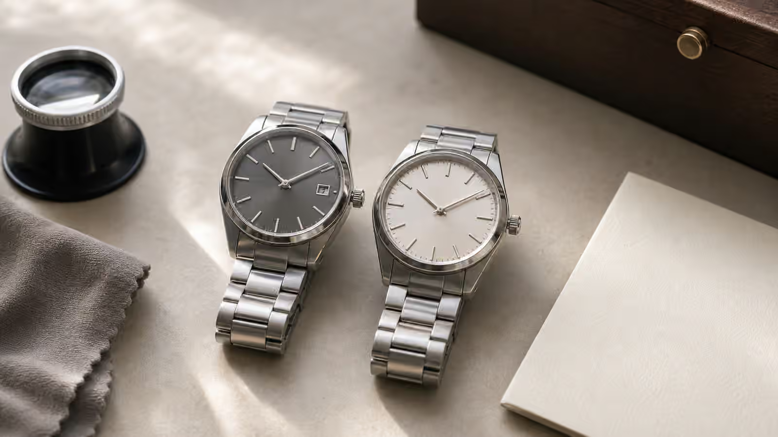
Legibility is not the same as liking a dial. A watch can be beautiful and slow to read. Another can look plain in a photograph and become the watch you trust most because the time arrives instantly, without a second glance. That difference matters because watches are not read under studio lights. They are read while walking, carrying a bag, sitting in a dim restaurant, leaning across a desk, or waking before the room is fully bright.
The basic question is simple: how quickly can your eye find the hour hand, the minute hand, and the orientation of the dial? Everything else either helps or interferes. Hand shape, marker size, dial color, crystal reflection, date placement, polished surfaces, subdials, and text all join the same small argument. A legible watch is one where the argument stays quiet.
The fastest watch is usually the clearest watch
A fast-read dial gives your eye a hierarchy. The hands come first. The hour markers come second. The minute track, date, logo, and other information stay subordinate. When the hierarchy is clear, you do not consciously decode the dial. You glance, your eye catches the hand positions, and the watch has done its job.
Contrast is the beginning of that hierarchy. Dark hands on a pale dial can be excellent. Pale hands on a dark dial can be excellent. Polished silver hands on a silver sunburst dial can be beautiful and terrible, depending on the light. The problem is not polish itself. The problem is a hand that disappears whenever it reflects the dial beneath it. Many dress watches accept that trade because elegance is part of their job. A field watch or travel watch should be held to a stricter standard.
This is why legibility belongs beside The Dial That Told a Story . Dial design is not decoration applied after function. It is the function made visible. A textured dial, applied markers, glossy lacquer, or polished bevel can add depth, but each choice has to earn its place when the watch is read at speed.
Hands carry most of the message
The hands are the active part of the dial. If they are too short, too thin, too similar, or too close in color to the dial, the watch becomes slow no matter how good the rest of the design is. A minute hand should reach confidently toward the minute track. An hour hand should be clearly shorter and visually distinct. The seconds hand can be useful, but it should not compete with the main time-telling hands unless the watch has a timing purpose.
Hand shape creates recognition. Baton hands look clean and modern, but very thin batons can vanish. Sword hands carry more surface area and often read well on sport watches. Arrow or broad hour hands make orientation quick. Dauphine hands can be wonderfully elegant because their facets catch light, but that same reflective quality can cause them to flash bright one moment and disappear the next. Skeleton hands may look technical, yet they often ask the eye to sort hand shape from dial furniture below them.
The hand set should also match the markers. Broad hands with tiny polished indices can feel unresolved. Slender hands with massive luminous blocks can look underpowered. The best dials feel like the hands and markers were drawn in one conversation, not assembled from separate parts. That harmony is easy to miss in a spec sheet and obvious on the wrist.
Markers are a map, not ornament
Hour markers tell the eye where the dial begins. A strong twelve o’clock marker helps orientation, especially when the watch is read at an angle. Field watches often use Arabic numerals because numbers are fast. Dive watches often use bold plots and a distinct twelve marker because the watch may be read in poor light or motion. Dress watches may use slim batons or Roman numerals because the mood is quieter and the reading environment is usually less demanding.
Printed markers can be perfectly legible when the print is crisp and high contrast. Applied markers add depth because they cast tiny shadows and catch light separately from the dial. That depth can help, but only if the marker shape remains visible. A polished marker on a bright dial may become a sliver of glare. A matte printed numeral may look cheaper under a loupe and still be easier to read in a hallway.
Marker spacing matters too. A dial with generous negative space can feel calm because the eye is not negotiating every millimeter. A crowded dial may offer more information and less comprehension. Minute tracks, five-minute numerals, chapter rings, depth ratings, crosshairs, and date frames can all be attractive. They become a problem when they make the hands harder to separate from the background.
Clutter is often disguised as usefulness
Watch dials accumulate information easily. A date window seems useful. A day display seems useful. A power reserve can be useful. A chronograph adds subdials, scales, and a central timing hand. A GMT adds another hand and often a twenty-four-hour scale. None of these features is automatically bad, but each one spends some of the dial’s limited attention budget.
The question is not whether information exists. The question is whether you can ignore it when you only want the time. A well-designed chronograph can keep the running time clear while the timing registers sit behind it. A poorly designed three-hander can be harder to read than a complicated watch if the hands, markers, and reflections are fighting each other. Complexity is not the enemy. Unranked complexity is.
Watch Complications Guide explains what the extra functions do. From a legibility point of view, the useful habit is to ask how often you use each function and what it does to the main time display. If a date window is useful every day, a small interruption may be worth it. If a tachymeter scale is never used and makes the dial feel crowded, it is style rather than function for you. That is allowed, but it should be honest.
Crystals can make a clear dial unclear
The crystal is the lens through which every dial decision passes. A clean, flat crystal with good reflection control can make a dial feel immediate. A tall dome can add warmth and charm while bending the minute track near the edge. A sapphire crystal can stay scratch-free for years and still behave like a mirror if the profile and coating are not handled well. Acrylic can soften reflections in a way that feels vintage, but it can scratch and distort differently.
This is one reason a watch should be judged in changing light. A dial that looks perfect straight-on under a display lamp may vanish near a window. A polished hand that looked crisp in photos may turn black, silver, or invisible as the wrist moves. Watch Crystal Materials covers the materials in detail, but the legibility lesson is immediate: the crystal is not a transparent afterthought. It is part of the dial.
Anti-reflective coating can help, especially on sapphire. Under-side coating is protected and often enough for daily use. Exterior coating can reduce glare dramatically, but it may show marks over time. The right answer depends on the watch’s purpose. A tool watch benefits from clarity under difficult light. A vintage-inspired watch may accept distortion because the dome is part of the charm. A dress watch may prioritize thinness and elegance over all-weather readability.
Lume is only one kind of legibility
Low-light reading often gets reduced to lume strength. Lume matters, but it cannot rescue a confused dial on its own. If the hour and minute hands are too similar, glowing strips may still leave you uncertain. If every marker glows identically and there is no clear orientation point, the dial can become a ring of dots. If the hands have little luminous material, bright hour plots do not tell the time by themselves.
Watch Lume and Legibility goes deeper on darkness, aging luminous material, and real night use. In daylight and mixed light, the broader system matters just as much. Contrast, hand length, marker hierarchy, and crystal behavior decide how the watch reads before the lume ever starts working.
There is also no rule that every good watch needs lume. A formal watch can be excellent with no luminous material at all if its hands and markers suit the setting where it will be worn. The problem is expecting a no-lume dress dial to behave like a field watch in a dark stairwell. Legibility is not universal. It belongs to the watch’s job.
Date windows and symmetry
Date windows are useful because dates are useful. They are also one of the easiest ways to disturb a dial. A date at three o’clock can cut into an hour marker. A date at four-thirty can feel like an afterthought. A date at six can preserve symmetry but may be smaller or harder to read. A color-matched date disc can keep the dial calm. A bright white date disc on a dark dial can become the first thing the eye sees, even when you wanted the time.
None of this means date windows are bad. It means they should be designed, not merely inserted. On a daily watch, a clear date can be worth the visual cost. On a clean dress watch, the absence of a date can be part of the peace. On a travel watch, date and local time may matter enough to justify more information. The best choice depends on use, not forum purity.
The same idea applies to dial text. A brand name, model line, water-resistance rating, chronometer note, and movement label can all make sense individually. Together they can crowd the dial. When text becomes the visual equal of the hands, the watch has lost the plot. The time should not have to compete with the brochure.
Test the watch in the life it will have
A good legibility test is ordinary and a little unfair. Read the watch at arm’s length, then at a glance. Tilt it toward a window. Read it under warm indoor light. Read it while walking. Read it with the watch partly under a cuff. If you have to pause every time the hands cross a polished marker or pass over a subdial, remember that hesitation. It will not become charming later unless the watch offers something else you value more.
This belongs with Complete Watch Buying Guide because legibility is part of fit. A watch that looks perfect online can fail on your wrist because your eyes do not like the dial. That is not a defect in you or the watch. It is a mismatch between design and use. The same watch may be perfect for someone who values texture, polish, and mood over instant reading.
The best dials do not make you choose too harshly. They offer character and clarity together. The hands separate from the dial. The markers orient the eye. The date stays in its place. The crystal does not sabotage the work. The watch can still be beautiful, but it remembers that beauty is more convincing when the object performs its basic task with ease.