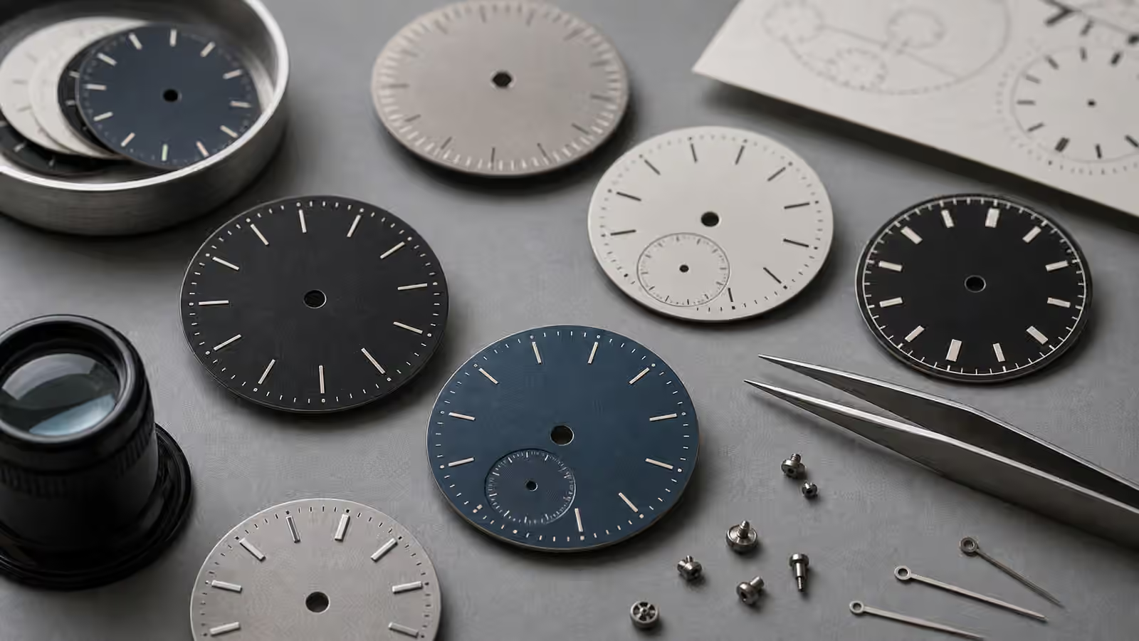
The dial is the part of a watch most people fall for first, even when they claim to be movement people. It is where the watch meets the eye. Case size, movement type, bracelet fit, and service history all matter, but the dial decides whether the watch makes you look twice. Color, texture, printing, indices, hands, and finish determine how the watch behaves in light, how formal it feels, how quickly it reads, and how much personality it carries after years of wear.
A blue dial can look almost black indoors and bright at a window. A matte field-watch dial can make time feel immediate because nothing fights the hands. A cream dial can soften a watch that would feel severe in white. A guilloche pattern can make a small dress watch feel alive under a lamp. A glossy lacquer dial can look deep and luxurious, then become a mirror outdoors. None of these choices is neutral. Dial surface is not decoration layered on top of design. It is design.
Matte dials are honest about the time
Matte dials are common on tool watches because they reduce reflection and keep attention on the hands and markers. A matte black dial with pale markers may not be exotic, but it works in bad light, bright light, and quick glances. It gives the watch a practical voice. Field watches, divers, pilot watches, and some chronographs use matte surfaces because the owner is supposed to read the time before admiring the finish.
That practicality can also feel stylish. A matte dial often makes a watch look calmer and less precious. It can hide small printing choices that would look loud on a glossy surface. It can make lume plots and white hands stand out clearly. Watch Lume and Legibility explains the low-light side, but matte surfaces matter in daylight too because glare is a real ownership issue.
The limitation is emotional range. A flat matte dial may feel plain if the rest of the watch is also plain. Texture, case finishing, hand shape, and marker design have to carry the interest. Some of the best matte dials work because they are not trying to impress at first glance. They become satisfying because they keep working.
Sunburst dials move with the wrist
Sunburst finishing uses fine radial brushing that catches light from the center outward. The dial changes as the wrist turns. Blue becomes navy, electric, or gray. Green becomes forest or bright. Silver flashes from warm to cool. A sunburst dial can make a simple watch feel dynamic without adding complications or extra case shape.
This movement is the attraction and the risk. A sunburst dial can be beautiful in photographs and more assertive in real life. Under strong sunlight it may become bright enough to compete with the hands. Under low light it may collapse into a darker color. The owner should judge the dial in more than one environment. A watch seen only under boutique lights has not told the whole story.
Hands and markers matter more on sunburst surfaces because reflections can reduce contrast. Polished hands over a polished or highly reflective dial can disappear at certain angles. Brushed hands, dark outlines, strong lume plots, or applied markers with clean facets can help. Watch Dial Legibility is the companion topic because beauty that hides the time eventually becomes irritating.
White, cream, and black are not basic choices
White dials can make a watch feel crisp, open, and slightly larger. They show printing clearly and work well with blued, black, or polished hands if contrast is handled properly. A true bright white can feel modern and clinical. An off-white or cream dial feels warmer, softer, and often more vintage. The difference between white and cream is not small on the wrist. It changes the mood of the case, strap, and even the metal color.
Black dials can make a watch feel compact, formal, technical, or sporty depending on the finish. Glossy black reads dressier and can create depth, especially under a domed crystal. Matte black reads practical. Black also makes date windows, dust, and reflective hands more noticeable because contrast is high. A black dial is forgiving in size but unforgiving in execution.
Cream and champagne dials often pair well with leather, gold tones, and vintage-inspired cases. They can also clash with bright white lume or stark modern printing if the design is not coherent. The best warm dials feel intentional. The weaker ones look like white dials that aged before the rest of the watch did.
Texture gives the dial a second reading
Textured dials reward close viewing. Guilloche, linen, waffle, hammered, grained, frosted, stamped, and vertically brushed surfaces all create small shadows. At a distance, the watch may read as simple. Up close, the dial becomes architectural. Texture can make a three-hand watch feel complete without adding a date, bezel, or subdial.
Guilloche has a special place because traditional engine turning creates repeating geometric patterns with real depth. Many modern dials imitate or reinterpret that look through stamping, CNC work, or other production methods. The ownership question is less about purity than effect. Does the pattern add life without making the hands hard to see? Does it suit the case? Does it look like craft or like noise?
Texture also changes formality. A fine barleycorn or clous de Paris pattern can feel dressy. A rough grained dial can feel outdoorsy. A waffle dial can feel mid-century or sporty depending on the markers. A vertically brushed dial can make a watch feel lean and architectural. Complete Watch Styles Guide helps place these choices because dials borrow language from the watch’s intended role.
Lacquer, enamel-like depth, and glossy surfaces need restraint
Glossy dials can be seductive because they create depth. Lacquer-like surfaces, enamel-like finishes, and polished dark dials can make the hands appear to float above a deep field. On a dress watch, this can be exactly right. The dial becomes a quiet pool of light under the crystal. On a casual watch, too much gloss can feel delicate or distracting.
Reflection is the practical cost. A glossy dial under a reflective crystal can turn into a mirror. Anti-reflective coating helps, but it does not erase the physics of a shiny surface under a shiny window. If the watch is meant for fast outdoor reading, gloss should be judged carefully. If it is meant for evening wear, the same gloss may be the point.
Traditional enamel is a craft category of its own, with firing, color depth, and failure rates that deserve respect. Many watches use enamel-like language for finishes that create a similar impression without being fired enamel. The buyer should read descriptions carefully, but also remember that the wrist experience matters. A beautiful surface does not need a romantic label to be beautiful.
Fume, gradient, and colored dials are personality choices
Colored dials can make a watch memorable, but they narrow the wardrobe and mood. Green, burgundy, teal, salmon, brown, and purple can be wonderful when the color supports the case and hands. They can also make a watch harder to wear daily if the owner expected neutrality. A color that feels exciting online may become too specific after a month.
Fume or gradient dials darken toward the edge, creating depth and a framed effect. They can make the center glow and the case feel more integrated. The darker edge can also improve apparent contrast with a polished case. On the wrong watch, a gradient can feel theatrical. The difference is restraint. A subtle transition feels like atmosphere. A heavy one becomes the whole identity of the watch.
Salmon and copper-toned dials are a useful example. They can look refined, vintage, and warm, especially with blued hands or applied markers. They can also fight skin tone, strap color, or case metal. The only reliable test is the wrist. Dial color is one of the places where photographs lie most politely.
Aging can be beautiful or simply damage
Vintage dials complicate the conversation because age changes surfaces. Tritium lume can darken. Black dials can spot or fade. White dials can cream. Lacquer can crack. Moisture can stain. Some aging is attractive because it belongs to the watch’s history. Some is damage that threatens value, readability, or future stability. The line is not always clear.
Collectors often use soft words for aging because watches invite romance. Patina can be wonderful, but it should not excuse every flaw. A dial with even, stable aging may be desirable. A dial with moisture damage around the markers may suggest water entry and movement risk. A watch with a beautiful dial and a compromised case seal needs sober inspection, not only admiration.
This is where Watch Box, Papers, and Service Records and Buying a Watch Secondhand become useful. Documentation and seller story can support a watch, but the dial still has to be judged by condition. Originality matters, but originality in poor condition is not automatically better for every owner than a clean service dial. The right answer depends on collection goals and honesty about the watch’s future.
The dial has to live with the case and strap
A dial does not exist alone. A silver sunburst dial in a polished case can feel dressy. The same dial in a brushed sports case can feel sharp and modern. A cream dial on brown leather can become warm and traditional. On a steel bracelet it may feel more casual. A textured dial can make a simple case feel richer. A loud color can make a large case feel even larger.
Case finishing is part of this relationship. Watch Case Materials and Finishing explains how brushed, polished, titanium, gold, and ceramic surfaces change the whole object. Dial finish either harmonizes with that case language or argues with it. A mirror-polished case and glossy black dial can be elegant. A matte blasted case with a matte dial can be purposeful. Mixed signals can work, but they need intent.
The strap is the easiest way to test a dial’s range. A blue sunburst watch may feel formal on alligator-style leather, sporty on rubber, and relaxed on fabric. A cream dial may come alive on suede and look bland on a mismatched bracelet. If a dial color seems difficult, the strap may be the issue. If every strap seems wrong, the dial may be less versatile than you hoped.
Choose the surface you want to see every day
The best dial is not the most elaborate one. It is the one you continue to enjoy under ordinary light, at ordinary distance, in the clothes and settings where the watch will actually live. Matte dials give clarity. Sunburst dials give movement. Glossy dials give depth. Textured dials give intimacy. Colored dials give personality. Warm dials give softness. Black and white dials give structure, but even they are full of choices.
When comparing watches, do not ask only which dial is most impressive. Ask which one remains legible, which one suits the case, which one works with your straps, and which one still feels right after the first surprise fades. A dial is not a poster. It is a small instrument face you will glance at thousands of times.
If the movement is the engine and the case is the watch’s body, the dial is its voice. It can speak quietly, brightly, technically, romantically, or with more confidence than the rest of the watch deserves. Learn how color and texture shape that voice, and the watch becomes easier to choose. More importantly, it becomes easier to keep enjoying after the photograph has stopped doing the selling.