A date window looks like a tiny decision until you live with it. On some watches, it is the detail that makes the watch useful every morning. On others, it interrupts a dial that would have been calmer without it. The debate is rarely about the date alone. It is about how you use the watch, how much dial balance matters to you, how often you set the time, and whether the watch is meant to be a tool, a dress object, or something in between.
The best way to think about the choice is not to ask whether date windows are good or bad. Ask what the date is doing on that specific watch. If it helps the owner without weakening the design, it earns its place. If it exists only because a movement had a date wheel and the maker felt obligated to show it, the dial may feel less intentional.
The date changes the ownership rhythm
A date window turns a watch into a small daily reference. For office work, travel, paperwork, appointments, medication logs, shipping labels, and calendar-minded routines, that can be genuinely useful. Many owners do not realize how often they glance at the date until they wear a no-date watch for a week. A date watch can reduce the tiny friction of checking a phone or computer, especially when you want the watch to remain the thing you use for time.
That usefulness has a cost. If the watch stops, the date must be corrected as well as the time. If the watch has been sitting for a few days, advancing the date can become part of the morning ritual. Watch Winding, Setting, and Date Changes explains why calendar mechanisms deserve patience, especially around the changeover period near midnight. A date window is simple to read but not always simple to reset in a hurry.
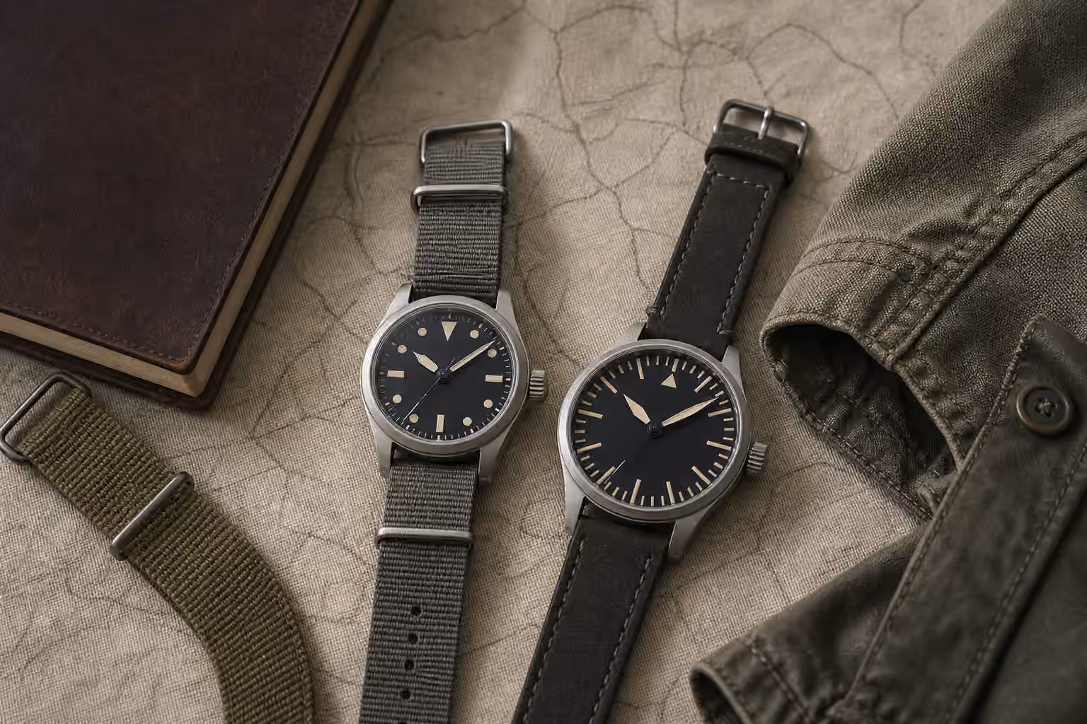
No-date watches avoid that extra step. They are quick to pick up, wind, set, and wear. This can be especially pleasant in a collection where several mechanical watches rotate through the week. A no-date hand-wound watch, a simple automatic, or a quartz field watch can feel unusually direct because there is less to synchronize before leaving the house. The dial gives time and nothing else.
Symmetry is only part of the question
No-date dials often win the beauty argument because they preserve symmetry. The hour markers remain uninterrupted, the minute track can run cleanly, and the dial does not need a framed opening or a mismatched disc. On a small dress watch or a minimalist field watch, that restraint can make the whole design feel more settled. Watch Dial Legibility, Hands, and Markers is useful here because legibility depends on the relationship between every visible element.
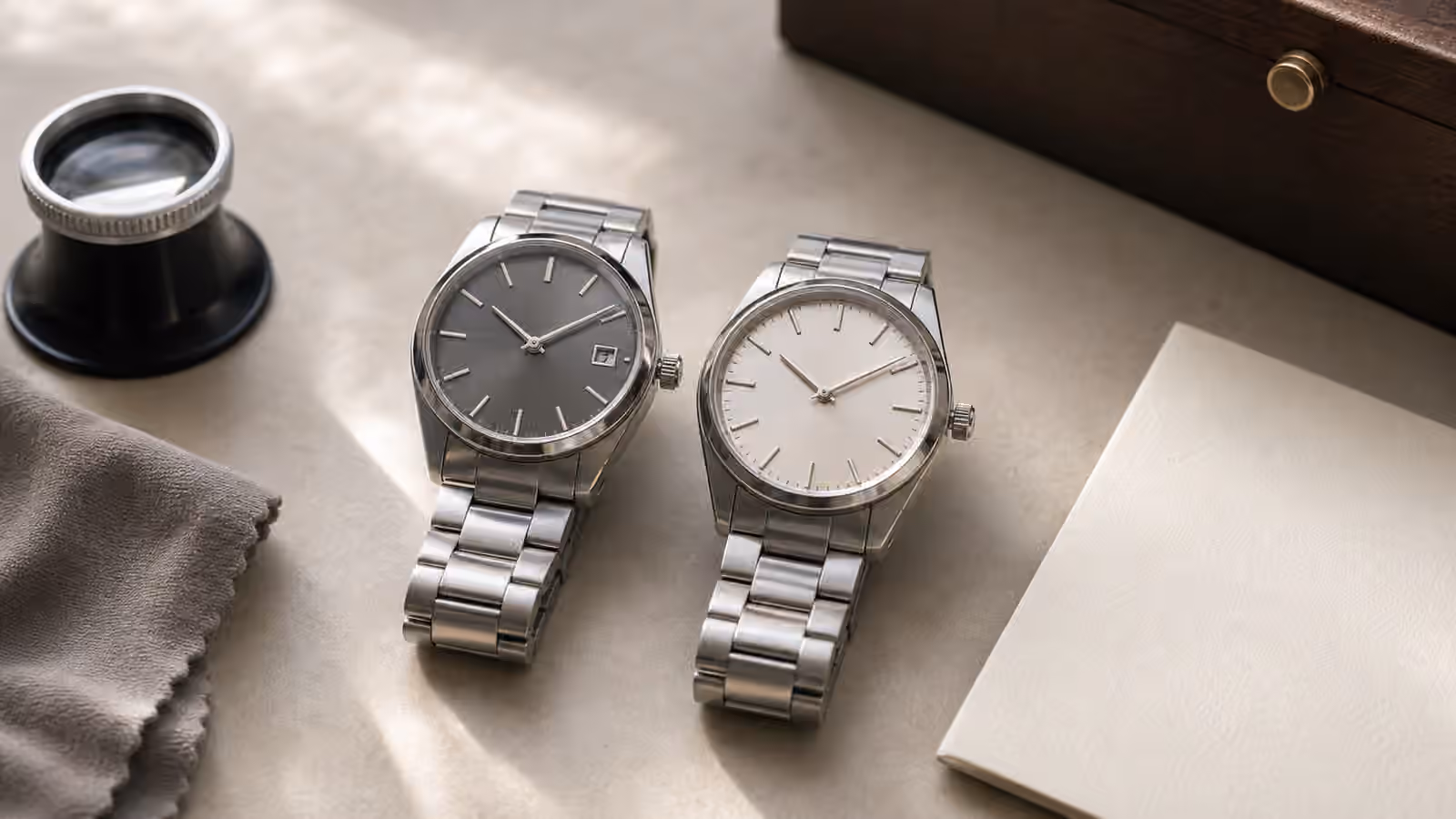
Still, symmetry is not automatically better than usefulness. Some date windows are beautifully integrated. A date at 3 o’clock can balance a crown and suit a practical daily watch. A date at 6 o’clock can preserve left-right symmetry while adding utility. A color-matched date disc can recede into the dial. A framed date window can feel like an applied marker when the proportions are right.
The weak date window usually looks like an afterthought. It may cut into an index awkwardly, sit too far from the dial edge because the movement was too small for the case, use a bright white disc on a dark dial without design support, or introduce a typeface that clashes with the rest of the watch. The problem is not the date. The problem is the lack of design agreement.
Placement tells you how the watch was planned
Date placement reveals movement choice, case size, and design priorities. A date window close to the center of the dial can suggest that a small movement was placed inside a larger case. That does not automatically make the watch bad, but it does change how finished it feels. A date pressed close to the rehaut can look better integrated if the movement and case are proportioned for each other.
The common 3 o’clock date is practical because it is familiar and easy to find. It can also be partially covered by the minute hand at certain times, and it can make a simple dial feel right-heavy if the marker opposite it is not handled well. A 6 o’clock date often feels calmer, especially on dressier watches, but it can be small and harder to read. A 4:30 date is divisive because it preserves hour markers but can look tucked away, as if the watch is apologizing for having a date at all.
None of these positions is always wrong. The real test is whether the placement matches the watch’s purpose. A sport watch can tolerate a bolder date window because utility is part of its voice. A dress watch usually needs more delicacy. Watch Dress Watch Cuff Fit pairs well with this topic because formal watches often rely on quiet proportions rather than feature count.
The date disc matters more than many buyers expect
The date disc is a small part, but it can change the whole dial. A white disc on a white dial usually disappears. A white disc on a black dial becomes a bright square. That can be useful if the watch is meant to be read quickly, but it can look harsh if the rest of the design is restrained. Color-matched discs are often more elegant, although they may be harder to read in low light.
Typography matters too. A date numeral can clash with the dial numerals, the logo, or the minute track. A tall, narrow date font can look technical. A rounded font can feel softer. If the watch uses applied markers and a refined dial texture, a crude date font becomes more noticeable. This is why Watch Dial Typography and Printing is relevant even to a feature that occupies only a few millimeters.
Magnifiers add another layer. A date magnifier can make the date easier to read, especially on smaller watches, but it also changes the crystal profile and the character of the dial. Some owners like the practical clarity. Others find it visually heavy. The decision should follow the watch’s job rather than a general rule.
Calendar complexity begins with one aperture
A simple date is the easiest calendar feature to live with, but it still belongs to the larger family of calendar complications. Day-date displays, pointer dates, annual calendars, and perpetual calendars all build on the same basic promise: the watch will tell you more than the hour and minute. Watch Calendar Complications explains why extra calendar information brings both pleasure and responsibility.
For many owners, a plain date is the sweet spot. It adds practical value without turning the watch into a setting project. For others, even that is too much. If you rotate mechanical watches often, dislike resetting calendars, or prefer the dial to stay calm, a no-date watch can feel more honest. It accepts that a wristwatch does not need to answer every question.
The movement also matters. Some movements have a ghost date position when the dial shows no date, meaning the crown still has a date-setting click even though there is no date window. That is not necessarily a functional problem, but it can make the design feel less purpose-built. A true no-date movement can make the ownership experience cleaner.
Choose the compromise you will actually enjoy
The date window decision becomes easier when you connect it to your real habits. If you wear one watch every day and frequently need the date, a well-integrated date window may be the right choice. If you rotate watches, value fast setting, or want a dial that feels undisturbed, no-date may suit you better. If your eyesight makes small numerals frustrating, a date window may only be useful if it is large, magnified, or high contrast enough to read.
Do not let online arguments turn a personal preference into doctrine. A beautiful no-date watch can be inconvenient for someone who lives by calendars. A date watch can be elegant when the maker designs around it. The better question is whether the feature makes the watch more useful, more coherent, or both.
A date window is a daily compromise, but watches are full of daily compromises. Thickness trades against water resistance. Bracelet stability trades against lightness. Dial simplicity trades against information. The small square on the dial deserves the same calm reading as every other choice. If it serves the watch and the owner, it belongs there. If the dial breathes better without it, the absence is not a missing feature. It is the design doing less on purpose.