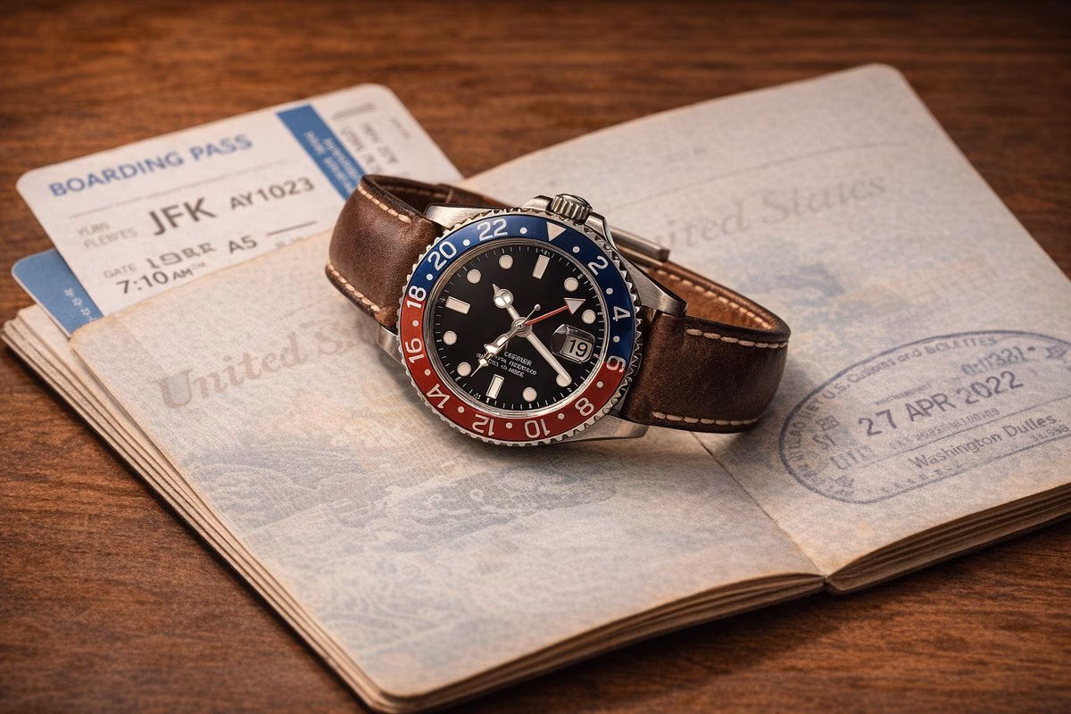
The watchmaker held the dial at an angle, and the surface changed completely.
Straight on, it had looked black—a clean, matte black with silver hour markers and slender hands. But tilted fifteen degrees under his desk lamp, the surface exploded into a pattern of concentric circles radiating from the center, each one catching the light differently, transforming the flat black into a shimmering, dimensional landscape that seemed to pulse as I moved my head.
“Sunburst finish,” he said. “Dozens of ultrafine grooves cut in a radial pattern from the center. Each groove catches light at a different angle. That’s why the dial looks different every time you glance at it.”
He tilted it again. The effect was mesmerizing—like watching the surface of dark water ripple without wind.
“A dial is not decoration,” he said. “It’s the face of the watch. Everything on it—every index, every texture, every hand—is there for a reason. Some reasons are practical. Some are aesthetic. Some are both. But nothing is accidental.”
That afternoon in his workshop, surrounded by dials in various states of assembly, I learned to read watch faces the way you read a poem: every element chosen, every space intentional, every detail carrying meaning.
The anatomy of a dial
A watch dial is a small canvas—typically 28-42mm in diameter—on which an extraordinary amount of information and artistry is compressed. The major elements:
The base (dial blank)
The foundation is a thin disc of metal—usually brass, sometimes gold or silver—that forms the structural base. This blank is what all other elements are attached to or applied onto. The finishing of this base creates the dial’s fundamental character:
Sunburst: Radial grooves creating a star-like light play. The most common finish on dress watches. Looks different under every light condition, which is the point—a sunburst dial rewards attention.
Brushed (vertical or horizontal): Fine parallel lines that give a matte, industrial appearance. Common on tool watches and divers. The linearity creates visual order.
Guilloche: An ancient technique using a hand-operated rose engine to engrave intricate geometric patterns—barley grain, basket weave, flame, clous de Paris. True hand-guilloche is rare and expensive; most modern “guilloche” dials are machine-stamped approximations. But the real thing is unmistakable: a depth and dimensionality that stamping can’t replicate.
Enamel: Powdered glass fused to metal at 800°C, creating a surface of extraordinary depth and luminosity. Grand feu enamel dials are the pinnacle of dial craftsmanship—each one requires multiple firings, and the failure rate is high. A cracked enamel dial cannot be repaired, only discarded and restarted.
Lacquer: Multiple layers of lacquer (sometimes 20-30 coats), each hand-applied and polished, creating a mirror-like depth. Japanese urushi lacquer dials, made with the same techniques used for Japanese lacquerware for centuries, are among the most beautiful surfaces in watchmaking.
Dial color is not just aesthetic—it has historical and functional context:
- White/silver: The classic. Maximum legibility. Traditional for dress watches. A white enamel dial is the most timeless choice in watchmaking.
- Black: The tool watch standard. High contrast with luminous hands and markers. Preferred for dive watches, pilot watches, and field watches because it’s readable in all conditions.
- Blue: The modern classic. Ranges from dark navy (conservative) to electric blue (bold). Blue dials with sunburst finishes are currently the most popular choice in the market.
- Green: The recent trend. Started with Rolex’s iconic “Hulk” Submariner and spread to every price point. A green dial signals awareness of current watch culture.
- Salmon/copper: Rare and distinctive. Found mostly in independent and haute horlogerie watches. A salmon dial almost always indicates a watch chosen with intention.
- Fumé (smoke): A gradient from lighter at center to darker at edges, created by multiple lacquer layers. Adds visual depth and makes the dial appear three-dimensional.
The indices: how a watch tells you the time
Hour markers—called indices—are the elements at each hour position that your eye uses to read the time. They seem simple. They are not.
Printed indices
The simplest and cheapest method: hour markers printed directly onto the dial surface using pad printing or transfer printing. Common on watches under $200. Printed indices are flat—they don’t catch light or cast shadows, which makes them less legible and less visually interesting than applied indices.
Applied indices
Individual metal markers—machined, polished, and glued or pinned to the dial surface. Applied indices stand above the dial, catching light independently and casting tiny shadows that create visual depth. The difference between a printed index and an applied index is the difference between a painted window frame and a carved one—both serve the same function, but one has dimension.
Types of applied indices:
- Baton/stick: Rectangular bars. Clean, modern, versatile. The default for contemporary dress watches.
- Dot/pearl: Round dots, sometimes faceted. Common on dive watches and sport watches.
- Arabic numerals: Actual numbers. More traditional, more immediately legible. Favored by field watches and pilot watches for maximum readability.
- Roman numerals: Printed (rarely applied due to complexity). The most classical and formal marker. Often seen on dress watches and Cartier designs.
- Triangle/arrow at 12: A dive watch convention—the triangle at 12 o’clock provides an unambiguous reference point for reading elapsed time on a bezel.
Luminous markers
Many indices are filled with luminous material—a phosphorescent compound that absorbs light and glows in the dark. Modern watches use Super-LumiNova (a strontium aluminate compound) that glows green, blue, or occasionally other colors. The glow fades over hours but is recharged by any light exposure.
Historical watches used radium (1910s-1960s, radioactive, now discontinued) or tritium (1960s-1990s, mildly radioactive, now mostly replaced). Vintage radium dials have a distinctive aged cream color called “patina” that collectors prize—the glow has long since died, but the warm, uneven color tells the watch’s story.
The hands: the watch’s voice
If the dial is the face, the hands are the voice—they’re what actually communicates the time. And like everything else on a watch, the style of the hands carries meaning.
Dauphine: Broad, diamond-shaped, faceted to catch light. The classic dress watch hand. Named for the French royal title, they convey elegance and formality.
Baton/stick: Thin, straight, minimal. Modern and clean. Often paired with baton indices for a coordinated geometric look.
Sword: Straight with a slight taper, broader than a baton. A versatile hand that works on both dress and sport watches.
Mercedes (Rolex): A distinctive combination: a stick for the minute hand and a hand with a circle-and-triangle tip for the hour hand. Originally designed for legibility—the two hands are instantly distinguishable even in low light. Now synonymous with Rolex.
Cathedral: Broad, with cutouts reminiscent of gothic church windows, filled with luminous material. Originally a military design (maximum visibility), now common on pilot and field watches. The IWC Big Pilot and Panerai use distinctive cathedral hand variants.
Feuille (leaf): Thin, elegant, with a gentle taper like a willow leaf. The most delicate hand style, found on ultra-thin dress watches and haute horlogerie pieces.
Breguet: A specific design created by Abraham-Louis Breguet in the 18th century: a slender hand with a hollow circle (called a “pomme” or apple) near the tip. Instantly recognizable and associated with Breguet, the brand. One of the few hand styles named for a person.
Hands are a reliable indicator of a watch’s overall quality:
Check the finish. On a good watch, hands should be polished on their flat surfaces and have clean, sharp beveled edges. Under a loupe, there should be no burrs, rough spots, or uneven surfaces.
Check the fit. The hands should sit perfectly parallel to the dial, at a consistent height. A hand that’s tilted, touching the dial, or too far from the dial indicates poor assembly.
Check lume consistency. If the hands have luminous material, it should be evenly applied, the same color as the dial markers, and free of bubbles or gaps.
The “sweep” test. On a mechanical watch, the second hand should sweep smoothly (not tick). On a quartz, it should tick precisely once per second and land exactly on each index. Anything else suggests a movement or assembly issue.
Heat-blued hands (deep blue, achieved by heating steel to exactly 290°C) are a sign of high-quality traditional finishing. The blue color should be deep and uniform—not painted, but a structural property of the oxidized steel.
The small details that matter
The date window
The most controversial element in watch design. A date window—typically at 3 o’clock, sometimes at 6—breaks the symmetry of the dial. Some collectors refuse to buy watches with dates. Others consider them essential.
The date window’s quality matters: a cyclops lens (magnifying lens over the date, invented by Rolex) should magnify 2.5x and align perfectly. A poorly aligned cyclops is a common quality complaint. Matched date disc color (white disc on a white dial, black disc on a black dial) shows attention to detail. A white date disc on a black dial—creating a visible “window”—is considered aesthetically inferior but is common on less expensive watches.
The minute track
The ring of marks around the outer edge of the dial, dividing each minute into seconds. On a well-made watch, the minute track is hair-thin and perfectly concentric. On a great watch, it’s an art element: Nomos’s bauhaus-inspired minute tracks, Grand Seiko’s razor-sharp printing, Cartier’s railroad minute tracks on tank watches.
The text
Every watch dial carries text: the brand name, the model designation, sometimes depth rating, movement type, or place of manufacture. The quality of this text—its size, font, spacing, and printing precision—is another quality indicator. Great watches use minimal text, beautifully printed. Overloaded dials with too much text suggest a manufacturer prioritizing specification marketing over design.
What the dial taught me
The watchmaker reassembled the watch he’d been showing me and snapped the caseback shut. He held it up, and I looked at the dial differently now. What had been a black surface with silver markers was now a landscape of decisions:
The sunburst finish, chosen because it creates visual life under changing light. The applied baton indices, hand-polished and pinned with invisible precision. The dauphine hands, faceted to catch the same light the sunburst generates. The date window at 3, with a matched black disc so it doesn’t interrupt the dial’s field. The minute track, printed so finely I needed a loupe to see its individual marks.
Every element supporting every other element. Nothing competing. Nothing accidental.
“A good dial,” the watchmaker said, “is one you can stare at for years and still notice something new. A great dial is one that becomes more beautiful the closer you look.”
I glanced at my own watch—a simple three-hander with a white dial and blue hands. I’d owned it for two years and had never really looked at it. I looked now. The hands were blued steel—heat-treated, not painted. The indices were applied, not printed. The minute track was a fine, even ring of marks that I’d never consciously noticed.
The watch hadn’t changed. But I was finally reading what it was saying.
Next steps
- Read Quickstart for the essential watch buying foundation
- Explore Watch Styles for understanding design categories
- See Complications for what’s beyond hours and minutes
- Read Watch History for the evolution of dial design
- Check Buying Guide for finding your ideal watch