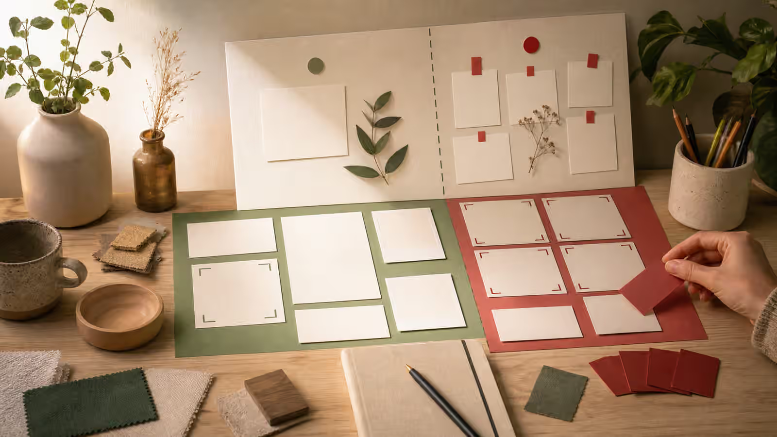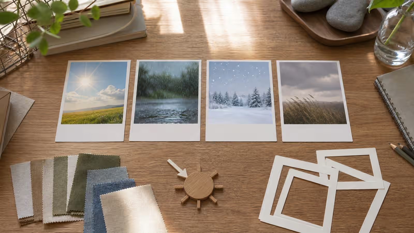
Weather can make a generated image feel specific very quickly. A dry street becomes reflective after rain. A soft summer scene becomes colder when the light shifts and fabric choices change. Wind turns still props into motion. Snow changes contrast, footprints, roofs, and the way color appears. Those details help an image support a page, but only when the prompt gives the model enough physical cues to keep the scene coherent.
The weak version of a weather prompt is a single word added at the end: rainy, winter, sunny, windy, autumn. The stronger version describes how that condition changes light, surfaces, clothing, objects, distance, and mood without pretending to document a real event.
Treat Weather As A System
A scene does not become rainy only because streaks appear in the air. Pavement darkens. Reflections appear under lights. Hair, fabric, paper, and cardboard react differently. Distant objects lose contrast. A window may carry droplets while the interior stays dry. If the image shows a picnic table, some surfaces should look wet and others sheltered. If the image shows a person, clothing and posture should match the weather without becoming theatrical.
The same is true for snow. Snow affects ground edges, rooflines, tree branches, shadows, and color temperature. It should not float in a warm indoor room unless the scene is intentionally surreal. Wind affects lightweight objects more than heavy ones. Heat can show in hard light, dry ground, shade seeking, and atmospheric shimmer, but it should not melt every object into visual drama. Good weather prompts ask for visible cause and effect.
The Lighting Words guide is essential here because weather and light are tied together. Overcast rain usually softens shadows. Low winter sun casts long shadows. Bright snow can bounce light into shaded areas. A storm scene may be dim, but it still needs a believable source of light. If the light and weather disagree, the image may look polished and still feel wrong.
Choose Seasonal Cues With Care
Seasonal imagery can drift into shorthand. Autumn becomes orange leaves everywhere. Winter becomes snow even in places where winter is not snowy. Summer becomes beaches and sunglasses. Spring becomes flowers. Those shortcuts are not always wrong, but they are often lazy, and they can make an image feel generic.
Start with the place type, not a postcard season. A winter kitchen might show low daylight, heavier textiles, steam from a mug, and muted garden color through a window. A summer workshop might show strong side light, open shade, dust in the air, and lighter fabrics. A rainy city scene might focus on reflections, umbrellas, darker pavement, and softer distance rather than a dramatic storm. The seasonal cue should support the page’s promise, not replace it.
When a prompt involves culture, location, or community, avoid turning season into costume. The Cultural Context Without Stereotype Shortcuts guide gives a useful rule: use concrete scene details instead of symbolic pileups. Weather can be concrete. A narrow shaded alley after rain is a scene detail. A random set of flags, costumes, and seasonal symbols is a shortcut.
Keep The Subject Readable
Weather effects are tempting because they add texture, but texture can overwhelm the subject. Heavy rain, fog, snow, dust, and glare all reduce clarity. If the image is for a guidebook hero, product article, tutorial, or social thumbnail, the subject still needs to read at small size. Ask for moderate rain instead of a wall of rain. Ask for light snowfall with clear foreground shapes instead of dense white noise. Ask for wind shown through a scarf, curtain, grass, or paper edge rather than every object bending at once.
This is where Backgrounds and Negative Space helps. A weather image still needs quiet zones for crop, caption, and layout. A stormy sky can be useful negative space if it is not filled with fake text, birds, lightning, and random props. A snowy field can frame a subject beautifully if the subject has contrast and the edge details remain clear.
Color should also respond to weather. Wet streets deepen color. Snow desaturates many scenes and increases contrast around dark objects. Haze lowers contrast. Golden evening light warms a scene, while overcast daylight cools it. The Color, Material, and Texture Prompts guide gives language for surface finish and material behavior, which is often what makes a weather image believable.
Do Not Fake Current Conditions
Weather imagery can become evidence by accident. A generated image of a flooded street, damaged roof, wildfire smoke, blocked road, storm surge, or emergency shelter can look like a real event. If the place is named or recognizable, the risk rises. Readers may believe the image documents current conditions, even if the surrounding page only meant to illustrate preparedness or explanation.
For real places, follow the caution in Place and Landmark Prompts Without False Evidence . Do not use generated weather scenes to imply that a landmark, neighborhood, venue, school, hospital, road, or home is experiencing a current event. If you need to discuss a real event, use verified sources and appropriate real imagery, or use an obviously conceptual diagram that cannot be mistaken for a record.
The safer prompt language is educational and fictional. Ask for a fictional street, an abstract planning scene, a generic preparedness desk, or a conceptual weather card. Avoid official-looking signs, emergency vehicles, maps, timestamps, and damage close-ups unless the image is clearly symbolic and the page context supports that use. Even then, restraint is usually better.
Review The Physics
After generation, inspect the image as a physical scene. Are shadows consistent with the sky? Are surfaces wet where rain would reach them? Are indoor objects dry? Does wind affect lightweight objects more than heavy objects? Are footprints, tire marks, or reflections plausible? Are people dressed and posed for the condition without turning into caricatures?
Then inspect the usual generated-image failures from AI Image Quality Checks . Weather adds places for errors to hide: strange hands under umbrellas, unreadable sign fragments, impossible reflections, duplicate streetlights, and inconsistent horizon lines. A beautiful atmosphere does not excuse a confusing image.
A good weather prompt makes the scene more specific without making it less honest. It names the condition, adds physical consequences, protects the subject, and avoids false evidence. The result feels grounded because the weather touches the whole image, not because one dramatic word was attached to the end.