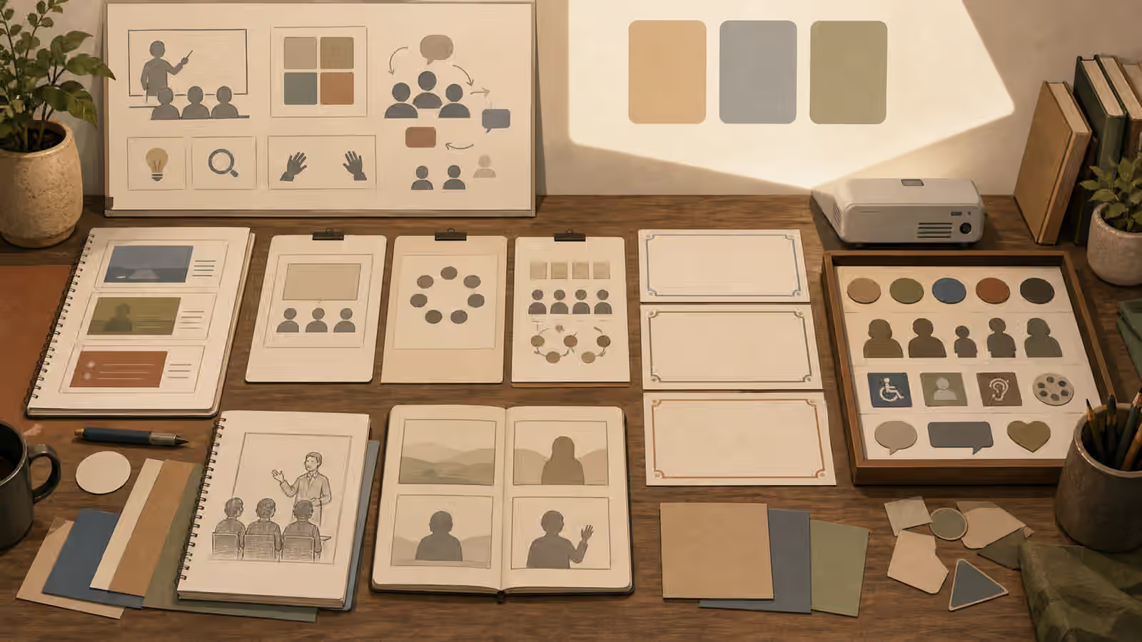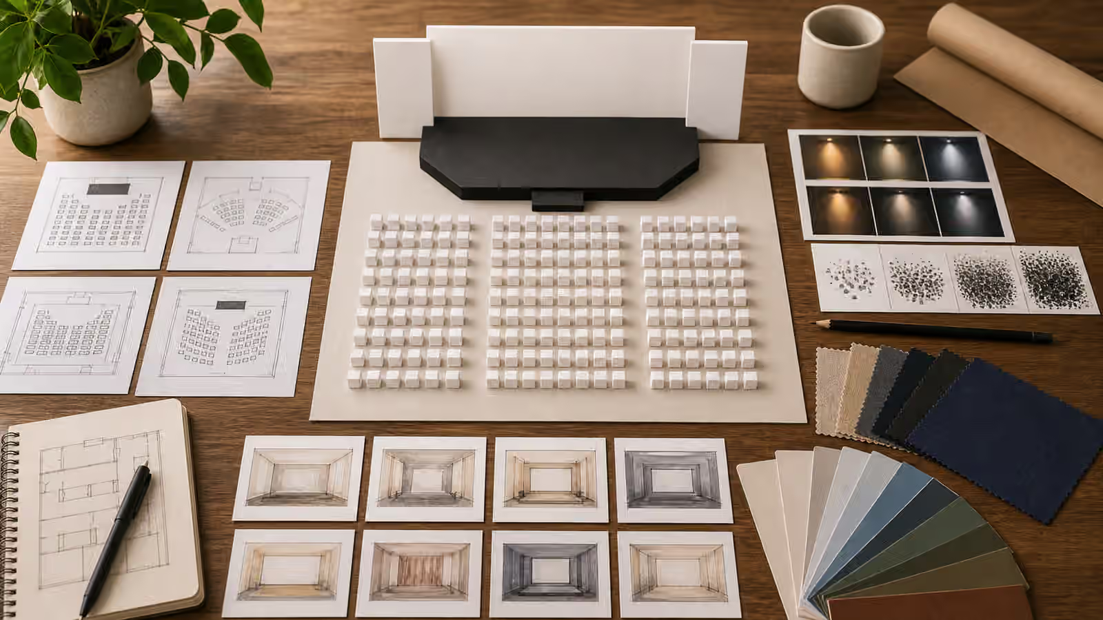
Abstract topics are where generated images most often become decorative fog. Trust becomes a glowing lock. Growth becomes a sprout in a hand. Innovation becomes a light bulb over a laptop. Those images are easy to request, but they rarely help the reader understand the page.
A visual metaphor works better when it is concrete enough to inspect. The reader should be able to describe what is visible before interpreting what it means. That description might be a bridge crossing a gap, a set of path stones, a prism splitting light, or a workbench with parts being sorted. The metaphor does not have to be new to the history of art. It has to be specific enough for the page and honest about what it is not proving.
Begin With The Reader’s Problem
Before choosing the image, name what the reader is trying to understand. A page about disclosure is not just about transparency as an abstract virtue. It may be about showing where an image came from, how much editing happened, and what a viewer should not assume. A page about iteration is not just about improvement. It may be about keeping the useful parts of a prompt while changing one visible variable.
Once the reader’s problem is clear, the metaphor can become smaller and stronger. For disclosure, a clear container, a labeled-but-blank provenance trail, or a visible inspection light may serve better than a generic glass cube. For iteration, a row of draft image cards with one changed crop can be clearer than a spiral arrow. The Article Hero Images guide uses the same principle: the image should confirm the promise of the page instead of decorating around it.
This habit also keeps you from asking for impossible images. If the page is about confidence, the model cannot render confidence itself. It can render a person placing a finished card beside rejected drafts, a stable bridge over a gap, or a clean workspace after a decision. The prompt should describe the visible scene and let the metaphor arise from the relationship between objects.
Choose Objects With Controllable Meaning
Some objects carry strong cultural, religious, political, or commercial meanings. Others are flexible but overused. A lock can suggest privacy, safety, restriction, secrecy, or exclusion depending on context. A seedling can suggest growth, fragility, care, sustainability, or a cliche startup pitch. A compass can suggest navigation, but it can also feel vague if the rest of the scene does not say what is being navigated.
The safer move is to anchor the object in a specific action. A compass beside blank route cards is more meaningful than a compass floating in space. A bridge model spanning two document trays is more useful than a bridge glowing in the clouds. A prism on a table with separated color swatches can suggest interpretation or transformation without pretending to be scientific data.
When culture matters, do more than grab a familiar symbol. The Cultural Context Without Stereotype Shortcuts guide is relevant because metaphors can flatten people and places quickly. If the page is culturally specific, use concrete scene details that belong to the subject and avoid costume, flags, sacred objects, or symbols used as shortcuts. If you do not have enough context to use a symbol respectfully, choose a more neutral visual structure.
Avoid Fake Evidence
Metaphors become risky when they look like proof. A glowing chart can make an unsupported claim feel measured. A doctor-like scene can make a general wellness article feel clinical. A before-and-after image can imply that a real transformation happened. A courtroom-like image can imply legal authority. These are not just aesthetic problems. They change how the viewer interprets the page.
For abstract business, health, education, or safety topics, keep the image clearly conceptual unless you have real evidence and a trustworthy way to present it. The Charts and Data Visuals guide explains this for chart-like imagery, but the rule is broader. If the image is not a real chart, do not ask for numbers. If it is not a real product, avoid packaging claims. If it is not a real event, avoid photojournalistic framing that suggests documentation.
The prompt can say this plainly. Ask for an editorial illustration, blank cards, unlabeled shapes, conceptual props, and no readable text. Ask the image to avoid official forms, dashboards, certificates, medical scans, legal documents, and real brand marks when those details would create false authority. The resulting visual may be quieter, but it will usually be more trustworthy.
Make The Metaphor Reviewable
A good metaphor can be reviewed in ordinary language. Show the image to someone without the prompt and ask what they see. If they can only answer with the abstract noun you hoped to express, the visual may be too generic. If they can describe the objects and then offer a reasonable interpretation, the metaphor is doing useful work.
Alt text is a strong test. The Alt Text and Captions guide recommends describing visible content rather than hidden intent. If your image needs alt text that says “an illustration of resilience” but the visible content is only mist and light, the image is weak. If the alt text can say “small path stones crossing a gap between two blank cards,” the metaphor has enough substance to survive without overclaiming.
Review at thumbnail size too. Abstract images often collapse into a blur when reduced. A concrete metaphor with a few large shapes usually performs better. A bridge, prism, seedling, path, doorway, desk, or set of sorted cards can remain legible. Tiny symbolic objects scattered across the frame may look sophisticated at full size and meaningless in a card.
Let The Page Carry Some Meaning
The image does not have to explain the entire idea alone. It sits inside a page with a title, description, body copy, caption, and surrounding links. A metaphor should open the door, not replace the article. If you force every layer of meaning into the image, the prompt will likely become crowded and the output will become harder to review.
Use nearby text to clarify the specific point. Use the image to establish a concrete scene that supports that point. For a guide about prompt constraints, blank cards and exclusion tabs may be enough. For a guide about visual metaphor, a table of simple objects can make the topic visible without placing a glowing word in the center.
The strongest abstract-topic images usually feel less abstract than the subject. They show a small decision, a physical relationship, or a practical object arranged with care. That restraint is useful. It gives the reader something to look at, gives the editor something to review, and keeps the generated image from pretending to know more than the page can support.