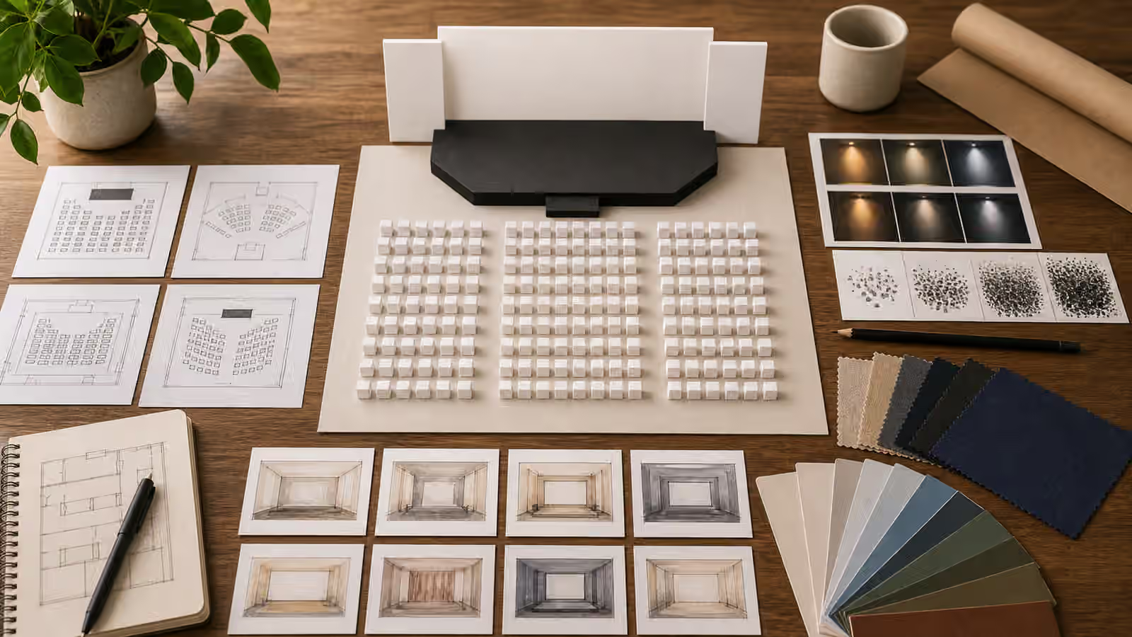
Poster and signage prompts are where generated images most often overreach. The user wants a mood, a layout, or a visual concept, and the model tries to help by inventing words. At thumbnail size the invented words may look convincing. At full size they often become broken lettering, fake logos, strange warnings, or phrases that no editor approved.
The better workflow is to generate the visual system without the text. Leave real copy, typography, legal language, accessibility checks, and brand review to tools where humans can control every letter. A generated image can still do useful work. It can establish composition, color, subject, margin, atmosphere, and hierarchy. It just should not pretend to be the final poster or sign.
Separate Image Work From Type Work
A strong poster prompt names the main visual and reserves a blank area for typography. That blank area can be a quiet sky, a soft wall, a clean paper panel, an empty sign board, a table surface, or a simple color field. The prompt should say no readable text, no lettering, no logos, and no symbols that look like official marks. If the output still contains glyph-like marks, treat that as a quality failure rather than a charming texture.
This separation keeps the image honest and more useful. Real poster copy may need exact spelling, translation, line breaks, contrast ratios, licensing review, brand tone, and accessibility checks. A generated image model is the wrong place to settle those details. Add the words later in a design tool, content system, or layout component where the text remains editable.
The habit connects directly to Social Thumbnails and Covers . A cover image often needs a visual hook and a safe text zone, but the generated asset should not carry the final headline. If the headline is important, keep it as real text layered by the site, social tool, or designer. That way it stays sharp, readable, translatable, and correct.
Make The Blank Space Intentional
Blank space should not look like the model forgot to finish the image. It should look reserved. Ask for a clean headline area, quiet margin, empty placard, blank poster field, or unmarked sign panel. Mention the intended crop if it matters. A vertical event poster needs different space than a wide website hero. A square social card needs more central hierarchy than a long banner.
The Aspect Ratio, Cropping, and Responsive Reuse guide is useful because poster concepts often move between formats. A generated image with the subject pressed against every edge will be hard to reuse. A concept with a clear subject, stable negative space, and quiet margins can accept real text later without fighting the layout.
Think about the reading path even though the generated image contains no words. Where will the headline go? Where might a logo or disclosure sit if the project uses one? Which part of the image can be cropped without losing meaning? If the prompt answers those questions, the output becomes a production asset rather than a decorative experiment.
Avoid Official And Brand-Like Signals
Signage carries authority. A generated warning sign, transit notice, safety instruction, medical poster, public health notice, campaign placard, legal notice, or government-style board can be mistaken for real communication. Even without readable text, shape, color, placement, and iconography can imply official status. Use extra restraint around these surfaces.
If the image is only a design concept, keep it visibly conceptual. Show blank poster frames on a desk, a wall with unmarked paper layouts, an empty display board in a fictional studio, or abstract wayfinding panels with no arrows or instructions. Avoid red-alert styling, official seals, emergency colors, ballot-like layouts, hospital notices, court forms, and signs placed in real-world public contexts where a viewer might treat them as instructions.
Brand confusion is the other common problem. A poster concept can accidentally resemble a movie franchise, fashion campaign, app launch, concert tour, or product advertisement. The Copyright, Trademarks, and Brand-Like Outputs guide gives the broader boundary: do not borrow protected characters, logos, packaging, campaign language, or visual systems that make the output look affiliated when it is not.
Prompt For Structure, Not Copy
Instead of asking for a poster that says something, ask for the visual structure that will hold the later message. A useful prompt might describe a central object, a blank headline panel above it, a quiet lower band for details, and a restrained color palette. Another might describe a fictional gallery wall with empty posters in several ratios, all with crop guides and no text. The image can be specific without containing a single word.
This approach also reduces gibberish. Models often create letter-like shapes because posters and signs normally contain type. If you ask for a finished poster, the model may decide text is required. If you ask for a text-free poster concept with blank typography zones, you are telling it which part of the poster belongs to a later workflow.
For image SEO, the real filename, alt text, caption, and surrounding article copy can carry the topic. The generated image does not need to write the topic inside itself. Image SEO for Generated Visuals is helpful here because it keeps metadata useful without turning the image into a keyword billboard. A file named for the guide and an accurate alt sentence are better than fake words embedded in pixels.
Review At Full Size
Text artifacts often hide until you zoom in. Before publishing, inspect the image at full size and thumbnail size. Look for marks that resemble letters, numbers, logos, stamps, labels, signatures, posters inside posters, product tags, interface copy, or official icons. If the image contains a vague line texture on paper, decide whether it could be mistaken for writing. When in doubt, regenerate with stronger constraints or crop the image so the mark disappears.
Also check whether the reserved text zone is actually usable. A blank area full of complex texture may make real type hard to read. A beautiful gradient may compress poorly. A busy object crossing the margin may force the designer into awkward placement. The AI Image Quality Checks guide covers common failures, but poster concepts need one extra question: could someone place real, accessible text here without fighting the image?
Publish The Concept Honestly
When the final design uses generated imagery plus human-added type, the page should not imply that the generated asset itself contained accurate typography. Keep editable text in the content layer. Use captions or disclosure when the image origin matters. If a poster concept is only a concept, call it that.
This discipline may feel slower than asking for a finished poster in one prompt, but it produces assets that can survive review. The image carries composition and mood. The design layer carries words. The reader gets a cleaner, more honest result, and the team keeps control over the parts that must be exact.