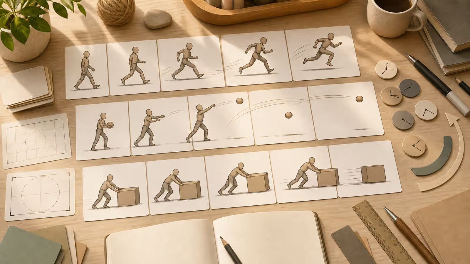
A single generated image can be judged on its own. A sequence has to make sense across time. The reader needs to understand what stayed constant, what changed, and why the next frame follows the last one. That is why storyboards and step-by-step visuals need a different prompt habit than one-off hero images.
Sequential work is common even when nobody calls it a storyboard. A recipe may need process images. A product explainer may need setup, use, and cleanup. A lesson may need a concept shown in stages. A landing page may need three cards that feel related but not identical. Each case asks the model to hold visual memory, and that is exactly where careless prompting can become unstable.
Treat The Sequence As One System
Before writing a prompt for the first frame, decide what belongs to the whole sequence. The stable pieces might be medium, palette, lighting, camera distance, subject type, background density, and crop. The changing pieces might be the action, object placement, gesture, season, or stage of a process. This is the same idea behind Building a Cohesive Visual Set , but a storyboard adds order. The images do not merely belong to the same family. They have to read from one moment to the next.
A useful sequence brief names the constants in every frame. If the subject is a fictional workbench setup, say that every image uses the same workbench angle, warm side light, blank labels, unbranded tools, and quiet background. If the subject is an illustrated character, keep the character simple and original, then use the Character Consistency guide to define stable features without copying a real person or protected character. The more detailed the character, the harder continuity becomes, so modest designs usually hold up better.
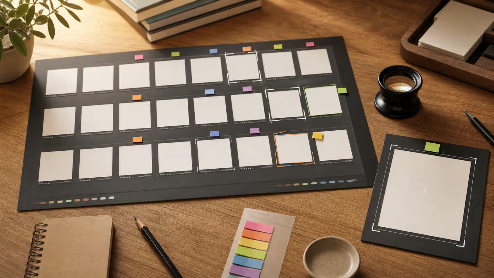
Do not ask for a long scene and hope the model will infer the order. Write each frame as a small beat in the same system. The first frame might show a blank planning board. The next might show image cards being arranged. The next might show a crop frame placed over one card. In prose, that can still be a calm brief rather than a numbered list. What matters is that each frame has a job and only one or two meaningful changes.
Use Anchors The Viewer Can Track
Continuity depends on anchors. A recurring object, a stable camera angle, a consistent background, or a repeated color cue gives the viewer something to follow. Without anchors, a sequence can feel like six unrelated images that happen to share a topic. With anchors, even a simple set of blank cards can read as a process.
Anchors should be visible but not noisy. A small teal notebook, a clay-red crop frame, or the same lamp in the same corner can do more work than a cluttered table full of props. If the anchor is a person, be careful with likeness and identity. For many guidebook sequences, a human-free workspace is easier to control and safer to publish. If people are necessary, describe role, pose, distance, and gesture rather than real-person likeness. The People, Pose, and Gesture Prompts guide gives a safer way to make that choice.
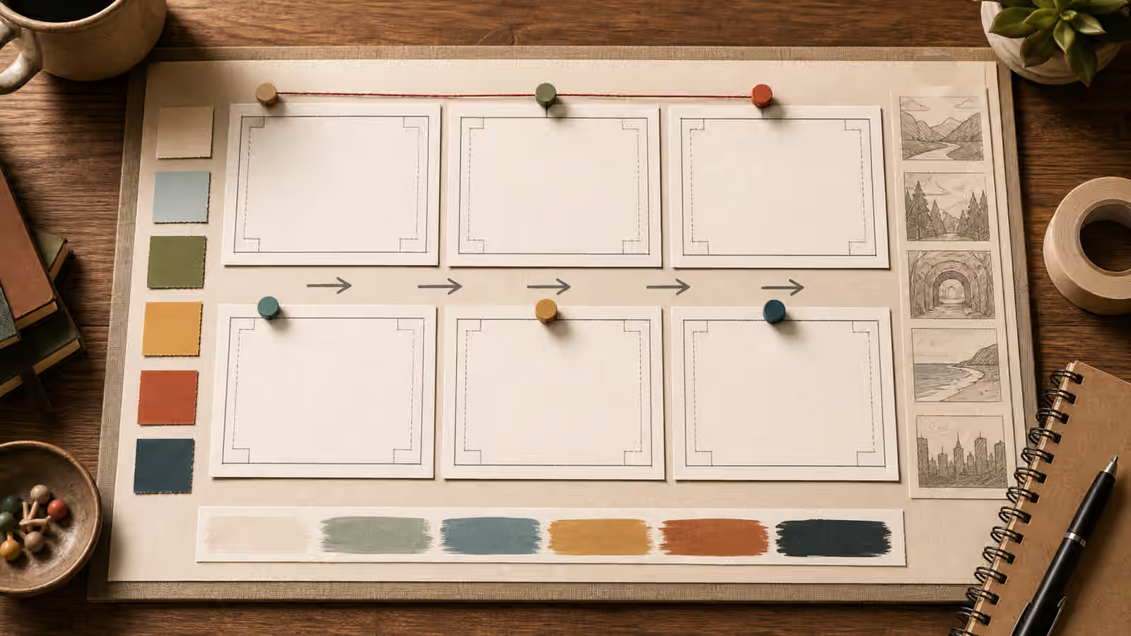
Avoid relying on readable text to carry sequence order. Generated text often fails, and a storyboard full of fake labels creates a quality problem even when the composition looks polished. Use placement, color, arrows made from simple shapes, object movement, and visible before-and-after changes instead. If the published page needs labels, add them later with a design tool where the text can be checked.
Change One Frame At A Time
When one image in the sequence fails, resist the urge to rewrite the entire series. A full rewrite may fix the weak frame while breaking the others. Instead, preserve the stable rules and change the frame-specific instruction. This is the sequence version of Editing One Thing at a Time . It keeps the experiment readable.
For example, if frame three should show a crop decision but the output introduces a fake software interface, keep the same medium, desk, light, crop ratio, and palette. Replace only the problem with a clearer instruction such as a physical crop frame placed over a blank image card, no screen, no readable text, no app interface. That makes the edit easier to evaluate. If the next output still fails, the issue may be the visual idea rather than the wording.
Some discontinuity is normal. Image models do not guarantee exact persistence across separate generations, and a storyboard brief should leave room for review. The goal is practical continuity, not frame-perfect animation. If the guide needs exact diagrams, brand-safe UI, or precise instructional labels, use generated imagery only for rough mood and rebuild the final sequence with controlled design assets.
It also helps to rehearse the sequence in words before spending generation time. Read the planned frames aloud as one small scene. If the action jumps, the viewer will feel that jump too. If two frames do the same job, one of them may be redundant. If a later frame introduces a new prop, new room, new scale, or new lighting style without a reason, the prompt set is already drifting. This rehearsal turns continuity from a vague hope into an editorial check. You are not asking the model to remember everything. You are giving each frame a narrow lane so the review can catch the moment it leaves that lane.
Practice A Six-Frame Brief
Start with six blank frames and write the constants above them: medium, palette, camera distance, lighting, subject, setting, and safety boundaries. Then give each frame one beat. For a guidebook explainer, the beats might be setup, first action, close detail, comparison, correction, and finished state. For a social carousel, the beats might be problem, clue, choice, example, review, and next step. Keep the beat language visible in your notes, not inside the generated image.
After drafting the six prompts, look for accidental drift before generating anything. If frame four changes the room, frame five changes the crop, and frame six adds new props, the sequence is carrying too many variables. Move those changes into a later design pass or remove them. A storyboard prompt is strongest when the viewer can tell what changed because most other things stayed put.
Review For Order, Honesty, And Use
A storyboard review should happen in page context. Place the frames beside the draft section, shrink them to card size, and ask whether the order is still visible. A sequence that only works when every detail is full size may fail in a guidebook shelf, a mobile page, or a social preview. The frame should still read when the reader is moving quickly.
Also check whether the sequence implies evidence. A staged set of images can accidentally look like a documented process, a real event, or a product test. If the images are illustrative, say so in the caption or surrounding copy. Do not use a generated sequence to imply that something happened in the real world, that a product passed a test, or that a person performed an action. The safety boundary is not only about the prompt. It is about how the final sequence will be understood.
Finally, describe the sequence after generation. If you cannot explain what changes from frame to frame in plain language, the viewer probably cannot either. A strong storyboard prompt creates images that feel related, ordered, and honest. It gives the model enough structure to repeat what matters and enough variation to show the next beat.