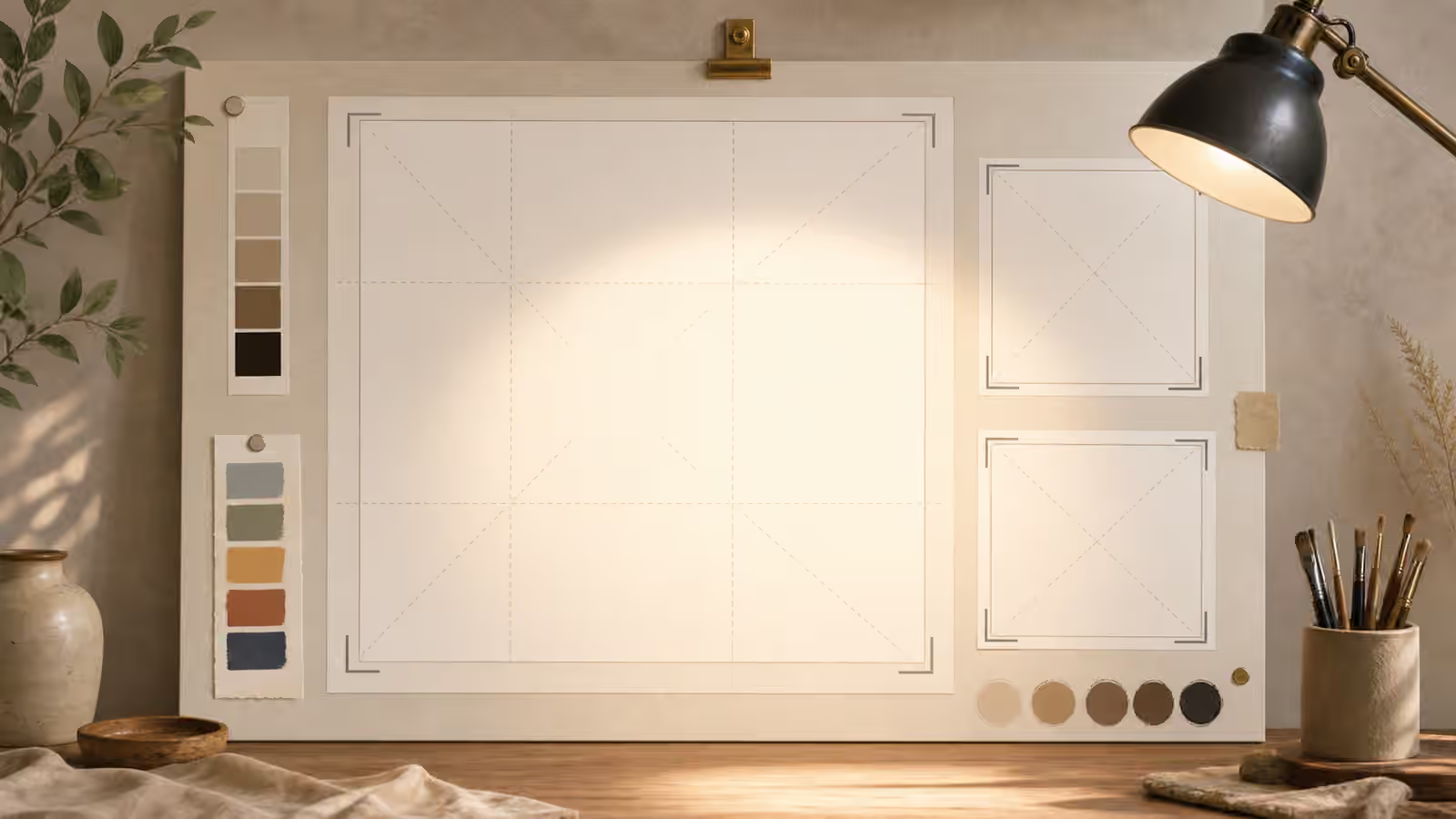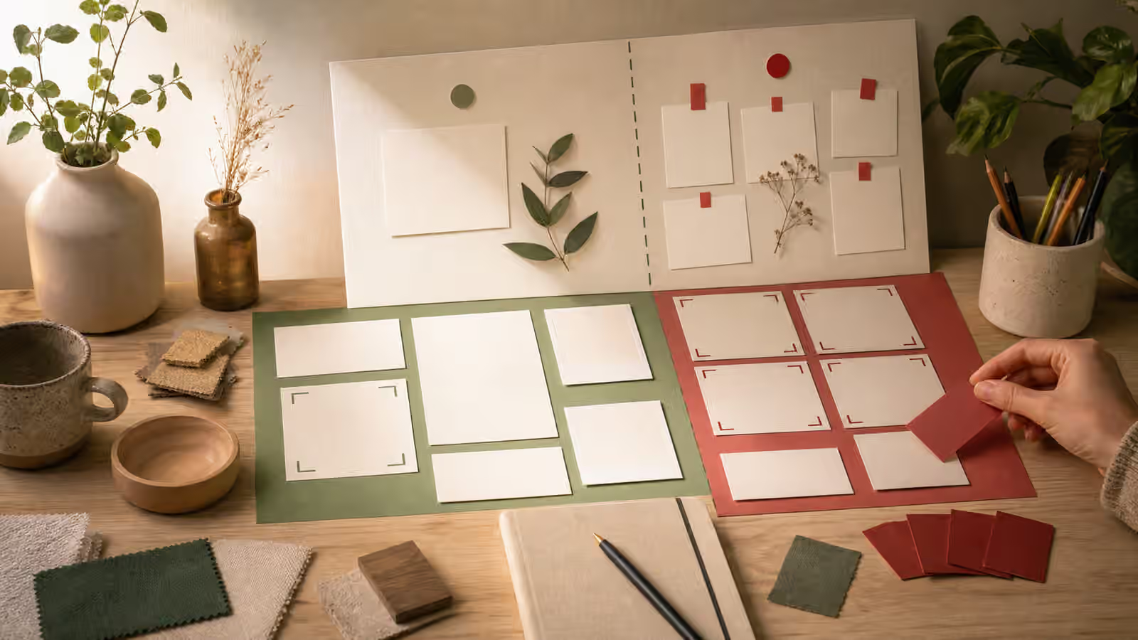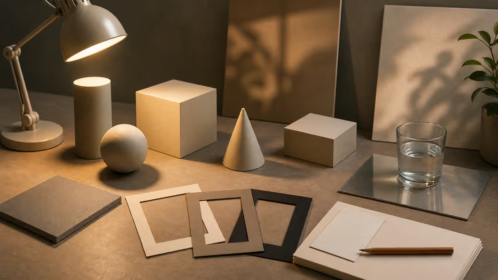
Shadows and reflections are easy to ignore when a generated image has a strong subject. They are also where many images quietly break. An object may float above the table, cast a shadow in the wrong direction, reflect on a matte surface, or glow as if lit by several invisible lamps. The picture can still look polished, but the viewer senses that the scene is not grounded.
This guide is a close companion to Lighting Words That Actually Change Images and AI Image Quality Checks . Lighting prompts choose the source. Shadow and reflection review checks whether the result behaves like the source exists. The goal is not perfect optical simulation. The goal is enough coherence that the image supports the page instead of distracting from it.
Name The Surface
A shadow depends on the surface that receives it. Matte paper, brushed metal, glass, polished stone, fabric, wood, and painted plastic all treat light differently. If the prompt only says “on a desk,” the model may mix cues from several surfaces. It might add glossy reflections to a paper background or make a ceramic object float on a wood table with no contact darkening.
Surface language should be practical. “Matte warm paper surface with soft contact shadows” gives the model and reviewer a standard. “Subtle reflection on a small glossy tile, but no mirror-like table” creates a boundary. “Natural wood surface with restrained sheen” is different from “polished reflective countertop.” These choices also affect the mood of the image, but their first job is physical clarity.
The surface should match the use case. A product-neutral guidebook image often benefits from matte surfaces because they reduce fake labels, glare, and dramatic reflections. A technology concept may use a little gloss, but too much gloss can make the scene look like an advertisement for a product that does not exist. The Product Mockups Without Fake Brands guide is relevant whenever shiny surfaces start to feel like packaging or brand theater.
Contact Shadows Make Objects Sit Down
The most important shadow is often the smallest one. A contact shadow is the dark, tight area where an object meets a surface. Without it, cups hover, cards float, tools look pasted on, and hands fail to touch what they are holding. The viewer may not name the problem, but the image feels assembled rather than photographed or illustrated.
Prompting for contact shadows works best when paired with clear object placement. “A ceramic cup resting on a matte desk with a soft contact shadow under the base” is more useful than “realistic cup.” “Blank cards lying flat on the table with slight edge shadows” tells the model how the cards relate to the surface. For object-in-use scenes, Object-in-Use Prompts applies the same idea to hands, supports, and props.
Review contact shadows after each edit. Edits that remove a background object, change surface material, or move a prop can break the grounding that was previously correct. If the image is otherwise strong, the next edit should address the contact area directly. Do not reprompt the whole scene when the problem is that one object needs to sit on the table.
Reflections Need A Reason
Reflections can make generated images look polished, but they can also create confusion. A reflection should belong to a surface, light source, and object shape. If a matte notebook reflects like glass, the surface logic is broken. If an object reflects details that do not appear in the scene, the image starts to feel unreliable. If reflections create accidental letters or logo-like marks, they become a publishing problem.
Use reflection language sparingly. “Subtle diffuse reflection on a small glossy tile” is a controlled instruction. “Dramatic cinematic reflections everywhere” invites clutter and fake evidence cues. For many Visual Prompt Lab images, the safer choice is restrained material realism: enough light to show form, not enough gloss to invent extra detail.
Reflections are especially risky in images that resemble documentation. A shiny floor in a fictional location can make the scene feel like proof of a real place. A reflective product surface can create fake brand-like marks. A mirrored screen can imply a real interface. The guide on Realism Levels helps decide when the image should remain clearly illustrative instead of chasing photographic persuasion.
Light Direction Should Stay Coherent
The prompt should name the main light source before asking for shadows. Side light, overhead diffuse light, window light, backlight, and soft studio light produce different shadow patterns. If the prompt asks for all of them at once, the model may average them into a scene where every object is lit from a different direction.
Review the image by tracing shadows back to a plausible source. If the cup shadow falls left, the card shadow falls right, and the background object casts no shadow, the scene needs a simpler light instruction. If the subject has a rim glow but no visible reason for it, decide whether the glow is useful or merely decorative. If the image is for a trust-sensitive topic, restrained coherent light is usually better than theatrical light.
Coherent does not mean boring. Soft side light can create depth. Overhead light can make a desk feel clear. Window light can make a room feel natural. The key is to choose one dominant logic and let secondary fill light stay subtle. A prompt that says “soft window light from the left with gentle fill and natural contact shadows” gives the model fewer ways to contradict itself.
Treat Physics Review As Trust Review
Shadow and reflection errors are quality issues, but they also affect trust. An image with impossible light may make an instructional page feel careless. A fictional image with too much photographic realism may imply evidence the page cannot support. A product concept with glossy fake labels may invite brand confusion. The review should ask both whether the physics makes sense and whether the realism level is appropriate.
When the image fails, revise the physical cue instead of adding style words. Ask for softer contact shadows, less reflective material, one clear light source, matte surfaces, or a simpler background. If the image is already too evidence-like, move it toward editorial illustration, simplified materials, or a less documentary camera angle.
Good generated images do not need perfect shadows. They need shadows that do not fight the story. They need reflections that do not invent extra claims. They need light that helps the viewer understand the subject. Those are small details, but they are often the difference between a picture that merely looks finished and a picture that can sit on the page without apology.