Words can describe a picture, but they are often weak at spatial intent. “A person at a desk with room for a headline” leaves open where the person sits, which side should stay quiet, how much of the desk is visible, and whether the image still works when cropped. A rough sketch can answer those questions in seconds.
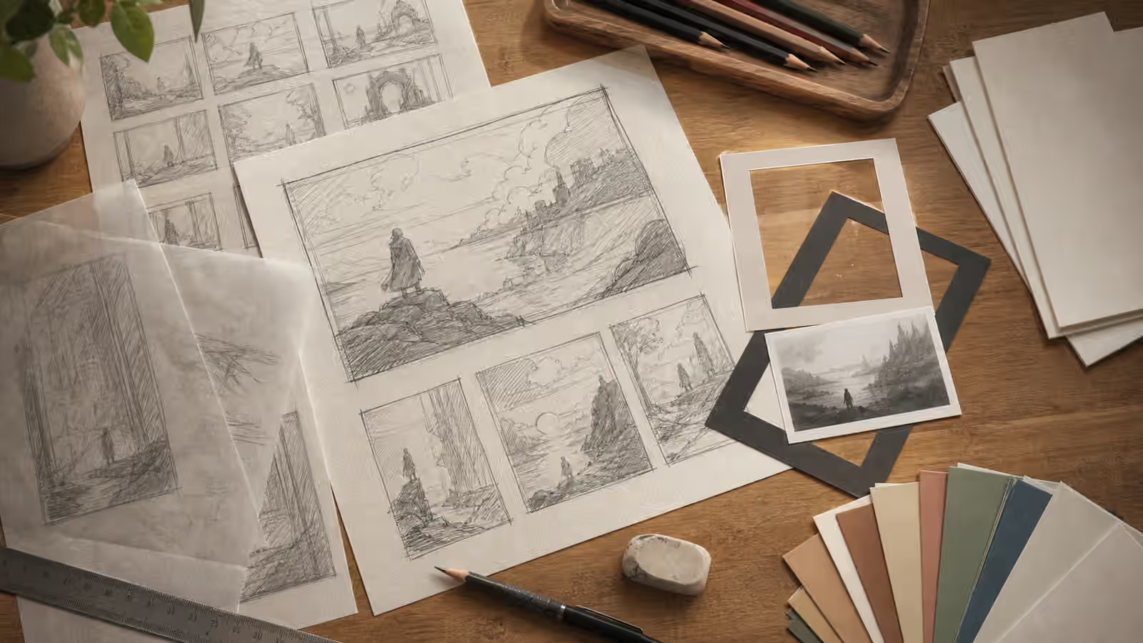
The point is not to turn every image prompt into a drawing assignment. A sketch can be ugly and still useful. It can be four boxes, a horizon line, a subject circle, and a shaded area for negative space. In Visual Prompt Lab terms, the sketch is a layout note. It helps you describe the shot more clearly, then review whether the generated result followed the intended composition.
Treat The Sketch As Geometry
A rough layout should guide placement, not style. If you show or describe a sketch, translate it into geometry before asking for texture, color, lighting, or mood. The useful language is simple: subject in the lower right third, open background across the left half, tabletop visible in the foreground, tall object breaking the top line, small props kept below the headline safe area, horizon low in the frame.
This approach keeps the workflow close to Composition Basics . The sketch is a way to name hierarchy. It tells the prompt where attention should go first and where the page needs calm space. If the image is for a hero banner, the quiet zone may matter more than the decorative detail. If it is for a guidebook card, the main shape must read at thumbnail size. If it is for an explanatory figure, the relationship between objects may matter more than lighting polish.
The sketch also protects against a common prompt failure: too many details competing for the center. When every object receives equal written attention, the model may arrange them like a catalog spread. A quick thumbnail lets you decide what is large, what is secondary, what can be cropped, and what should disappear.
Translate Before You Generate
Do not rely on a sketch alone when the model or tool lets you provide references. Write the translation. A sentence such as “Use the sketch only for composition: a large blank image card on the left, a small tool cluster on the right, and open desk surface across the top third” is clearer than attaching a scribble and hoping the output understands your intent.
The translation also helps when you are not using an image reference at all. You can sketch on paper, learn what you mean, and then write the prompt from that sketch. This is often enough for article heroes, social covers, and guidebook images. The Aspect Ratio, Cropping, and Responsive Reuse guide is especially useful here because one sketch can fail differently in a wide hero, a square card, and a vertical crop.
A strong sketch-based prompt names the crop up front. A wide hero may need a central subject with quiet space on both sides, or it may need the subject on one side with a clean text area on the other. A square thumbnail needs a stronger central shape. A vertical story image may need stacked depth rather than a horizontal sweep. The sketch lets you notice those differences before spending time on color and material.
Keep Reference Use Clean
Sketches feel harmless because they are rough, but they can still carry ownership and privacy problems. A client’s wireframe, a designer’s unpublished storyboard, a classroom whiteboard, or a marked-up product layout may contain information that should not be fed into an image workflow. If the sketch came from someone else, treat it like any other reference. The Reference Images and Mood Boards guide applies even when the source looks casual.
For a safe practice habit, redraw the layout in your own simplified form. Remove names, logos, UI copy, product claims, map labels, and other identifying details. Keep only the geometry you need. A rectangle for a card, a circle for a head, a line for a shelf, and a shaded area for negative space are usually enough.
This also prevents accidental copying. If the prompt asks for the exact sketch as a finished image, the workflow can drift into reproducing a specific design. If the prompt asks for an original editorial illustration that follows the rough geometry, the result has a clearer purpose. You are borrowing structure from your own planning, not asking the model to polish someone else’s composition.
Use Sketches To Negotiate With The Page
Generated images do not live alone. They sit near headlines, captions, buttons, cards, and body copy. A rough sketch is a fast way to make the image negotiate with that layout. Before generating, draw the container. Mark where the headline or crop pressure may land. Then place the subject so it will not fight the real page.
This is especially helpful for text-free image work. Visual Prompt Lab often recommends avoiding readable text inside generated images because fake lettering can damage trust and accessibility. That does not mean the page has no text. It means the typography should be added by the site, design tool, or editor after the image is made. A sketch can reserve that space without asking the model to invent letters.
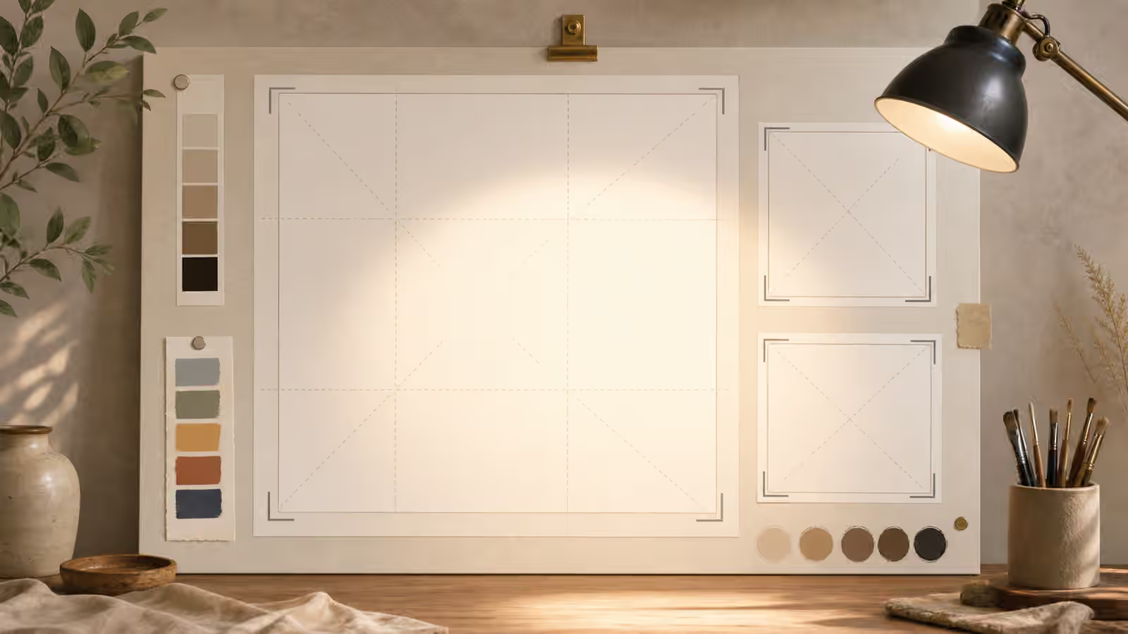
For guidebook images, the body image near the opening section should usually explain the topic without needing a caption to rescue it. If the sketch shows blank cards, crop frames, and a work surface, the prompt can ask for those things directly. If the sketch only says “make it interesting,” it has not done enough work.
Review Against The Thumbnail
After generation, compare the output to the sketch at two sizes. First inspect the full image. Did the main subject land where intended? Is the quiet zone still quiet? Are important objects cut off in a way that helps or hurts? Then shrink the image mentally to a card. Does the composition still read, or did the model fill every inch with small props?
The sketch is not a prison. A generated image can improve the arrangement. It may add depth, soften a corner, or find a better diagonal. The review question is whether the output still serves the layout problem that made you sketch in the first place.
When the result fails, revise the spatial language before changing style. Say which zone should be emptier, which object should be larger, which background should be simpler, or which edge needs more padding. If you jump straight to palette or mood, the next image may look nicer while repeating the same layout mistake.
Rough sketches are useful because they slow down the right part of the process. They make you decide where the image should breathe before the generator fills the frame. That small pause often separates a usable visual brief from a pile of attractive but awkward pictures.