The first style choice in an image prompt is not really style. It is trust. A simple illustration, a polished render, and a photo-like image can show the same subject while making very different promises to the reader. The illustration says the scene is conceptual. The render says the object or space is designed, staged, or speculative. The photo-like image can imply that the scene existed in front of a camera. That implication is useful in some settings and dangerous in others.
Visual Prompt Lab already has guides for article hero images , AI image quality checks , and disclosure . Realism level sits before all three. It shapes what the image seems to be, how closely it needs review, and where disclosure should sit around it.
Start With the Image’s Job
A prompt should name what the image is doing for the page before it names how realistic it should look. A guidebook hero may only need to orient the reader. A process article may need to show the shape of a workflow. A product-neutral mockup may need to communicate scale, material, or packaging structure without claiming that a real product exists. A safety article may need restraint more than impact. These jobs point toward different fidelity levels.
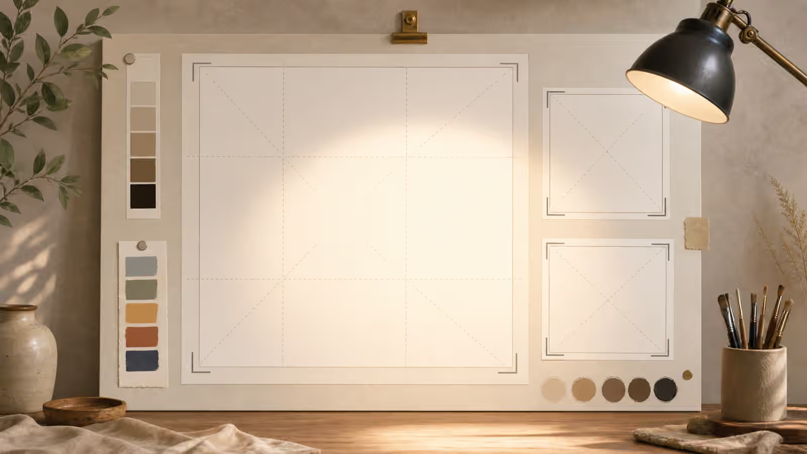
Illustration is often the safest choice when the image represents an idea, a workflow, a habit, or a category. It can be specific without pretending to be evidence. A warm editorial illustration of a prompt desk, crop frames, and blank cards can support a lesson about image planning without implying that a particular team, client, or product exists. It also tolerates abstraction. If the image needs to avoid real people, real brands, and real places, illustration gives the prompt more room to be useful.
A render sits in the middle. It can show object form, material, light, and space with more physical detail than a flat illustration, while still feeling designed rather than documentary. Renders work well for unbranded product forms, room concepts, packaging shapes, interface-free devices, and educational object studies. They also carry risk when they become too close to a product photograph. A rendered bottle with blank packaging is one thing. A rendered bottle with a fake label, certification mark, or clinical surface is another.
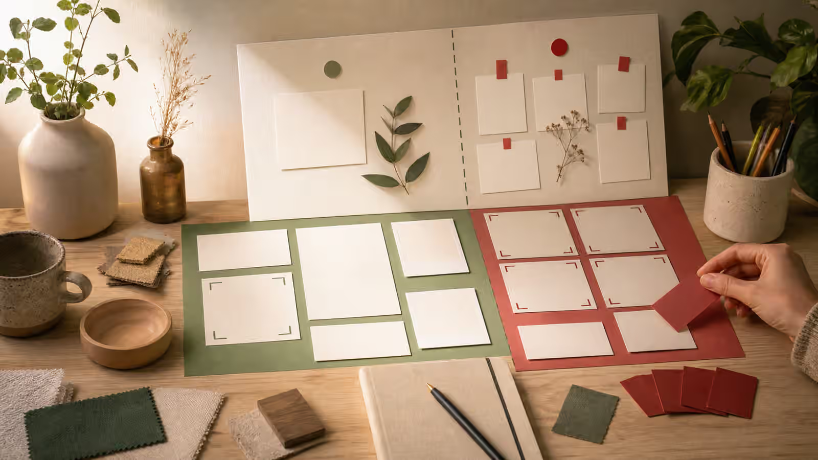
Photo-like realism should be chosen deliberately. It can make a scene feel familiar and concrete, but it also borrows the language of photography. If the page is not documenting a real event, place, person, result, or product, the prompt should keep that boundary visible. Sometimes the better prompt is not “photorealistic office” but “photo-inspired editorial still life of blank planning materials, clearly staged and unbranded.” The difference is small in wording and large in reader expectation.
Realism Changes the Review Standard
The more documentary an image feels, the more the reader may infer facts from it. A photo-like image of a flooded street, crowded clinic, damaged building, protest sign, product package, dashboard, or person in distress can imply events or claims that the page has not proved. A stylized image of the same subject may still need care, but it gives the reader more visual signals that the image is explanatory. That is why realism level belongs in the same conversation as What Not to Generate .
This does not mean photo-like images are always wrong. It means they deserve a stricter brief. If the subject is a generic tabletop scene, a simple room, or a neutral object study, photo-like rendering may be fine when the prompt avoids people, brands, claims, and location-specific cues. If the subject involves evidence, identity, medicine, disasters, financial claims, politics, legal settings, or real-world harm, photo-like realism can make the image heavier than the page can support.
Review also changes for small details. Illustration can survive simplified hands, soft edges, and symbolic props. Renders need believable contact shadows, material scale, and object geometry. Photo-like images need coherent physics, plausible depth of field, natural light, and no accidental document marks. The AI image quality checks guide covers the general pass, but realism level decides which flaws matter most. A slightly simplified plant in an illustration may not hurt the page. A pseudo-official form on a photo-like desk can change the meaning of the whole image.
Use Fidelity Words With Constraints
Style words are too loose when they travel alone. “Realistic” can produce documentary-looking scenes, glossy stock-photo surfaces, or uncanny objects. “3D” can produce toy-like plastic or polished product-render language. “Illustrated” can drift into childish, abstract, or overly decorative work. Pair the fidelity word with material, framing, purpose, and avoid language.
A safer illustration prompt might ask for a modern editorial illustration of blank image cards on a creative desk, with warm paper texture, soft daylight, no readable text, no logos, and no people. A render prompt might ask for an unbranded matte object on a neutral surface, physically plausible shadows, simple material swatches, and no labels or claims. A photo-like prompt might ask for a staged still life of neutral materials, clearly fictional, no identifiable people, no official documents, no brand marks, and no event-like setting.
Notice that each prompt uses the visual style to serve a boundary. The illustration keeps the lesson conceptual. The render shows form without fake commerce. The photo-like still life uses staging language so it does not pretend to document a real situation. This is the same habit as Describe the Shot, Not the Vibe , only applied to fidelity. Instead of asking for a premium realistic image, describe the type of reality the page can honestly support.
Match Realism to Placement
Placement affects the fidelity choice. A card thumbnail needs a clear subject at small size. A hero image can carry more atmosphere but still needs to match the search promise. A diagram-like section visual may need a flatter illustration so readers do not over-read details. A product explanation may need a render because shape and material are the point. A social cover may need high contrast and simple forms rather than subtle realism.
The Aspect Ratio, Cropping, and Responsive Reuse guide is useful here because realism can make cropping harder. Photo-like images often include background details that become messy in small cards. Renders can survive resizing if the object is large and the background is quiet. Illustrations can be planned with stronger shapes and safer margins. If one image must work across many placements, choose the fidelity level that remains legible after compression, not the one that looks most impressive at full size.
Accessibility also benefits from a clear realism choice. A simple image is usually easier to describe. A busy photo-like image may require alt text that explains many details, some of which may be irrelevant or speculative. If the visual’s job is to say “this page is about prompt review,” then blank cards, crop guides, and a magnifier may communicate better than a realistic office full of tiny objects. Realism is not a prize. It is a tool with costs.
When to Step Down the Realism
If the image begins to imply proof, step down the realism. Move from photo-like to render, or from render to illustration. Remove location markers, invented documents, official-looking cards, named dashboards, brand-like packages, dramatic emergency cues, and identifiable people. Keep the useful visual structure while reducing the evidentiary signal. A guide about before-and-after comparisons may use side-by-side blank cards rather than a fake transformation. A guide about places may use generic environment cues rather than a fabricated landmark scene.
Stepping down can also improve quality. A model may struggle with exact screens, readable signs, hands, faces, small labels, or complex equipment. Asking for illustration or render language can move those details into simplified shapes that are easier to review. The result may look less dramatic but serve the reader better. Many strong guidebook images are not photorealistic because the page does not need proof. It needs orientation.
The final prompt should make the trust signal plain. Create an editorial illustration when the image is conceptual. Create a product-neutral render when shape, scale, or material matters. Create a staged photo-like still life only when realism helps and the image cannot be mistaken for evidence. Then review the output as if a skeptical reader will infer meaning from every object in the frame, because some readers will.