Place images carry a quiet promise. A street scene, coastline, storefront, shrine, skyline, or station platform can make a reader feel that the page is grounded in a real location. That is useful when the image is honest. It is risky when a generated picture starts to look like proof of a visit, a condition, a crowd, a closure, a disaster, or a business that may not exist in that form.
The safe path is to separate place atmosphere from place evidence. A generated image can suggest coastal light, mountain air, dense urban rhythm, desert materials, riverfront geometry, or a generic old-town street. It should not pretend to be a verified photo of a named landmark, a current venue, a specific street corner, or an event. This distinction lets visual prompts support travel, culture, architecture, education, and local-interest writing without manufacturing facts.
Name The Role Of The Place
Before writing the prompt, decide why the place is in the image. Sometimes the place is the subject. Sometimes it is context. Sometimes it is only mood. Those roles need different prompts. If a guide is about how to pack for rainy walking tours, the image can show a generic wet stone street, soft reflections, umbrellas as simple shapes, and layered clothing. It does not need a named bridge or an exact city block. If a page is about a real museum, a real hotel, or a specific landmark, a generated image is usually the wrong evidence. Use original photography, licensed imagery, official media, or a clearly labeled illustration instead.
This is the same editorial discipline behind Article Hero Images . The hero should match the reader’s promise, but it should not overstate what the page knows. A generated scene can say this article discusses urban travel planning. It should not say this is what the train station looked like on a certain day. If the image could be mistaken for a report, review, listing, warning, or eyewitness document, make it less documentary or do not use it.
Prompts become safer when they describe visible traits instead of exact identities. Broad setting traits include climate, terrain, street scale, building materials, roof shapes, vegetation, light quality, path width, waterfront geometry, or market density. These are useful because they help the model create atmosphere without claiming a verified location. Exact identities include a named monument, a known facade, a hotel entrance, a street sign, a business logo, a current crowd, or a map pin. These should be handled with more care.
Avoid Landmark Lookalikes
Landmarks are tempting because they make a place immediately legible. They also create a copy and evidence problem. A generated tower, bridge, temple, mosque, cathedral, palace, memorial, museum, or stadium may drift into a recognizable real structure even when you did not ask for one. If the page does not need that specificity, ask for generic architecture instead. Say low hilltop stone walls, arched colonnade, compact harbor buildings, shaded courtyard, or modern transit canopy rather than a named landmark.
If you do need to discuss a landmark, be honest about the image type. A stylized educational illustration of a famous location is different from a photoreal image that implies a current scene. The more realistic the rendering, the easier it is to misunderstand. A place-aware illustration can use simplified geometry, non-photographic medium, blank signs, and a visible editorial composition. A fake street-level photograph with plausible people and signage can mislead even if nobody intended deception.
The Cultural Context Without Stereotype Shortcuts guide is important here. Place prompts often slide into lazy symbols: a flag, costume, monument, food stall, religious object, or color palette used as shorthand for a whole community. Better prompts name concrete, respectful scene details that serve the article. A neighborhood image might focus on shaded sidewalks, mixed-use building rhythm, tiled stoops, balconies, planted courtyards, or warm evening light. It does not need caricature.
Keep Maps And Signs Abstract
Readable maps, signs, and labels can turn a pleasant image into false evidence. Generated maps may invent roads, boundaries, transit lines, addresses, and place names. Generated street signs can look official while spelling nonsense or pointing to places that do not exist. Even if the text is unreadable, the image may imply a specific navigation instruction. For most guidebook heroes, the safer instruction is no readable map labels, no street signs, no license plates, no business names, no venue names, no transit logos.
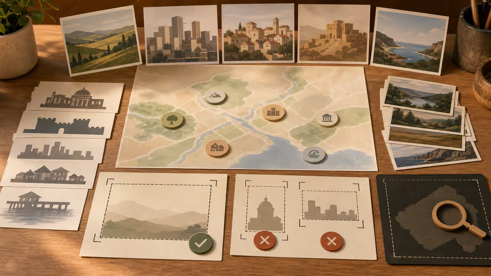
Abstract map shapes can still work. A tabletop planning image can show blank route cards, colored path lines, unlabeled pins, terrain-like swatches, and crop frames. A travel-planning article can use a folded blank map as a symbol without claiming the route is real. A city guide can use generic blocks and transit-like lines as background texture if the surrounding copy carries the real information.
This also helps with accessibility and quality. Fake labels are hard to describe in alt text because they look like information but are not reliable. A clean abstract map is easier to explain: blank route cards and location markers on a planning table. If the page needs exact directions or names, put them in reviewed text, not generated pixels.
Think About Time
Place images also imply time. A sunny empty plaza, a damaged storefront, a bustling restaurant, a closed gate, or a crowded station can suggest a current condition. If that condition is not verified, avoid it. Use timeless, low-claim imagery instead. A generic planning desk, a broad landscape, a quiet illustrated street, or a material-focused architectural detail is less likely to be read as a report from the present.
Seasonal imagery needs the same care. Snow, smoke, floodwater, construction, protest barricades, police tape, emergency vehicles, or boarded windows can all imply facts. Unless the article has evidence and the image is clearly not documentary, keep these cues out. The What Not to Generate boundary applies to place imagery because false location evidence can create real confusion.
For evergreen articles, timelessness is often stronger anyway. A guide to evaluating neighborhood walkability can use a generic street with clear sidewalks, shade, crossing geometry, and storefront scale. A guide to planning architecture photos can use a fictional facade with light and shadow studies. A guide to cultural festivals can use unbranded preparation details, materials, lighting, and gathering cues without inventing a specific crowd at a specific event.
Review For Misread Claims
After generation, ask a simple question: what would a rushed viewer think this image proves? If the answer includes a real place, date, crowd size, safety condition, product availability, business status, property condition, official notice, or travel claim, the image needs revision or replacement. Move toward illustration, abstraction, generic architecture, blank signs, fewer people, and less photoreal camera language.
Also inspect for accidental identifiers. Street signs, logos, flags, license plates, uniforms, badges, venue names, and distinctive landmark silhouettes can appear even when the prompt says not to include them. Cropping can remove some problems, but do not rely on crop as the only fix if the whole image feels documentary. Prompting for broad visual cues from the start is safer than trying to rescue a misleading picture at the end.
A good place prompt gives the reader orientation without borrowing false authority from location realism. It says this article cares about setting, material, light, climate, and movement. It does not pretend that a generated image stood on a street corner and saw what happened there.