Pattern prompts have a different job from scene prompts. A scene asks where the viewer is looking. A surface design asks what could cover an area without collapsing into noise. Wallpaper, wrapping paper, fabric, notebook covers, packaging liners, and decorative backgrounds all depend on repetition, scale, and motif control. If the prompt treats them like ordinary illustrations, the result may look attractive once and fail as soon as it needs to repeat.
The goal is not to make a perfect production-ready textile file inside an image generator. The goal is to create a clear concept image or a useful starting point for a designer. A pattern prompt should state the surface, motif family, density, palette, scale, and originality boundary before it asks for beauty.
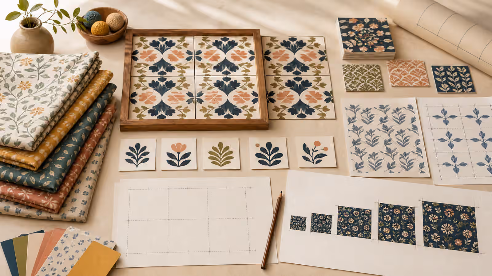
Decide If You Need A Tile Or A Presentation
A repeat tile and a presentation sheet are different images. A repeat tile tries to make the edges behave so the design can repeat. A presentation sheet shows the idea on swatches, paper samples, or a flat display. Many generated images look like pattern presentations even when the prompt asks for a seamless repeat. That can still be useful, but only if you know what you are getting.
If you need a concept for a guidebook hero, a presentation sheet is usually safer. It can show tiles, swatches, and motif variations without pretending to be production-ready artwork. If you need an actual repeatable asset, you should expect additional review in design software, edge testing, and manual cleanup. A generated image may suggest repeat logic, but it should not be trusted automatically for wallpaper, textiles, or packaging runs.
Use the language of intention. Ask for a pattern concept sheet, a square repeat tile, a half-drop inspired layout, a scattered motif field, or a border pattern study. Each phrase pushes the composition differently. The Aspect Ratio, Cropping, and Responsive Reuse guide matters here because a wide hero crop can make a pattern look complete even when the underlying repeat would break.
Control Motif Family And Density
Motifs are the small visual units that give a pattern its character. Leaves, shells, tools, stars, kitchen utensils, abstract arcs, simple flowers, geometric blocks, and hand-cut paper shapes all behave differently. A good pattern prompt names a narrow family instead of asking for everything related to a theme. A gardening pattern made of seed packets, watering cans, gloves, tomatoes, bees, labels, flowers, fences, and soil bags will probably become cluttered. A pattern of simplified leaf sprigs and seed shapes has a better chance of staying coherent.
Density is just as important. Sparse motifs leave breathing room and work well for editorial backgrounds. Medium density can support wrapping paper or fabric. Dense micro-patterns can become texture, but they often lose readable subject matter. Say sparse, medium, or dense, then describe the amount of negative space. The Backgrounds and Negative Space guide is useful because patterns can either support a page or fight every piece of text placed over them.
Scale should match the surface. A large botanical motif may work on a poster or blanket but feel strange on a small label. A tiny geometric texture may work for a card background but disappear in a social preview. When the prompt names end use, the model and reviewer both have a standard. A notebook cover, apron fabric, children’s wallpaper, and article background do not need the same motif size.
Build Originality Into The Prompt
Pattern design has a long memory. Stripes, checks, florals, paisleys, monograms, folk motifs, luxury repeats, sports marks, and character silhouettes can drift toward recognizable sources. The safest prompt asks for original motifs, broad genre traits, and no brand marks. It should not name a living designer, a known textile house, a fashion label, a team, or a protected character as the target style.
The Style Without Stealing guide gives the right habit: describe visible qualities rather than asking for imitation. Instead of a famous wallpaper style, ask for hand-painted botanical silhouettes, muted mineral colors, loose spacing, and matte paper texture. Instead of a luxury monogram, ask for simple geometric repeats with no initials, no letters, and no emblem-like shapes. Instead of a cartoon character pattern, ask for original playful animal shapes with no recognizable character design.
Cultural motifs need care too. A pattern can borrow sacred, ceremonial, regional, or community-specific visual language without understanding it. If the project needs culturally specific design, use appropriate research, permissions, and collaborators. If the project is general, stay with neutral motif families and avoid treating cultural markers as decoration.
Separate Pattern From Typography
Generated images are unreliable with text, and patterns make that problem worse. Letters can appear as fake labels, pseudo-monograms, or decorative marks that look like brand symbols. If a surface design needs words, initials, dates, or a logo, add them later in a controlled design file. The generated layer should remain text-free unless it is merely a rough concept and clearly not final.
This matters for packaging and print. A pattern behind a real label can be useful, but a generated pattern with fake words can imply a product, maker, certification, or event. For unbranded product scenes, keep the pattern as a surface texture and follow the boundary in Product Mockups Without Fake Brands . Blank labels are easier to review than invented ones.
When the pattern will sit behind real text on a page, test contrast early. A beautiful dense pattern may be useless behind headings. A subtle tonal pattern may work better. Ask for quiet corners, low-contrast background zones, or a presentation that shows the pattern as swatches rather than filling the whole hero image. The point is to support the page, not prove how many motifs can fit.
Review Repetition, Edges, And Use
Review a pattern in three passes. First, look at the whole image. Does the motif family read clearly, or has the design become a collection of unrelated objects? Second, inspect the edges. If the image claims to be repeatable, do the motifs cut off awkwardly? Are there visible seams, sudden density changes, or corner clusters that would create a grid when tiled? Third, imagine the end use. Would this work at the size and surface you named?
Generated patterns often look best in a single framed view. That is fine for a guidebook illustration or concept board. It is not enough for fabric, wallpaper, or packaging production. Export decisions, color management, licensing, print testing, and accessibility all sit outside the prompt. Treat the generated image as a starting point and keep a short note about what worked, much like the habit described in Prompt Iteration Logs .
A good surface prompt is restrained. It names the family of marks, the spacing, the scale, the palette, and the boundary around originality. It leaves text, logos, and protected motifs out. It gives the reviewer a way to judge success beyond personal taste. When pattern work is framed that way, generated images can support exploration without turning into accidental copies or decorative noise.