Packaging is one of the fastest ways for a generated image to look like commerce. A box, pouch, bottle, jar, tube, bag, carton, wrapper, or hang tag does not feel neutral once it has a label. Even unreadable pseudo-text can suggest ingredients, certifications, warnings, awards, origin stories, safety approvals, flavor names, medical benefits, or environmental claims. A product mockup can quickly become a fake product.
The safer prompt treats packaging as a shape, material, and layout study. It can show blank panels, unbranded forms, paper texture, glass thickness, closure type, scale, lighting, shelf context, and label placement. It should not invent claims. If the project needs a real package, use real reviewed copy and approved design assets. If the image is only illustrative, keep the label fields blank and make the fiction clear.
Separate Form From Claim
A package has two jobs in a visual brief. The form tells the viewer what kind of object it is. The claim tells the viewer what to believe about it. A generated image can safely help with form: a matte paper pouch, amber glass jar, plain folding carton, refillable tin, molded pulp tray, or neutral shipping sleeve. It becomes riskier when it claims organic, safe, tested, certified, clean, proven, doctor recommended, fair, local, recycled, award winning, or compliant.
Ask for blank label zones and material cues. A prompt can say unbranded folding carton with blank front label, soft paper texture, rounded shadows, simple cap shape, and no readable text. It can say neutral supplement-like bottle form without supplement facts, medical claims, seals, dosage language, or health imagery. It can say fictional pantry jar with blank paper band and no food-safety or origin claims.
Product Mockups Without Fake Brands covers the broader product boundary. Packaging deserves its own caution because labels are dense with claims, and generated text-like marks can look official even when they are nonsense.
Keep Regulated Categories Quiet
Some packaging categories carry special meaning even before the label is legible. Medicine, supplements, baby products, pesticides, cleaning chemicals, alcohol, tobacco, cannabis products, financial cards, legal forms, safety equipment, and medical devices are not ordinary decorative objects. A generated package in these areas can imply approval, dosage, safety, or legal status. Avoid those categories unless the page has a very clear educational reason and the image is plainly conceptual.
When a topic requires regulated context, prompt the surrounding idea instead of the package. A health article can show a calm wellness planning desk with blank cards and non-clinical props. A cleaning article can show cloth, water, a brush, and an unlabeled container without hazard labels or claims. A food article can show ingredients and serving context rather than a fake nutrition panel. The image should support the page without pretending to be a compliant label.
This overlaps with Health and Wellness Visuals and Sustainability Visuals Without Greenwashing . Health and environmental packaging often leans on seals, leaves, crosses, lab motifs, badges, and tiny panels that imply proof. If proof is not real, keep those symbols out.
Avoid Brand-Like Trade Dress
Even when a label is blank, packaging can still resemble a brand. Color blocking, bottle silhouette, cap color, stripe placement, pouch shape, mascot-like marks, and shelf composition can drift toward known trade dress. The prompt should ask for original unbranded forms, generic geometry, no logos, no mascot marks, no distinctive brand color system, and no packaging layout that resembles an existing product line.
Reference images need care. A mood board can clarify paper texture, glass material, studio lighting, or label position. It should not tell the model to copy a brand’s package. When you use references, describe what to borrow at the craft level: frosted glass, kraft paper, matte pouch, embossed blank panel, soft shadow, or reusable tin form. Reference Images and Mood Boards Without Copying gives a useful pattern for separating direction from imitation.
If a package needs eventual typography, add it later in a design tool. Generated letterforms are unreliable and hard to review. A text-free render also supports localization because real copy can be placed, translated, and checked outside the image.
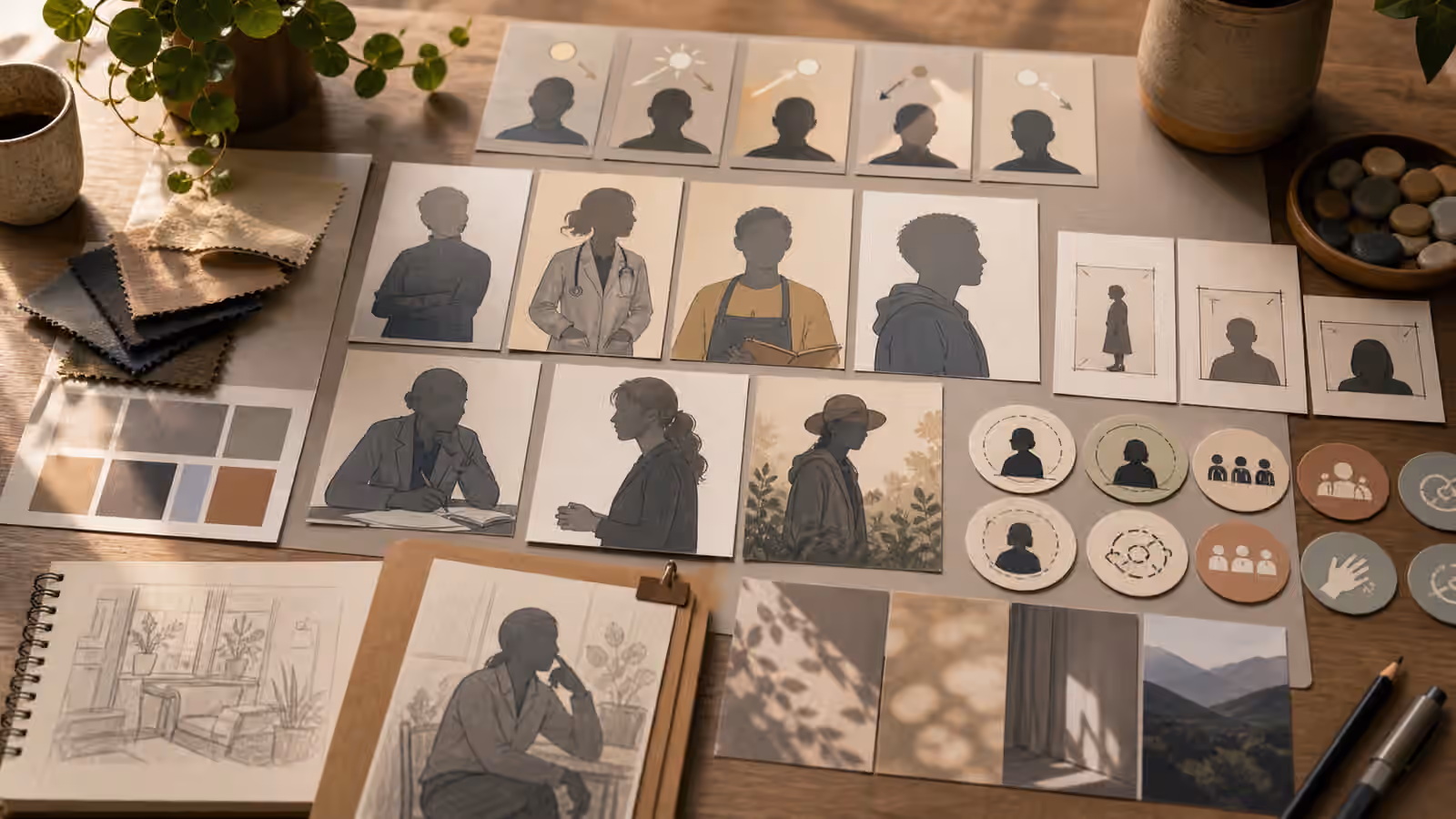
Use The Surrounding Scene
Packaging does not need to fill the frame. A safer visual can show a design desk, material swatches, blank cartons, die-cut shapes, crop frames, and review markers. That composition tells the reader the article is about packaging decisions rather than a real item for sale. It also gives the page more safe margin for responsive crops.
Context helps with scale and use without adding claims. A reusable tin beside fabric swatches, a blank jar near neutral ingredients, or a plain carton on a design table can communicate tactile direction. Avoid shelf scenes that look like a real store display, especially if the page could be read as recommending or comparing products. A shelf can imply availability. A desk implies concept work.
Text-Free Poster and Signage Concepts is a useful companion because the same rule applies: generate the visual structure, then add reviewed words later. The more the image depends on text, the less suitable it is for raw image generation.
Packaging prompts also need a handoff note. If a blank label is intentionally blank, say so before the image reaches layout or social reuse. Otherwise another person may fill the space with decorative pseudo-copy, a badge, or a confident claim because the surface looks unfinished. A short note such as “keep all label areas blank; this is a fictional package form study” protects the image’s meaning downstream. It also gives alt text a safer job: describe the blank package forms and materials, not an invented product.
Review The Package Like A Reader
After generation, zoom in on every label-like surface. Look for pseudo-letters, seal shapes, rating marks, dosage panels, ingredient charts, nutrition grids, warning triangles, recycled symbols, awards, medical crosses, legal-looking blocks, and brand-like marks. A tiny fake detail can change the meaning of the whole image. If it appears, crop only when the remaining package still reads as blank and fictional. Otherwise rerender with stricter constraints.
Then ask what the image appears to sell. Does it imply a safe product, healthy product, sustainable product, award-winning product, locally made product, official product, or available product? If the answer is yes and the page does not prove it, revise. The strongest packaging visuals often look like a design process rather than a finished product. That restraint keeps the image useful without inventing claims a reader might reasonably trust.