Motion is difficult in a still image because the picture has to freeze one moment and still let the viewer understand what happened before and after. A person can look as if they are running, falling, floating, posing, or slipping depending on a few small cues. A ball can look tossed, dropped, or glued to the air. A box can look pushed, parked, or drifting. The prompt has to choose the action clearly enough that the image does not rely on blur to explain everything.
This guide sits beside Storyboards and Sequential Scenes and People, Pose, and Gesture Prompts . Storyboards help when several frames are needed. Pose and gesture help when the action is human. Motion prompting asks a narrower question: which single phase of movement should this one image show, and what cues make that phase readable?
Choose the Phase of Movement
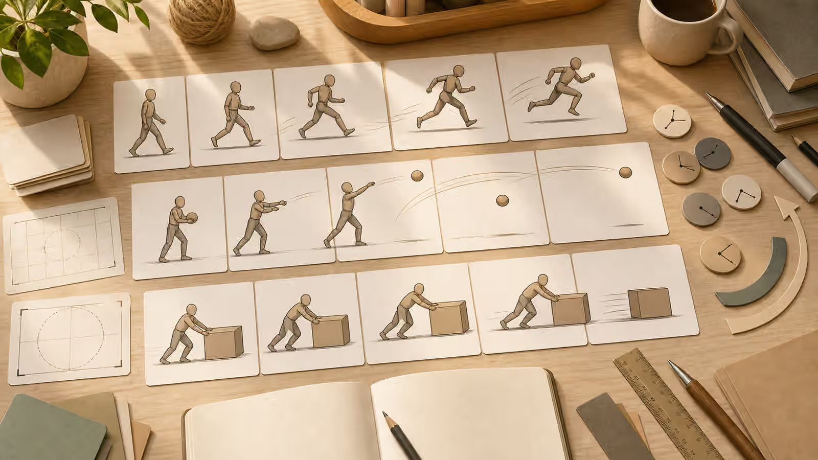
The weakest action prompts ask for a general activity and hope the model chooses the useful moment. “A person throwing a ball” might produce the wind-up, the release, the follow-through, or a strange in-between pose. “A box sliding across a floor” might show the box before movement, after movement, or hovering with speed lines. A stronger prompt names the phase: before release, at release, just after release, mid-step, landing, beginning to push, or coming to rest.
Phase language gives the image a physical anchor. A runner mid-stride needs one foot off the ground and the other near contact. A person pushing a box needs hands on the near side, weight leaning forward, and the box still aligned with the floor. A thrown object needs a path that makes sense from the hand to the air. These details are less glamorous than style words, but they decide whether the viewer can read the action.
The phase should match the page purpose. If the image is explaining a sequence, use a clean storyboard rather than one busy dramatic frame. If it is a guidebook hero, choose the clearest silhouette rather than the most intense moment. If the page is about review, a planning-table image with motion cards may be safer than a photo-like sport or emergency scene. The image does not need to perform action. It needs to make action understandable.
Use Motion Cues With Restraint
Motion blur, speed lines, repeated ghost positions, dust, splash, and tilted camera angles can help, but they can also hide the subject. A small arc behind a ball may clarify direction. Heavy blur across the whole image may make the object unreadable. A slight lean in a figure may show effort. Extreme diagonal framing may turn a practical guide into a crisis poster. Treat motion cues as annotation, not decoration.
The safest approach is to keep the subject sharp and the motion cue secondary. Ask for a clear silhouette, stable camera distance, and simple background first. Then add a restrained motion arc, soft trailing line, or subtle displaced shadow. If the model adds too many streaks or confusing duplicate limbs, revise the prompt toward stillness rather than asking for even more energy. Readability usually improves when the environment becomes quieter.
Camera language matters here. A side view can make walking, running, throwing, and pushing easier to understand. A three-quarter view can show depth and contact with the surface. A low angle may dramatize the scene but can hide foot placement. An overhead view may work for objects sliding or being arranged, but it can flatten human motion. The Camera Angle guide is useful because action scenes often fail when the viewpoint is too ambitious.
Keep the Setting Still Enough
Action needs contrast with something stable. A figure moving through a calm room, an object sliding on a plain table, or a ball crossing a simple background is easier to parse than motion inside a cluttered scene. If everything in the frame is diagonal, blurred, dramatic, and textured, nothing reads as the action. The prompt should identify what stays still: the floor plane, table edge, background wall, horizon, crop frame, or storyboard card.
Stillness also reduces false meaning. A running figure in a generic blank-card storyboard is a motion study. A running figure in a photorealistic street with smoke, crowds, emergency lights, and readable signs starts to imply a real event. If the page cannot support that implication, the setting is doing too much. Remove documentary signals and keep the action as an original, fictional, conceptual scene.
For unbranded educational visuals, a studio table or abstract card set often works better than a realistic event scene. It lets the image show motion without pretending that a particular accident, sport, protest, rescue, or product test happened. It also makes the quality review easier. You can check the movement, contact points, and cropping without decoding a whole world of background details.
Review Anatomy, Contact, and Direction
A polished action image can still be physically wrong. Review the limbs first. Count what matters, but also check orientation. Are elbows and knees bending in plausible directions? Does a foot meet the floor or float above it? Is the torso balanced for the action? If a hand releases an object, does the object seem to travel from the hand? If a box is pushed, does the figure touch the box at a useful height? These checks overlap with AI Image Quality Checks , but action scenes need extra attention because motion hides mistakes.
Direction is another common failure. Motion arcs can contradict posture. A figure may face one way while speed lines point another. A ball may travel in a path that ignores gravity. A shadow may appear under an object that is supposed to be airborne, or disappear under an object that is supposed to slide. If the image is only decorative, these issues still weaken trust. If the image teaches a process, they can mislead the reader.
When the action fails, simplify the phase. Replace “jumping across the room while holding a tool” with “stepping over a low object.” Replace “tossing several items” with “one plain ball just after release.” Replace “worker rapidly assembling a device” with “faceless figure placing one component on a table.” The fix is often less action, not more prompt intensity.
Avoid Fake Event Energy
Action scenes are tempting because they make a page feel active. They also borrow the language of evidence when they become photo-like. A generated image of a crash, crowded evacuation, product stress test, injury, protest, arrest, emergency response, or public figure in motion can imply that a real event occurred. Even when the page says the image is synthetic, the first impression may still feel documentary.
For Visual Prompt Lab work, keep action original, unbranded, and proportional to the lesson. Use faceless figures, abstract cards, neutral props, and clean settings when the action is conceptual. Avoid readable signs, uniforms, license plates, identifiable places, brand markings, official documents, and emergency cues unless the page has a strong reason and a clear safety boundary. The guide on What Not to Generate applies strongly here because action can make invented scenes feel urgent and real.
The final prompt should read like a calm direction note. Name the subject, the phase of movement, the camera distance, the stable setting, the restrained motion cue, and the avoid list. Then review the result at the size where it will actually appear. If the action still reads when small, if the physical relationships make sense, and if the scene does not pretend to document something it cannot prove, the image is doing its job.