Maps carry authority. Even a loose map-like image can make a viewer think there is a real route, border, neighborhood, facility, or event behind it. That authority is useful when the map is verified and labeled by people who know the data. It is risky when a generated image invents geography because the prompt asked for a map mood.
Visual Prompt Lab treats map-like images as diagrams unless there is a verified source outside the model. A diagram can suggest movement, distance, distribution, or planning without pretending to locate real people or places. This guide belongs beside place and landmark prompts without false evidence and charts without fake numbers because all three deal with visual forms that viewers often read as evidence.
Decide Whether It Is A Map Or A Metaphor
Before prompting, decide what the image is allowed to claim. A real map claims something about a location. A conceptual map explains relationships, sequence, tradeoffs, or coverage without pointing to real coordinates. A decorative map texture may only provide atmosphere. Those three uses need different prompts and different review standards.
If the page needs actual geography, do not ask an image model to invent it. Use a proper map source, verified data, and human labeling. Generated imagery can sometimes support a surrounding article as an abstract illustration, but it should not supply the geographic facts. If the page is about planning routes, regional policy, public safety, or property boundaries, a fake-looking but official-feeling map can mislead even when nobody intended deception.
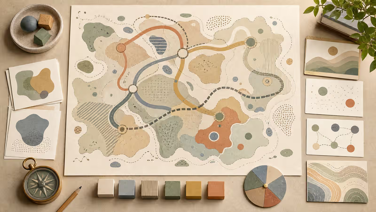
If the page only needs a metaphor, say so. Ask for fictional land shapes, abstract route ribbons, no real place names, no country outlines, and no scale claim. The image can still feel map-like. It can show paths, zones, distance, and orientation. It simply must not imply that a real route or place has been documented.
Remove Names, Borders, And Official Cues
Readable place names are a common failure in generated map-like images. They may appear as gibberish, invented towns, or almost-real labels. Even unreadable labels can create the impression of documentation. For most conceptual images, the safer prompt is no readable text, no labels, no addresses, no official symbols, and no country or state outlines.
Borders deserve the same caution. A line that resembles a national border, disputed boundary, transit route, evacuation zone, or property edge can carry meaning the page does not support. If the image needs zones, make them abstract and clearly fictional. Use soft shapes, unlabeled areas, or design tokens rather than realistic administrative lines. If the zones represent real data, do not generate them from a vague prompt.
Official map cues also create risk. Compass roses, grid lines, pins, coordinates, transit icons, stamps, seals, and satellite-like views can make a fictional image look evidentiary. Some of those details may be appropriate in a clearly conceptual design, but they should be restrained. The more official the image looks, the more careful the surrounding context must be.
Keep Scale Conceptual
Scale is one of the easiest things for a generated map-like image to fake. A route line, distance bar, or zoomed inset can imply measurable relationships. If the image is conceptual, avoid exact scale bars and distance labels. Use relative scale blocks, abstract spacing, or layered paths instead. If the image needs exact scale, use verified mapping tools rather than generated art.
This does not mean map-like diagrams must be vague. You can still show a short path versus a long path, a central hub versus outer nodes, or several regions feeding into one destination. The trick is to make the relationship conceptual. A viewer should understand the visual logic without mistaking it for a route they could follow.
Prompt language can help. Ask for a fictional diagram of movement, not a map of a real city. Ask for abstract terrain-like shapes, not a satellite view. Ask for route ribbons with no labels, not transit lines. Ask for visual planning materials on a desk, not an official map sheet. Those distinctions may sound small, but they change the promise the image makes.
Separate Data From Illustration
Map-like images often appear near data. A climate article, supply chain essay, travel guide, or local planning note may want geography and numbers together. Generated images should not invent either. If data is involved, create the real data visual separately and use generated imagery only as a decorative or explanatory companion. The educational infographic guide is relevant because labels, sequences, and factual relationships need human verification.
If the image needs to show a concept such as distribution, access, or coverage, write the prompt so the fictional nature is visible. A tabletop planning board with abstract regions and unlabeled tokens is safer than a realistic map with shaded zones. A diagram of generic route options is safer than a fake city street grid. A blank atlas-like spread is safer than invented place names.
Captions and surrounding copy should reinforce the boundary. Do not caption a generated diagram as if it shows a real region. Do not let alt text supply fake names that are not visible or verified. If the image is conceptual, say that in the page context when it matters. Honesty around use is part of the visual brief.
Review For Accidental Authority
After generation, inspect the image for details that create accidental authority. Look for fake labels, route numbers, coordinate-like marks, official symbols, recognizable coastlines, country shapes, street grids, pins, highlighted danger zones, and realistic satellite texture. Any of those details can shift the image from metaphor toward false evidence.
Also review the crop. A tight crop can remove the desk or diagram context that made the image feel fictional. A realistic close-up of a route line may look more official than the full image did. If the image will be reused as a thumbnail, make sure the small version still reads as conceptual.
Map-like imagery can be useful when it is honest about its role. It can show planning, movement, structure, and relationship without pretending to know where something happened. The brief should make that boundary visible, and the final review should reject anything that crosses it.