A generated image that works in one language can become awkward as soon as the page is translated, reused, cropped, or adapted for a different audience. The problem is rarely the main subject. It is the fake text in the image, the culture-as-costume shortcut, the flag used as a substitute for context, the tiny sign that cannot be translated, or the layout that leaves no room for real localized copy.
Localization-ready prompting is a planning habit. It asks the image to carry visual meaning while leaving language, claims, and region-specific details in editable page text. That makes the image easier to translate, easier to describe in alt text, and less likely to confuse readers with pseudo-writing. It also connects directly to the guide on Text-Free Poster and Signage Concepts , but the problem is broader than posters. It affects hero images, diagrams, social covers, product-neutral visuals, and guidebook cards.
Keep Language Out of the Bitmap
The simplest localization move is to keep readable language out of the generated image. Ask for blank labels, blank caption strips, empty sign shapes, clean panels, neutral cards, or reserved text zones instead of asking the model to write words. Then add real text in the page, design tool, social composer, or caption field where it can be edited, translated, checked, and resized.
This is not only about translation. Generated text often arrives misspelled, warped, or only partly legible. Even when it looks plausible at thumbnail size, it can become a distraction after compression or cropping. Worse, it can accidentally imply a claim. A fake certification mark, fake store sign, fake warning label, or fake dashboard tile may make the image feel more official than it is. The Image SEO and Alt Text and Captions guides both benefit when the actual words live outside the pixels.
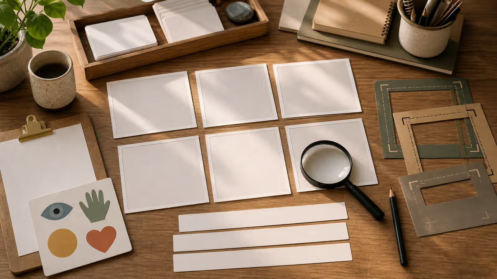
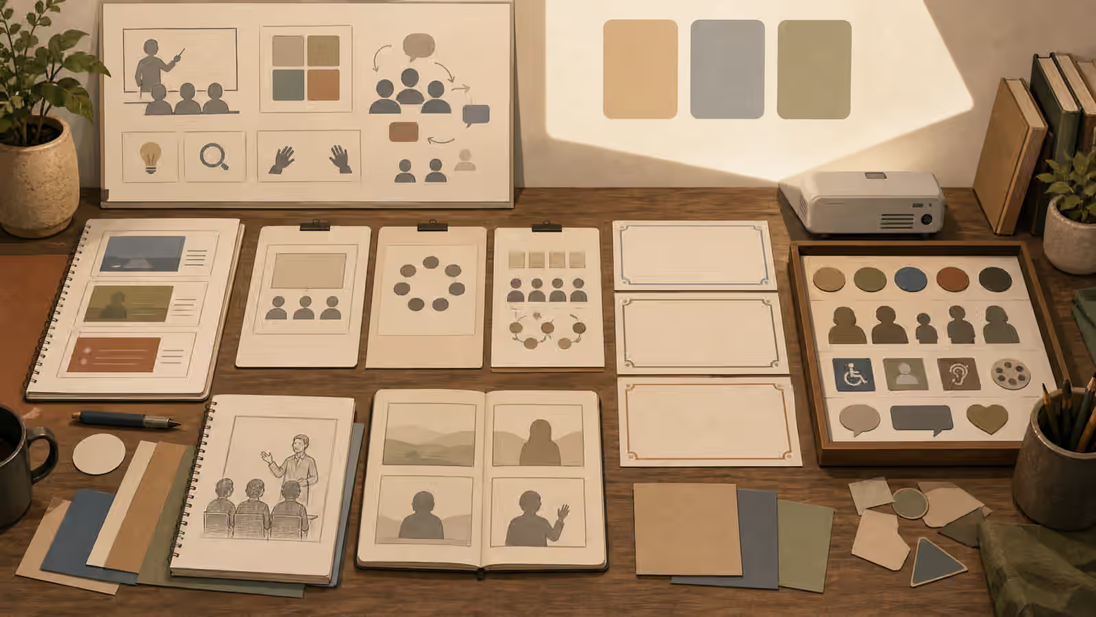
A localization-ready prompt might ask for an editorial illustration of a blank event poster frame, a quiet background, simple icon-like shapes, and a clear empty area reserved for real typography added later. It might ask for a conceptual dashboard with unlabeled blocks and no numbers because exact data belongs in authored text. It might ask for a classroom scene with blank cards and simple objects rather than signs on the wall. The image still communicates structure, mood, and subject. It simply refuses to carry language it cannot reliably own.
Leave Room for Real Copy
Text-free does not mean text-hostile. Many images need space where real localized copy can be placed later. The prompt should describe that space as part of the composition. Ask for a quiet upper third, a blank side panel, a large smooth background area, a centered subject with generous margins, or a series of empty frames that can accept real labels. If the image will be reused as a card, hero, and social cover, add the crop discipline from Aspect Ratio, Cropping, and Responsive Reuse .
The useful detail is not “space for text” by itself. Models may fill that space with texture, props, pseudo-lettering, or decorative clutter. Say what the empty area should be made of. A smooth paper background, unmarked wall, clear tabletop, blank fabric panel, unfussy sky, or matte color field is easier to use than a busy gradient or detailed shelf. Also say what should not cross it. No hands, no plants, no fake labels, no thin linework, no small objects near the intended copy area.
Real typography also has accessibility needs. Translated text may be longer than the source. Some scripts need more vertical room. A localized headline may wrap differently. If the generated image squeezes the text zone into a decorative corner, it will fail in the first adaptation. The image should give copy room to breathe. That makes the asset less flashy and much more useful.
Avoid Region Shortcuts
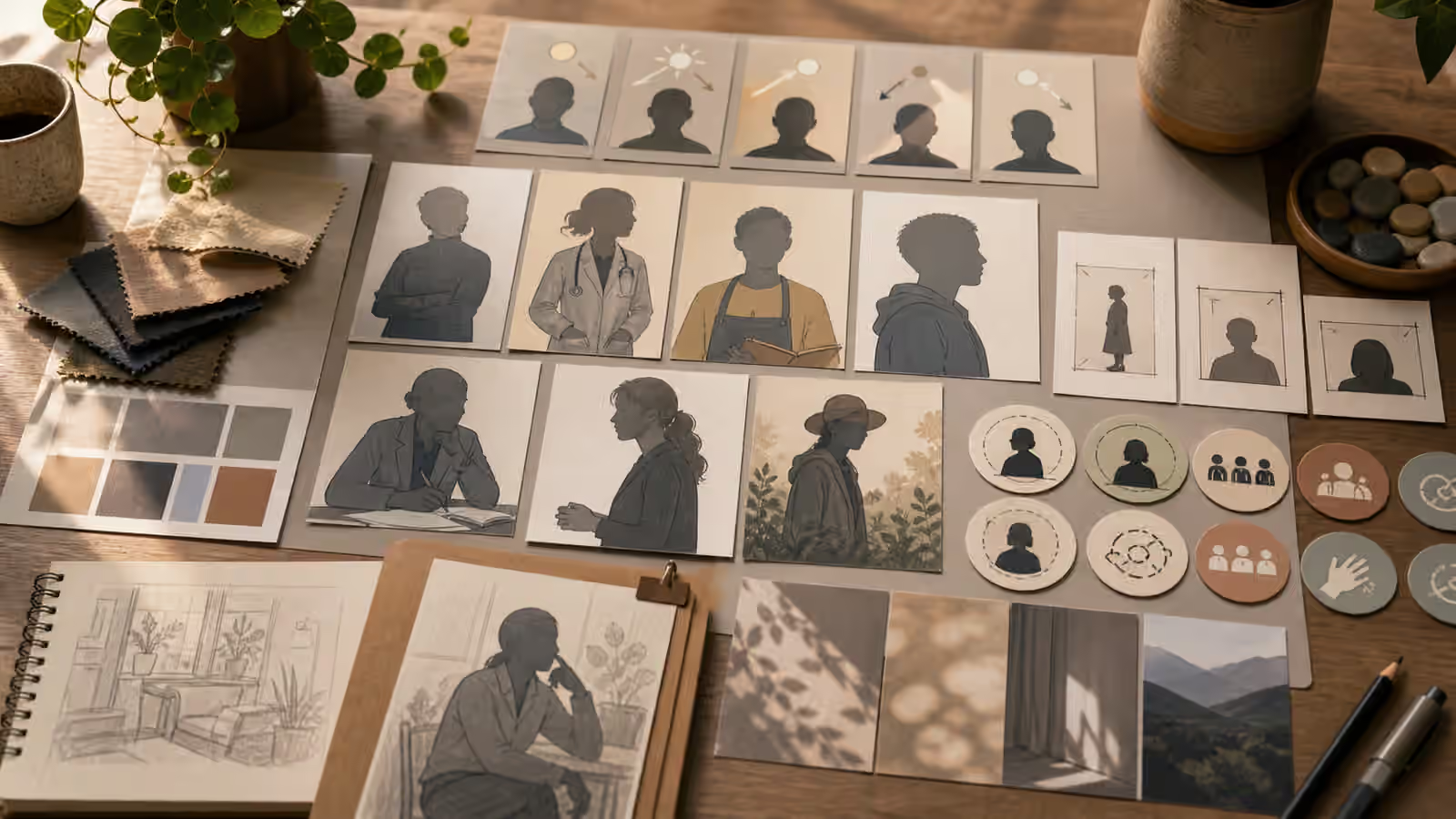
Localization-ready images should not reduce a region or language to a flag, monument, costume, food stereotype, or map outline. Those symbols may be legitimate in specific contexts, but they are weak defaults. They can also make an adaptable visual feel narrow, political, touristic, or inaccurate. The guide on Cultural Context Without Stereotype Shortcuts gives the broader rule: use concrete environment, material, light, use, and scene details instead of identity labels.
For localization, this means asking what must actually change by region. Sometimes nothing in the image needs to change. A blank notebook, a crop frame, a neutral product shape, or a simple workbench can support many languages. Sometimes the setting should change, but the prompt should name ordinary visible details with care: window light, desk material, plant type, street scale, classroom arrangement, packaging shape, or weather. The image should not lean on a national symbol when a practical scene detail would do.
This also helps avoid false evidence. A generated image of a specific transit station, public building, school, clinic, storefront, or government-style notice can imply that the page is referring to a real local institution. If the page is only a general guide, keep the image generic. Use place-neutral surfaces, fictional layouts, blank signs, and non-official objects. If a regional edition truly needs specific imagery, it may need human review, local knowledge, and perhaps real photography rather than a generic generated asset.
Treat Icons and Symbols Carefully
Icons seem safe because they are not words, but symbols can still confuse. Some shapes resemble real app marks, public agencies, hazard signs, political symbols, religious symbols, or brand systems. A generated icon set can also invent signs that appear meaningful but are not. For a localization-ready visual, neutral shapes are often better than symbolic claims. Circles, crop frames, blank cards, arrows without labels, simple swatches, and generic object silhouettes can carry structure without pretending to be official.
If the image needs icons, keep them broad and unbranded. A plain globe-like circle can suggest international adaptation, but a detailed map can create location claims. A speech bubble can suggest language, but a pseudo-word bubble can create unreadable clutter. A simple blank label can indicate future translation, but a label with fake script can alienate readers and make the asset harder to reuse. The guide on Icon Sets and Spot Illustrations is useful here because it treats small visuals as a system, not decoration.
Color deserves the same restraint. Do not use national palettes as shorthand unless the context genuinely calls for them and has been reviewed. A palette can create regional signals even when there are no flags. For adaptable assets, use colors chosen for readability, brand neutrality, contrast, and compatibility with the surrounding page. If a local edition needs a different palette, it is easier to adjust real design layers than to regenerate a busy image full of embedded color-coded meaning.
Review the Image Like a Translator
Before publishing, read the image as if you had to adapt it for another language tomorrow. Where would the real headline go? Would longer text still fit? Does any visible object depend on a local assumption? Are there symbols that a reader elsewhere may read differently? Does the image include pseudo-writing that will make alt text awkward? Does it imply a location, institution, law, product, or event that the page does not support?
Alt text is a useful test. If the alt sentence has to explain that the words in the image are meaningless, the image is probably not ready. If the caption must apologize for fake labels, regenerate. If a translator would need to redraw the visual to make the page honest, the prompt should be changed earlier. The strongest localization-ready images are usually quiet. They have clear subjects, editable copy zones, neutral visual structure, and enough specificity to be useful without becoming culturally lazy.
The final brief can be simple: create a warm editorial illustration of blank campaign frames, neutral symbol shapes, color swatches, and generous empty areas for real localized copy, with no readable text, no flags, no maps, no logos, and no official-looking signs. That prompt will not solve every localization problem, but it gives editors, designers, and translators an image they can actually work with.