An interface image has a special problem: viewers are trained to treat screens as evidence. A generated dashboard can look like a product exists, a feature ships, a customer account is active, or a metric has been measured. Even a harmless decorative mockup can become misleading when it looks too much like a screenshot.
The safer habit is to prompt interface visuals as conceptual artifacts. They can show layout rhythm, hierarchy, workflow, and design intent without pretending to be captured from a real product. That distinction matters for articles, guidebooks, pitch decks, product notes, and learning pages where the image should explain an idea rather than document a claim.
Mockup, Not Screenshot
Start by deciding what the image is allowed to prove. A conceptual mockup can prove that a page is about interface design, workflow planning, dashboard structure, mobile layout, or product thinking. It should not prove that a named app exists, that a user completed a transaction, that a security alert fired, that a medical record was reviewed, or that a financial figure is true. If the image would become more convincing by adding exact labels, numbers, names, or official-looking chrome, that is a warning sign.
Use words like conceptual, unbranded, illustrative, blank panels, abstract component shapes, and no readable text. These terms steer the model toward design language rather than documentary language. A prompt for a customer-support dashboard can show empty ticket cards, priority shapes, and a calm review board. It should not show a fake customer’s name, a real company logo, a precise refund amount, or a realistic screenshot of a known product. If exact copy is needed, add it later in a controlled design file where it can be reviewed.
This is close to the boundary described in Product Mockups Without Fake Brands . A product-style image can be useful, but it becomes risky when it borrows trust from a brand, a familiar interface, or a claim that has not been earned. Interface mockups raise the same issue with an extra layer of implied evidence. Screens feel operational. A blank packaging shape may look fictional; a dashboard with names and metrics can look like proof.
Replace Content With Structure
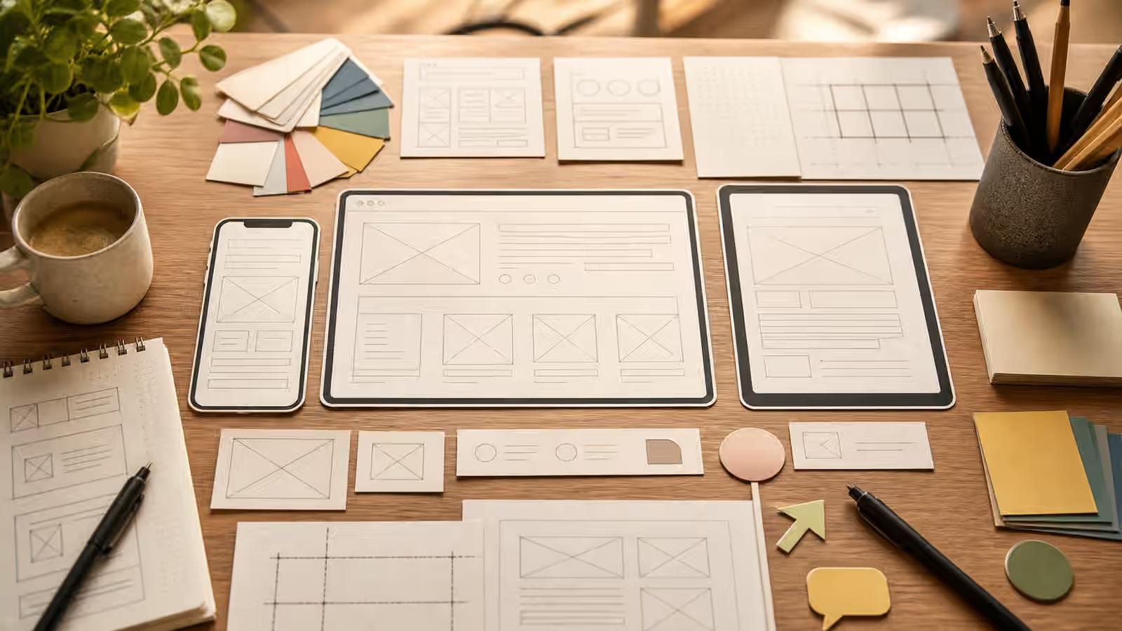
The best interface prompts often describe structure instead of content. Ask for a dashboard-like arrangement of empty cards, neutral chart shapes, soft status markers, a sidebar made of simple blocks, or a mobile frame with blank content zones. The viewer gets the point without having to read invented copy. This also avoids one of the most common image-generation failures: gibberish text that looks confident at thumbnail size and broken at full size.
When you want a workflow image, name the flow in prose around the image rather than inside the image. The generated visual can show three panels moving from input to review to approval using abstract shapes. The page text can explain the actual workflow. That split keeps the image useful on the first pass and accurate after editing. It also makes translation, accessibility, and future updates easier because the factual burden lives in real text.
For a feature article, this may feel less dramatic than a shiny fake app screen. It is also more durable. A real screenshot dates quickly, while a conceptual mockup can survive interface changes. It can support a piece about triage, planning, or design without anchoring the reader to a precise product state. If you are already using Article Hero Images , treat the interface mockup as the page’s promise in visual form: this is about how a workflow is organized, not proof that a particular tool produced a result.
Keep The Layout Plausible
Conceptual does not mean careless. The mockup still needs plausible spacing, hierarchy, and affordances. If a generated interface has six primary buttons competing for attention, unreadable chart marks, impossible navigation, or components floating with no alignment, it weakens the page. A good prompt names a simple layout pattern: a left navigation rail with blank blocks, a main review panel, two supporting cards, a quiet status strip, or a mobile frame with one primary area and one secondary action zone.
Keep the composition easy to crop. A guidebook hero should work as a wide image, a card thumbnail, and sometimes a social preview. If the interface details are tiny, the image may collapse into noise. The Aspect Ratio, Cropping, and Responsive Reuse guide is useful here because interface mockups often have dense edges. Leave margins, keep the central shape legible, and avoid placing important elements at the far corners.
Color also needs restraint. Do not borrow the palette of a famous app, operating system, or design system if the image is meant to be generic. A neutral palette with one or two accent colors usually reads as original enough for an educational mockup. If the article discusses a brand or product directly, use real approved screenshots or official assets according to the relevant permissions, not generated lookalikes.
Avoid False Data
Generated charts, analytics panels, inbox counts, maps, and scorecards are especially easy to misread. A dashboard with a rising line can imply improvement. A score tile can imply measurement. A map marker can imply a real location. If those values are fictional, keep them visibly abstract. Use unlabeled bars, soft blocks, placeholder shapes, or intentionally blank panels. The Charts and Data Visuals Without Fake Numbers guide applies directly: exact numbers belong in authored text, real charts, or verified data visualizations, not decorative generated panels.
This does not make interface imagery useless. It makes it honest. A blank review dashboard can still suggest triage. A mobile frame can still suggest onboarding. A set of empty cards can still suggest project planning. The image’s job is to orient the reader, not to smuggle in claims the article cannot support.
For sensitive domains, tighten the boundary further. Avoid fake bank screens, legal portals, government notices, insurance claims, medical charts, school records, safety alerts, and security incident dashboards unless the fictional nature is obvious and the surrounding copy makes the context clear. These surfaces carry institutional weight. If the reader could mistake the output for a record, receipt, warning, or result, the prompt is asking for too much realism.
Review In Context
After generation, look at the image beside the page. Ask what it appears to document. If it looks like a real screenshot, decide whether that is appropriate. If the answer is no, revise toward paper cards, blank panels, abstract interface blocks, or a visible planning desk. Physical context can help. A mockup shown as cards on a desk feels like a design artifact; the same mockup full-screen inside a device frame may feel like a launched product.
Also inspect the usual generated-image failures from AI Image Quality Checks : fake text, accidental logos, impossible shadows, duplicated controls, and visual clutter. Interface images invite these mistakes because they contain many small rectangular details. If a model invents convincing but unreadable labels, do not publish the image as if the labels are harmless. At best they distract. At worst they create accidental claims.
A strong interface mockup prompt keeps the useful part of a screenshot and removes the misleading part. It shows the shape of work without faking the work. It gives the reader enough visual context to understand the topic, while leaving the facts, labels, numbers, and product claims to reviewed copy and real evidence.