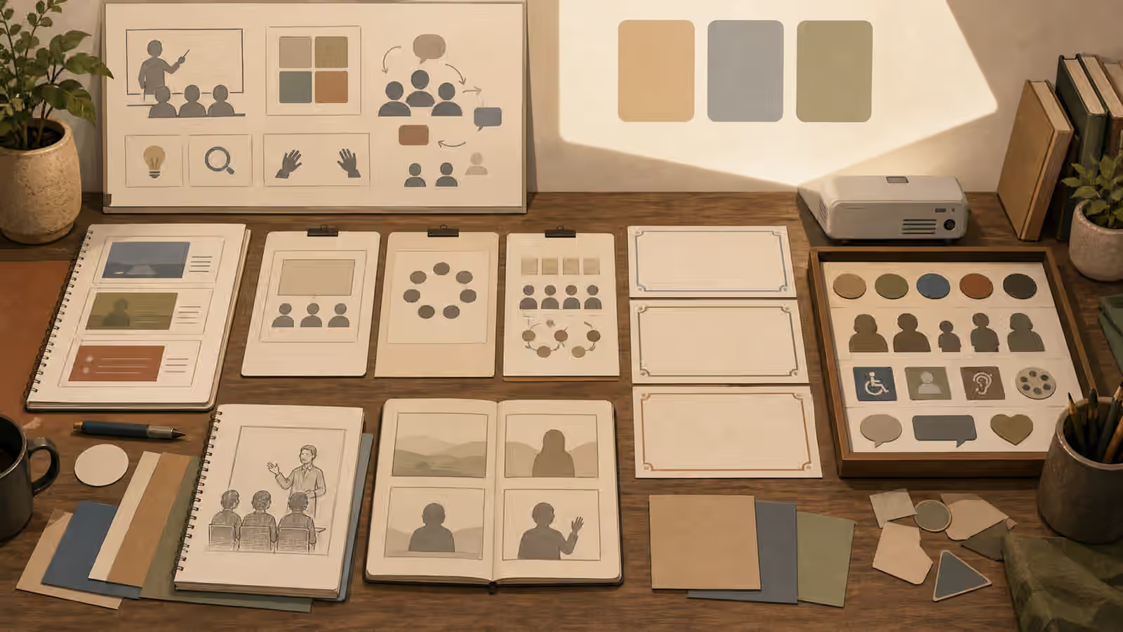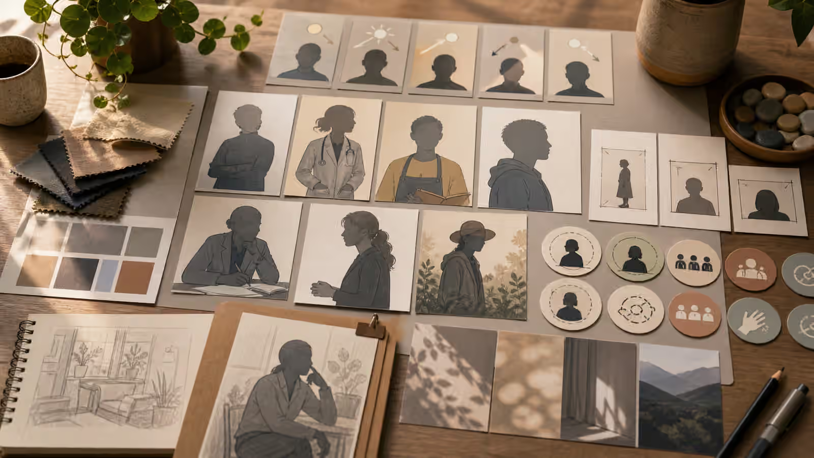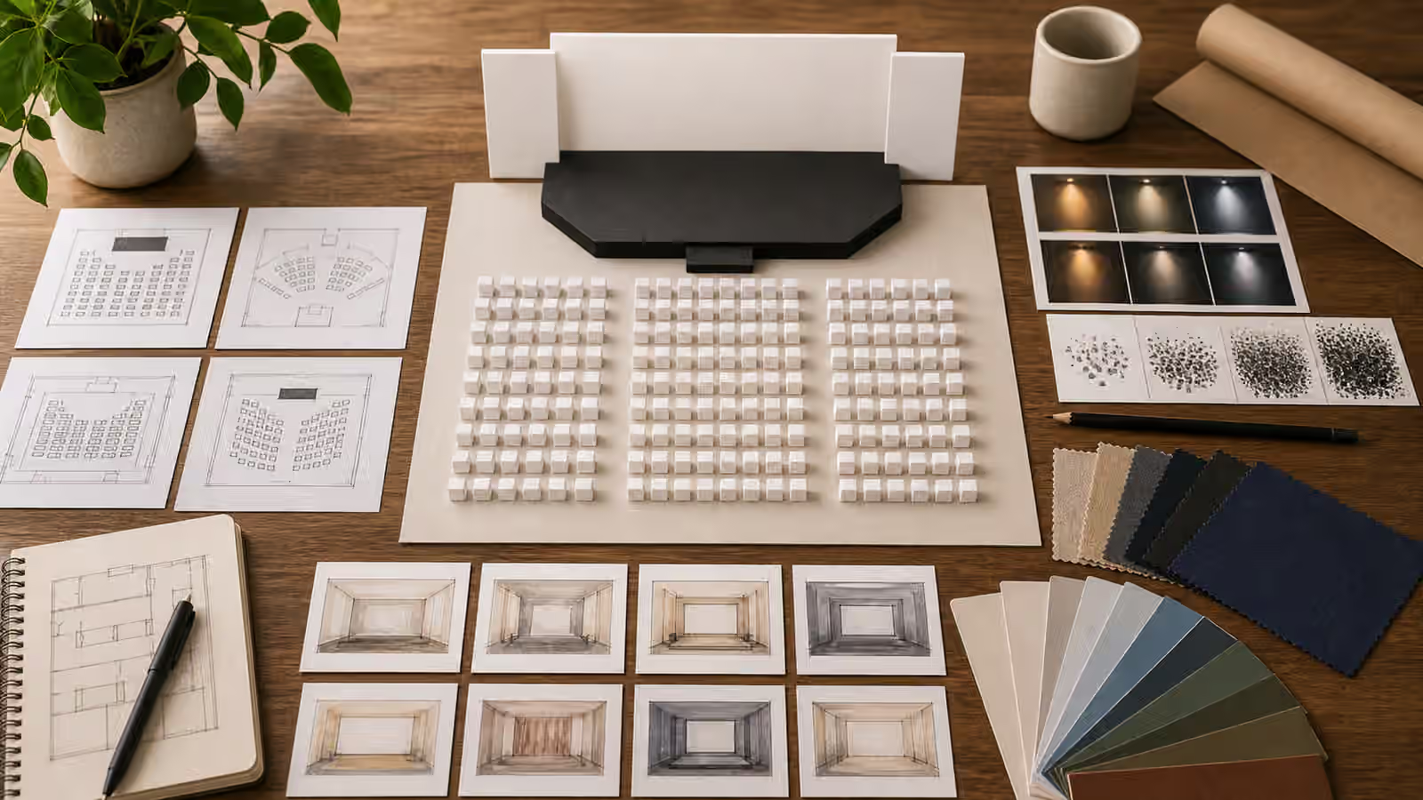
Hero images announce a page. Inline explainer images do quieter work. They sit near a paragraph and help the reader understand one idea before moving on. Because the job is smaller, the prompt should be smaller too. An inline image does not need to summarize the entire article, decorate the page, or prove the claim. It needs to make the nearby explanation easier to grasp.
Visual Prompt Lab already covers Article Hero Images and Educational Infographics . Inline explainers sit between those two. They are less broad than a hero and usually less formal than a diagram. The best ones are specific, modest, and honest about what they show.
Anchor The Image To One Paragraph
An inline image should answer the question raised by the surrounding text. If the paragraph explains why generated images need quiet background space, the image can show a simple subject with a calm margin. If the paragraph explains contact shadows, the image can show one object resting on a surface with a visible shadow. If the paragraph explains review handoffs, the image can show proof cards and revision markers. The subject should be narrow enough that the reader knows why the image appears at that exact point.
This is different from asking for a general image about the article topic. A general image tends to repeat the hero or become decorative filler. A paragraph-anchored image earns its place because it clarifies a specific sentence. The prompt should mention the paragraph idea in plain language and avoid pulling in every related concept.
Good inline prompts often start with the instructional purpose. “Illustrate how a wide crop leaves quiet space around a central object” is stronger than “make an image about layout.” “Show a fictional cutaway object with blank callout tabs” is stronger than “make an engineering visual.” The purpose keeps the output from becoming a stock-like scene that looks polished but explains little.
Keep The Visual Load Low
Inline images compete with body text. If the image is crowded, dark, or full of tiny details, it interrupts reading instead of supporting it. The prompt should ask for fewer objects, clear spacing, and a single focal point. It should also avoid readable text inside the generated image unless a human will add real typography afterward. Pseudo-writing is especially distracting inside a paragraph because readers naturally try to read it.
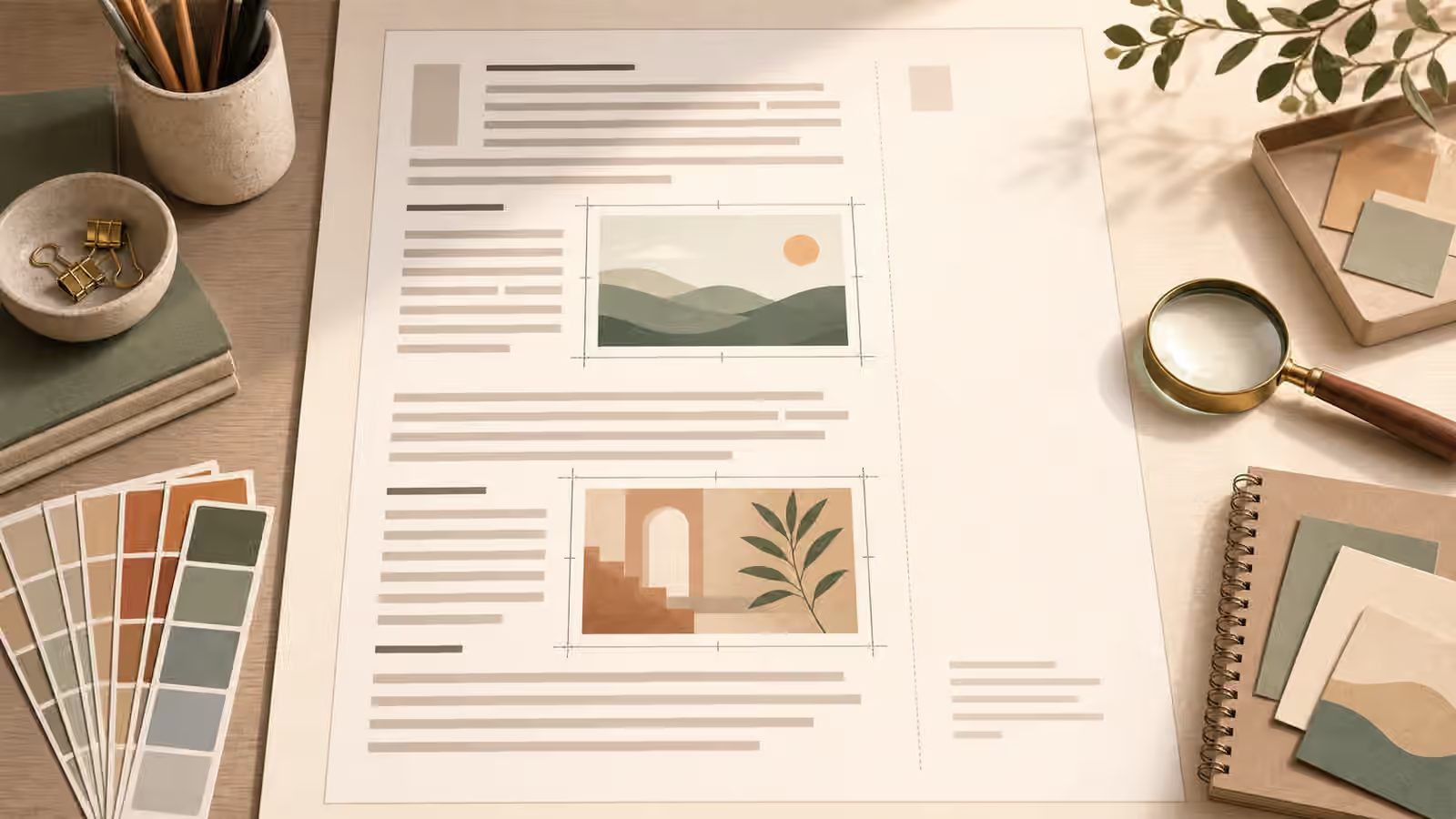
Low visual load does not mean bland. Material, light, and composition can still be pleasant. The difference is that every visible detail has a reason. A crop frame may explain responsive reuse. A magnifier may explain review. A blank card may represent a generated image without introducing fake content. A few muted swatches may show palette control without turning the image into a design catalog.
The guide on Focal Point and Visual Hierarchy is useful here because inline images need strong hierarchy at modest sizes. The reader should understand the image in a glance, then return to the paragraph. If the image requires careful inspection, it may need a captioned diagram rather than a small inline illustration.
Do Not Make Evidence From Illustration
Inline explainers are often placed near factual claims. That makes honesty important. A generated image can illustrate a concept, but it should not become fake proof. If the paragraph discusses a workflow, use conceptual objects rather than a fake screenshot. If it discusses data, avoid invented charts and numbers unless the image is clearly abstract and the real data appears elsewhere. If it discusses a place, avoid map labels, addresses, or documentary cues that imply the scene exists.
This boundary protects the reader and the publisher. A fictional inline image can be useful, but it should not silently take on the authority of a document, chart, screen capture, medical image, legal notice, or product photo. When the page needs evidence, the page needs actual evidence. The generated image can support the explanation around that evidence, not replace it.
The same issue appears in Charts and Data Visuals Without Fake Numbers and Interface Mockups Without Fake Screenshots . Inline placement can make fake details feel more credible because they sit near prose. That is why the prompt should explicitly ask for abstract shapes, blank cards, fictional objects, and no readable text when the image is illustrative.
Match The Surrounding Page Rhythm
An inline image should feel like part of the page rhythm. If every section uses the same wide hero-style image, the page may become heavy. If every inline image uses a different style, the article may feel patched together. Before generating, decide whether the image should match the site’s guidebook hero style, use a simpler diagram style, or share a repeated visual system with other inline examples.
For a long guide, inline images can mark transitions. One image might introduce a process, another might clarify a failure, and another might show the final review state. They should not repeat the same desk scene with different props unless repetition is intentional. The guide on Building a Cohesive Visual Set helps when several inline images need to live together.
Responsive size matters too. An inline image may appear full-width on mobile and narrower on desktop. It may sit near captions, pull quotes, or code blocks. The prompt should avoid important details at the edges and keep the subject readable even after compression. A small supporting image that only works at full resolution is not a good inline image.
Write Alt Text From What Is Visible
Inline explainers need alt text that describes what the image shows and why it matters in context. The alt text should not repeat the prompt or invent a factual claim. If the image shows blank article cards and small inline frames, say that. If it shows a fictional object with callout shapes, say that. If the surrounding paragraph already explains the concept fully, the alt text can stay concise.
The guide on Alt Text and Captions covers the accessibility layer, while Image SEO covers naming and page context. Inline images benefit from both, but they should not be made for search at the expense of clarity. A filename and alt text can be descriptive without stuffing every keyword into the image record.
The final test is whether the image improves the paragraph. Remove it mentally. If nothing is lost, the prompt may be too decorative. If the paragraph becomes harder to follow, the image is doing its job. Inline images are modest by design. Their strength is that they meet the reader exactly where one idea needs a little more visual support.