Small visuals are easy to underestimate. A full hero image announces itself as a design choice, but an icon set or spot illustration system quietly shapes how a page feels. It can make a guidebook shelf easier to scan, give a tool a calmer rhythm, or help a concept feel concrete. It can also create trouble quickly if the model invents fake app logos, badge-like marks, letterforms, or symbols that resemble real products.
Prompting icons and spot illustrations is different from prompting a single editorial image. The point is not one striking composition. The point is a family of small images that share rules. Those rules need to be visible enough that the set feels intentional and plain enough that each symbol remains readable at small size. If the prompt only asks for cute icons, the model may produce a charming mix of shapes that do not belong together.
Define the System Before the Symbols
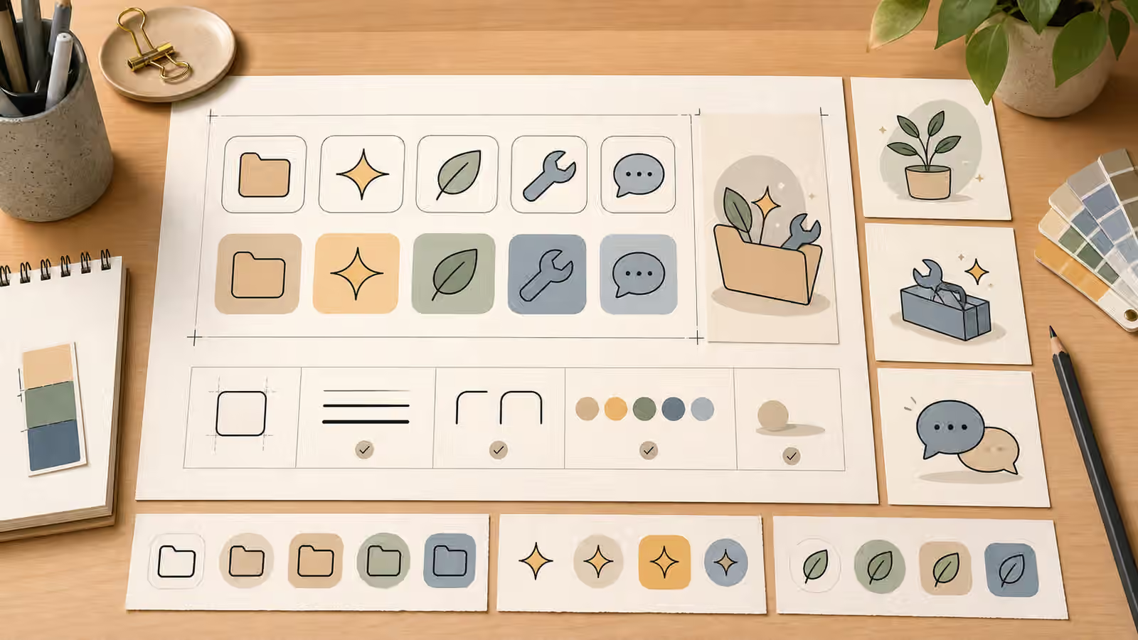
A useful icon prompt starts with the shared visual rules. Stroke weight, corner radius, fill style, palette, shadow behavior, background shape, line texture, and object scale all matter. A set with thin outlines, rounded corners, and two muted fills will feel different from a set with flat geometric blocks and no outlines. Both can work. Trouble starts when half the icons use detailed shading, half use flat line art, and one suddenly looks like a glossy app tile.
The cohesive visual set guide uses the same principle at a larger scale. Constants come first. Variables come second. For icons, the constants should be especially strict because small differences become noisy when repeated. A prompt can ask for unbranded line icons with a consistent medium stroke, rounded corners, soft cream tile backgrounds, muted green and blue fills, and no letters, numbers, logos, badges, or app-like marks. Once that system is clear, the individual symbols can vary.
Spot illustrations have a little more room. They may include a small object, a simple scene, or a metaphor card. Even then, the rules should remain tight. If one spot illustration is a paper-textured folder and another is a glossy 3D robot, the set stops being a system. If one uses a strong cast shadow and another floats without grounding, the page begins to feel assembled from unrelated sources.
Use Metaphors That Do Not Become Brands
Many useful concepts already have visual shorthand. A folder can suggest organization. A leaf can suggest growth. A wrench can suggest repair. A speech bubble can suggest conversation. The risk is that shorthand can drift toward brand marks or platform icons. A chat bubble with a particular color, a camera shape inside a rounded square, a play triangle in a red field, or a bird silhouette in a branded pose can create confusion even if the prompt never named a company.
Safer prompts keep symbols generic and unbranded. Ask for simple abstract objects, product-neutral tools, fictional interface-neutral shapes, and no known app icon silhouettes. Avoid letterforms unless the project explicitly requires text and can verify it. Generated text inside icons often becomes gibberish, and even clean letters can make an icon look like a logo. A small symbol should communicate by shape, not by pretending to be a brand badge.
The copyright and trademark guide covers the broader boundary. For icon sets, the practical rule is to avoid anything that a viewer might reasonably read as an official service mark, certification seal, platform button, or copied character universe. A fictional folder, plant, spark, tool, or abstract node is usually enough. The page does not need borrowed recognition if the surrounding copy explains the idea.
Keep Detail Below the Smallest Use
Icon prompts often fail because they include too much detail for the final size. A detailed miniature workspace may look lovely at full resolution and collapse into a smudge at twenty-four pixels. A spot illustration can carry more detail, but it still needs a clear silhouette. The prompt should name the smallest expected use. If the symbol will sit inside a small button, ask for large simple shapes, minimal interior detail, and strong separation from the background. If it will appear as a card illustration, ask for one main object and a few supporting shapes, not a full scene.
Review also needs to happen at the destination size. Zooming in can reveal artifacts, but zooming out reveals whether the icon works. If the image becomes a confusing knot, simplify the metaphor. If the subject can only be understood because you know the prompt, it is not working. If several icons become indistinguishable from one another, the set needs stronger individual silhouettes or clearer color roles.
This does not mean the icons have to be sterile. Paper grain, soft shadows, and hand-drawn line variation can make a set feel warm. The key is consistency. If texture appears on one tile, it should appear lightly across the set. If shadows ground the objects, they should come from the same direction. If colors indicate categories, they should not change randomly because a model invented a prettier palette in one square.
Spot Illustrations Can Carry More Context
Spot illustrations are useful when a concept needs a small scene rather than a single symbol. A guide about prompt logs might use a notebook, cards, and a pencil. A guide about image delivery might use export tiles and responsive frames. A guide about safety boundaries might use blank image cards and review markers without creating a frightening or deceptive scene. The illustration can be more expressive than an icon while still following the same system rules.
The brief should specify how much environment is allowed. A spot illustration can include a desk surface, a soft shadow, one or two props, and a background shape. It should not become a full hero image unless the page has room for it. When a spot is part of a set, the subject changes but the crop, palette, shadow, and level of detail stay steady. This keeps the page from feeling like every concept came from a different visual language.
The style without stealing guide is relevant here. It is tempting to ask for icons in the style of a famous product, studio, or illustrator because small assets often live near familiar interface patterns. Build your own repeatable style instead. Use broad material and construction terms, such as rounded line icons, flat editorial shapes, soft paper texture, muted palette, simple tile backgrounds, or gentle isometric spot illustrations. Those terms give the model direction without borrowing someone else’s identity.
Review for Confusion, Not Only Beauty
An icon set can be attractive and still unsafe or unusable. Check whether any mark resembles a real logo, whether any tile includes accidental letters, whether any symbol looks like an official badge, and whether the set suggests a platform relationship that does not exist. Also check whether the icons match the page tone. A playful icon set may be wrong for a serious disclosure guide. A severe monochrome set may be wrong for a beginner-friendly prompt lab.
For publishing, pair the visual system with honest filenames, alt text, and page context. Image SEO matters for icons too, but alt text should not overclaim. If an icon is decorative, it may not need descriptive alt text in every context. If it carries meaning, describe the visible object and the concept it supports without stuffing keywords or pretending the generated asset is an official mark.
A strong icon or spot illustration prompt does less than people expect. It does not ask for every symbol to be clever. It asks for a restrained system, visible rules, simple metaphors, and clear no-go boundaries. That restraint is what makes the set useful. The small images stop competing with the page and start helping the reader move through it.