Many weak generated images fail because everything in the frame asks for equal attention. The subject, background props, texture, lighting, and decorative details all compete. The image may look full, but the viewer does not know where to look first. A focal point gives the picture a job. Visual hierarchy tells the supporting details how quietly to behave.
This guide extends Composition Basics by focusing on attention. Composition places elements in the frame. Hierarchy decides which element should win. That distinction matters for guidebook heroes, article images, product-neutral mockups, and social thumbnails because the reader often sees the image at a small size before seeing it full-width.
Give Attention A Job
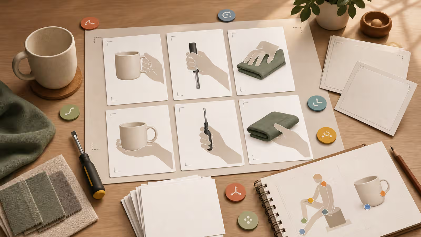
Before writing decorative language, decide what the viewer should understand first. The focal point might be a single object, a hand action, a blank card, a tool, a room feature, a diagram shape, or the relationship between two objects. If the prompt does not name that priority, the model may distribute detail evenly. It may decorate the background as heavily as the subject or place the most interesting object at the edge.
Focal point language should be direct. “Make the blank image card the clear focal point” is better than “make the scene feel organized.” “Center the unbranded object and keep supporting tools smaller and softer” is better than “show a creative workspace.” The prompt should tell the model which visual fact matters most.
This is not only an aesthetic issue. Hierarchy affects trust. If an image about careful review makes a fake-looking seal the most prominent object, it teaches the wrong visual lesson. If an image about a fictional product makes an invented label the strongest detail, it risks brand confusion. The focal point should support the page promise, not hijack it.
Use Contrast Before Decoration
Visual hierarchy usually comes from contrast, not extra ornament. Size contrast, value contrast, color restraint, sharpness, spacing, and light direction can all make one area read first. A prompt can ask for a larger main subject, softer background details, lower contrast in the corners, or a sharper focus plane around the important object. Those instructions are more reliable than asking for a polished or premium look.
Contrast should be used with restraint. If every element receives a bright highlight, no highlight matters. If every object has saturated color, the focal subject loses its advantage. If the entire frame is sharp and busy, focus has no work to do. A useful prompt might ask for a clear subject in warm light, secondary props in muted tones, and a background that remains quiet enough for cropping.
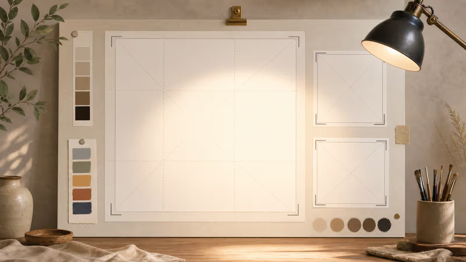
The guide on Backgrounds and Negative Space is a natural partner here. Negative space is not empty failure. It is a design choice that lets the focal point breathe. When a generated image fills the background with clever details, it may look rich in isolation while becoming harder to use on a page.
Place Secondary Details With Purpose
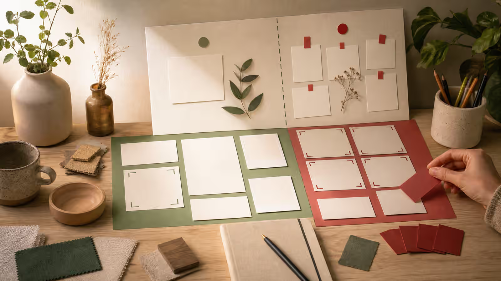
Secondary details should explain the subject, not compete with it. A guidebook image about image review might include a magnifier, blank proof cards, and crop frames, but those props should not be as large or bright as the main review surface. A prompt about food texture might include a spoon, plate, and steam, but the food should still win. A prompt about a room setup might show furniture and light, but the path through the room may be the real subject.
The prompt should name the support role. “Include small muted supporting props around the lower edge” gives those props a place and a level of importance. “Use subtle background tools that remain secondary to the central blank frame” tells the model not to turn every tool into a hero. If a prop does not help the reader understand the topic, leave it out. Generated images often become weaker when the prompt tries to prove that every related idea is present.
Secondary detail also needs safety review. A small background label can become pseudo-writing. A decorative badge can become an official-looking symbol. A face in the background can create likeness questions. If the supporting detail increases risk more than clarity, the hierarchy is wrong even if the image looks attractive.
Review At Thumbnail And Crop Size
Hierarchy should survive the places the image will actually appear. Shrink the image mentally to a card. If the focal subject disappears, the hierarchy is too delicate. Crop the image into a square. If the important object is cut away, the placement is too fragile. View the image in a wide hero. If the background pulls attention from the subject, the quiet zones need more control.
This is where Aspect Ratio, Cropping, and Responsive Reuse becomes part of the hierarchy check. A strong focal point in a full 16:9 image may fail in a vertical social crop. A central subject may work on a card but block headline space in a hero. The prompt should name the intended use case so the model does not optimize for a gallery view that the page will never use.
Review should happen before editing for style. If the subject is too small, changing the palette will not fix the image. If the quiet zone is noisy, adding more realism may make the noise worse. Fix attention first. Then refine material, lighting, or mood.
When Hierarchy Fails
Hierarchy failures have familiar shapes. The background is more interesting than the subject. The subject is centered but too small. The brightest object is irrelevant. The model adds fake text because blank space felt unfinished. The props explain the topic but crowd the image. The crop removes the most important visual clue. Each failure should lead to a specific next prompt.
Instead of saying “make it clearer,” write the visible change. Make the focal object larger. Reduce contrast in the background. Remove small labels and decorative badges. Keep the upper third quiet. Put the supporting tools in soft focus. Use one accent color on the subject and muted colors elsewhere. These instructions are plain, but they protect the image from another round of attractive clutter.
The final check is simple: can a reader tell what matters without studying the image? If the answer is yes, the hierarchy is doing its job. If the answer is no, the prompt has not yet decided what the picture is for. Generated images can produce endless detail, but a useful visual brief must still choose the reader’s first look.