Event images carry social proof. A packed room suggests demand. A stage suggests a speaker appeared. A badge suggests registration. A sponsor wall suggests endorsement. A photo-like lobby suggests a venue existed and hosted the gathering. That is useful when the image is real and sourced. It is risky when the image is generated for decoration.
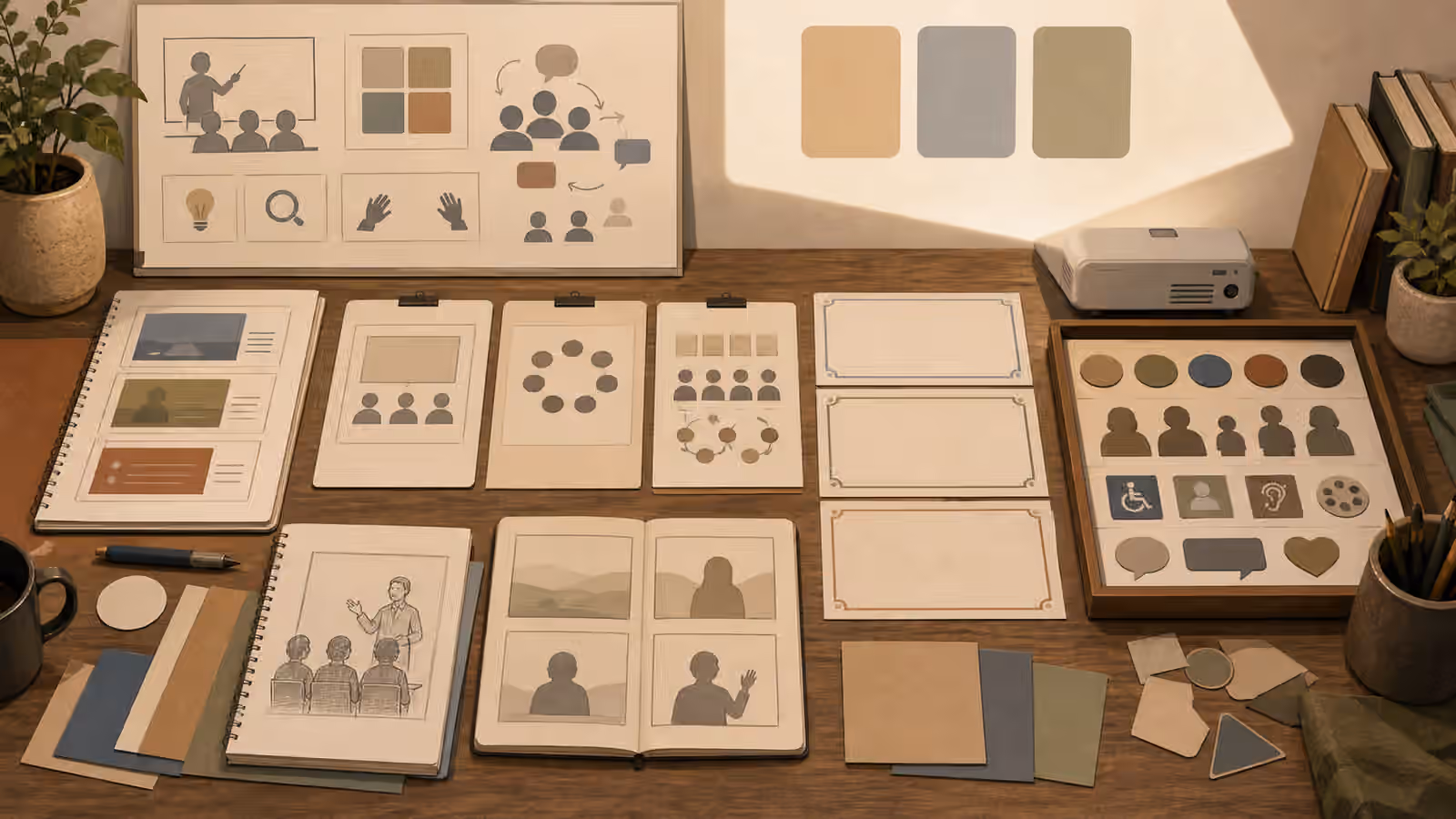
A safer event prompt treats the image as a concept, layout, or atmosphere study. It can show seating, lighting, room flow, a workshop table, a quiet stage before doors open, or an abstract planning board. It should not invent attendance, named speakers, badges, press walls, sponsors, awards, safety compliance, or real venue proof.
Prompt The Room Before The Crowd
If the page needs an event visual, start with the physical assignment. Name the room type, layout, lighting, furniture, scale, and use case. A small workshop can be shown through a table with blank worksheets, a whiteboard shape without writing, spare chairs, and warm side light. A conference concept can show an empty stage, soft aisle lighting, and rows of chairs as simple forms. A community gathering can be shown as a setup scene before people arrive.
This is more honest than asking for a lively packed audience. A generated crowd is hard to inspect and easy to misread. Faces become distorted. Badges and signs turn into gibberish. The room begins to imply real turnout. If the event has not happened, that implication is not a design detail. It is a claim.
For event previews, focus on invitation rather than proof. Show atmosphere, accessibility, wayfinding shapes, table arrangement, materials, and the kind of experience the event is designed to support. The Article Hero Images guide is helpful because a hero image should confirm the topic without overpromising the evidence.
Keep Signs And Sponsors Blank
Event spaces are full of text. Posters, schedules, badge lanyards, booth backdrops, sponsor walls, slides, programs, directional signs, and table cards all invite generated nonsense. Worse, they can imply real organizations or official messages. A prompt should keep these surfaces blank or abstract. If words are needed, add them later in a controlled design tool where they can be checked.
Sponsor-like marks need the same restraint as product logos. A generic geometric backdrop can quickly resemble a press wall. A stage screen can acquire a fake conference name. A badge can look like a credential. If the image is illustrative, ask for unbranded blank signage, simple blocks, soft color panels, and no readable text. The boundary resembles Interface Mockups Without Fake Screenshots : a visual can show structure without pretending to be an operational record.
When real sponsors, hosts, or venues matter, use approved assets and real documentation. Generated approximations are not a substitute. They can confuse viewers, annoy partners, and create a record that looks more official than it is.
Avoid False Place Claims
Venues often have distinctive architecture, skylines, carpets, signs, stage layouts, and neighborhood views. A prompt that names a real convention center, hotel, museum, school, or city landmark can create a false sense of place. If the event did not happen there, do not use generated imagery to imply it did. If the page discusses a real location, use sourced photos or keep the generated image plainly conceptual.
The safer pattern is neutral place language. Use a fictional community hall, unbranded workshop room, generic auditorium, small studio classroom, open-plan lobby, or conceptual venue layout. If city mood matters, describe broad features without claiming a specific address. The Place and Landmark Prompts guide covers this problem in outdoor and travel imagery, and the same logic applies indoors.
Also consider access and safety cues. Showing clear aisles, calm lighting, visible seating blocks, and uncluttered entrances can help the image feel practical. Avoid fake compliance markers, emergency signs, evacuation maps, security badges, or official inspection cues. Those are claims, not decoration.
Show People Carefully Or Not At All
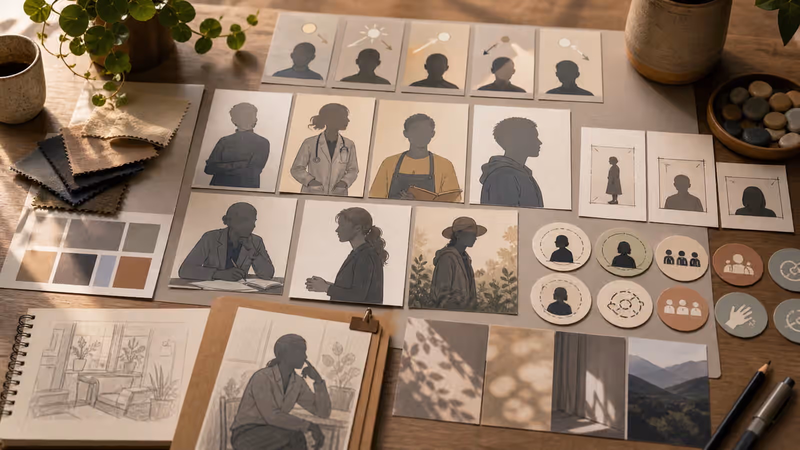
People can make an event image feel alive, but they also increase the risk of implied attendance. A few generic silhouettes or distant figures may be acceptable for a fictional atmosphere image, especially when the page makes clear that the visual is illustrative. For many guidebook uses, the better choice is no identifiable people. Empty-room setup scenes, planning boards, material flat lays, and abstract crowd-density diagrams can carry the idea without fake social proof.
If people appear, keep them generic, unidentifiable, and secondary. Do not ask for a recognizable speaker, celebrity, founder, politician, sponsor representative, teacher, student, or attendee. Do not ask for emotional crowd reactions, standing ovations, packed lines, press coverage, or sold-out energy unless those are real and sourced. The People, Likeness, and Consent guide gives the broader rule: do not borrow identity or consent that you do not have.
Crowd density can be shown abstractly. Dots on a layout card, soft silhouettes, empty chair arrangements, or a before-the-event setup table can communicate event scale without inventing faces. This also makes the image easier to crop, compress, and reuse.
Design For The Event Lifecycle
Not every event image needs to show the event itself. A planning article may need a venue map, supply table, lighting plan, or registration flow concept. A post-event recap should use real photos if it is making factual claims. A future workshop announcement can use an illustrative setup scene. A training page can show materials and room structure. A community safety note can show calm layout decisions without implying a specific incident.
Think about the lifecycle before prompting. Is this before, during, or after the event? Is the image promotional, instructional, archival, or reflective? A promotional concept can be illustrative. An archive should be real. A how-to page can show process. A testimonial page should not use generated people as stand-ins for attendees.
Disclosure helps when viewers might reasonably mistake the image for documentation. Content Credentials and clear captions can support trust, but they do not fix a misleading visual assignment. The Disclosure and Content Credentials guide is a useful companion because event images sit close to claims about who was there and what happened.
Review The Implied Claims
Before publishing an event visual, ask what the image seems to prove. Does it prove that a room was full? That a speaker appeared? That a sponsor endorsed the event? That a venue hosted it? That accessibility, safety, or ticket demand was verified? If the answer is yes and the proof is not real, revise the image or the surrounding context.
Then inspect the ordinary image quality details. Are chair rows coherent? Are shadows consistent? Are screens blank? Are badges unreadable or absent? Are faces generic? Does the crop leave room for real page typography? Does the image support the page promise without becoming fake documentation?
The strongest generated event visuals tend to be quieter than real event photos. They show planning, layout, and atmosphere. They leave attendance, names, sponsors, and success claims to real evidence. That restraint keeps the image useful without asking the viewer to believe in a gathering the model invented.