Focus is one of the quietest ways an image tells the viewer where to look. It can make a subject feel deliberate, create depth, and turn a busy scene into a usable page image. It can also create confusion when the wrong object is sharp, the background is blurred into mush, or every surface looks equally polished even though the prompt asked for a close camera view.
Depth of field language belongs beside camera angle, lens, and perspective prompts , but it deserves its own habit. Camera angle decides where the viewer stands. Focus decides what the viewer is asked to notice first. When those two instructions disagree, generated images often become visually loud.
Name The Focus Target
The most useful focus prompt starts by naming the sharpest subject. Do not ask for beautiful depth of field without saying what should be in focus. A model may choose the face, the nearest prop, the brightest object, or a random textured edge. If the image is for an article hero, the sharpest area should usually be the object or action that proves the topic. For a product-neutral image, it might be the blank package shape. For a planning image, it might be the central card, tool, or hand position.
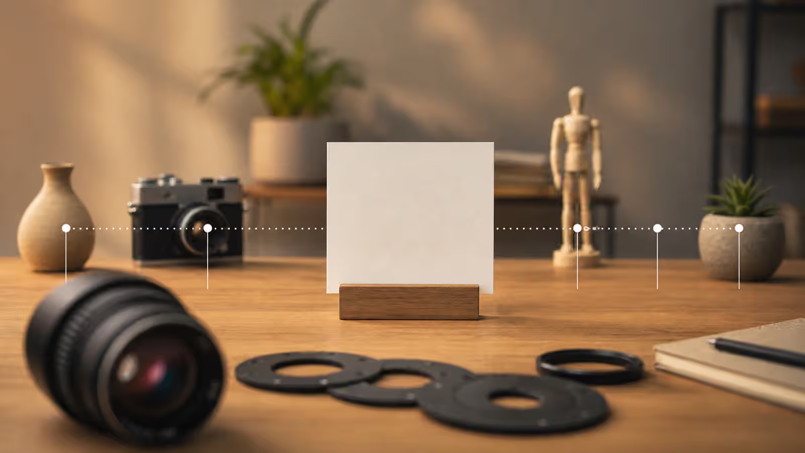
Specific focus language is simple. The central blank card is in sharp focus. The unbranded object on the table is the crisp focus point. The hand and contact point are sharp, while the background workbench is soft. The foreground frame edge is slightly out of focus, but the subject remains crisp. These sentences give the model and the reviewer a concrete standard.
This matters because focus can hide a weak composition. If the subject is not named, blur may make the image look cinematic while the actual idea remains unclear. The guide on composition basics still applies. Focus should support hierarchy that already exists in the frame, not compensate for a subject that is too small, too crowded, or unrelated to the page.
Use Blur As A Support, Not A Disguise
Soft foregrounds and backgrounds are useful when they protect attention. They are risky when they become a way to avoid solving the scene. A blurred label is still a label if it looks like a fake brand. A blurred face can still feel identity-like if the pose, setting, and context imply a real person. A blurred chart can still suggest data the page does not have. Blur should not turn unsafe or unsupported content into acceptable decoration.
For most Visual Prompt Lab work, restrained blur is safer than dramatic blur. Terms such as softly blurred background, gentle depth falloff, and shallow but natural depth of field often produce more usable images than extreme bokeh or cinematic lens blur. The stronger the blur request, the more likely the output will exaggerate lights, smear details, or make small objects look miniaturized.
When the image needs to be reviewed at thumbnail size, too much blur can also weaken the subject. A background can be soft while still showing useful context. A tabletop can fade without becoming a cloud. A room can recede without losing the scale cues that make the object believable. The question is not whether blur is present. The question is whether blur makes the subject easier to understand.
Keep Optics Plausible
Generated images often imitate photographic effects without obeying optics. You may see two objects at the same distance with different sharpness, a reflection sharper than the object it reflects, a background that is blurred while tiny text remains crisp, or a foreground object that appears both out of focus and sharply outlined. These failures matter because they make an image feel synthetic even when the subject is useful.
Prompts can reduce the risk by describing physical relationships. Say that objects on the same tabletop plane should share similar focus. Say that the foreground edge is softly out of focus while the main object on the center plane is sharp. Say that distant background objects should have less detail than the subject. If an object touches the main subject, ask for the contact point to stay sharp enough to inspect. That last move pairs with object-in-use prompts because contact points are where generated images often break.
Do not overuse technical camera numbers unless you are prepared to review the result. A prompt that names a lens and aperture can be useful, but the model may treat those terms as style cues rather than strict physics. Plain visual language is often better. Close tabletop view with the central object sharp and the distant background softly blurred is easier to judge than a string of camera specifications that the image may not actually honor.
Focus And Layout Need To Agree
Page images often need negative space for crops, cards, or headlines. If the sharpest object sits in an area that will be cropped away, the image fails even if the focus effect is attractive. Plan the focus target together with aspect ratio and responsive reuse. The guide on aspect ratio and cropping is relevant because depth of field can make a crop feel intentional or accidental.
For a wide hero, the focus target may sit slightly off-center with quiet space on one side. For a card thumbnail, the focus target may need to be larger and more central. For an inline illustration, more of the scene can remain sharp because the reader has time to inspect it. Focus prompts should mention the use case so the visual hierarchy fits the container.
The same logic applies to generated sets. If one guidebook hero uses crisp flat illustration and the next uses heavy photographic blur, the shelf may feel inconsistent. That does not mean every image must have the same focus style. It means the level of realism, sharpness, and depth should be chosen deliberately. A soft background can add polish, but cohesion is usually more valuable than a single dramatic render.
Review The Edge Cases
After generation, inspect the sharpest area first. If the wrong object is sharp, edit the image or reprompt with a clearer focus target. Then inspect the blur boundaries. Look for halos, melted edges, impossible reflections, or objects that lose their contact with the surface. Finally, check whether blur has hidden problems that should instead be removed from the scene.
A good depth-of-field prompt does not need to sound like a camera manual. It needs to say what the viewer should notice, what can recede, what must remain physically plausible, and what the image must avoid. That is enough to turn focus from decoration into a briefing tool.