Cutaway and exploded-view images are useful because they show relationships that a normal view hides. A layered object can explain inside and outside. A separated assembly can show parts without clutter. A section slice can make a process easier to understand. The risk is that these visuals often look technical, even when the prompt is only conceptual.
This guide sits near Educational Infographics and Charts Without Fake Numbers . The shared rule is simple: an image can explain a concept without pretending to be a source of precise facts. A generated cutaway should not invent dimensions, tolerances, labels, wiring, safety instructions, medical anatomy, or repair procedures that nobody verified.
Decide Whether The View Is Conceptual
Begin by deciding what kind of truth the image is allowed to claim. A conceptual cutaway can show broad relationships: outer shell, inner chamber, flow path, support layer, cushion layer, signal layer, or protective cover. It should not claim exact structure. A technical diagram, by contrast, requires verified information, expert review, and real labels. Most generated images belong in the conceptual lane unless a qualified process provides the facts.
The prompt should say that clearly. “Conceptual exploded view of a fictional unbranded device” is safer than “exploded view of a real product.” “Simple layers that suggest inside and outside” is safer than “accurate mechanical assembly.” If the image is for a public article, it should not invite a reader to treat the visual as a manual.
This distinction is especially important for objects connected to safety, repair, medicine, transportation, electricity, or structural systems. A generated image may place parts in plausible-looking but false positions. It may invent fasteners, seals, labels, or flow paths. If the reader might act on those details, do not use an unsupported generated cutaway as instruction.
Use Fictional Or Generic Objects
A safe exploded view usually starts with a fictional or generic object. An unbranded sensor-like device, a simple household object, a made-up learning model, or an abstract material sample can explain structure without impersonating a real product. The object should not resemble a protected design, recognizable brand, patented device, or copyrighted prop. The Product Mockups Without Fake Brands guide applies whenever the object starts looking market-ready.
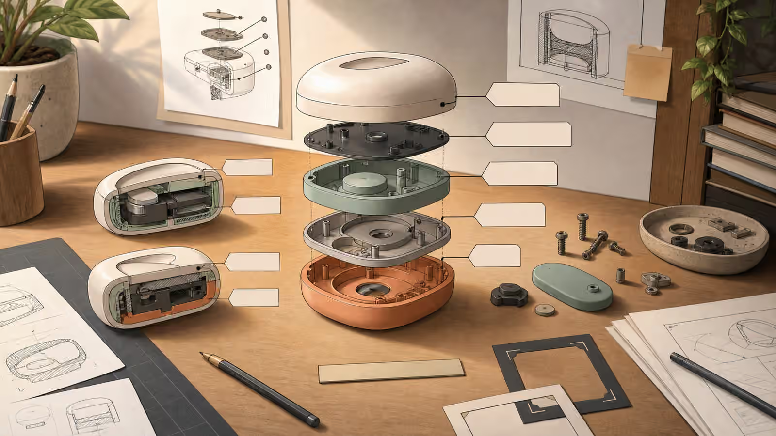
Generic does not mean vague. You can describe a rounded outer shell, a soft gasket-like layer, a simple core, a translucent cover, or separated neutral components. The key is to avoid details that imply exact manufacture. Screws can be small plain fasteners, not a real screw pattern from a known product. Callouts can be blank tabs, not invented labels. A ruler can be a plain scale-like strip without numbers.
The prompt should also control style. A patent drawing style can make a fictional image seem official. A highly realistic product render can make an invented object feel purchasable. A warm editorial illustration or simplified technical concept style often better communicates that the image is explanatory rather than documentary.
Show Relationships, Not Measurements
Cutaways work because they reveal relationships. The prompt can ask for a shell lifted away from a core, a transparent section showing a path, or layers separated in the order they stack. It does not need to ask for exact measurements. In fact, invented measurements are one of the easiest ways for a generated image to become misleading. If numbers are needed, they should come from a verified source and be added by a human after the image is generated.
Relationship language is strong enough for many use cases. “Separate the outer cover slightly above the inner layer” tells the viewer how the pieces relate. “Show a simple cross-section with three broad material layers” explains structure without false precision. “Use blank callout tabs placed near the parts” reserves space for real editorial labels later. This is the same text-free habit described in Text-Free Poster and Signage Concepts , applied to diagrams.
The review should ask whether the picture communicates the intended relationship at a glance. If the object looks impressive but nobody can tell what is being separated, simplify it. If the callouts look precise but have no verified content, remove or blank them. If the image invites the reader to infer a mechanism that the article does not explain, reduce the technical detail.
Keep The Cutaway Physically Plausible
Even conceptual images need basic physical logic. Parts should not pass through each other. Layers should align well enough to feel related. Shadows should show which pieces are lifted or resting. Exploded components should have a consistent viewpoint. The guide on Shadows, Reflections, and Contact Light is useful because exploded views often fail through floating parts and contradictory lighting.
Plausibility is not the same as accuracy. A fictional device can be arranged cleanly for explanation. It can omit fasteners, simplify shapes, or use color to separate layers. What it should not do is combine impossible contact points, confusing perspective, and fake labels in a way that looks like a real instruction sheet. The viewer should understand the picture as a concept, not a diagram to build from.
If the object is shown in use, connect the cutaway to Object-in-Use Prompts . A cutaway of a hand-held object may need clear hand placement, but adding hands also raises realism and likeness concerns. Often the cleaner choice is to show the object alone on a workbench with a neutral crop.
Add Real Labels Later
Generated text is a weak place to put important information. For cutaways, it is also risky because fake labels can look authoritative. A prompt should ask for blank callout tabs, blank leader shapes, or empty label areas. Then a human editor can add accurate labels in the design or publishing tool. That keeps the visual useful without relying on the model to invent terms.
Alt text and captions should be honest about the image’s status. If the image is conceptual, say that. Do not describe it as a real product diagram, verified assembly, or exact internal structure. The image may help a reader imagine layers, but the surrounding article should carry the facts.
The best cutaway prompts are modest. They show broad structure, keep objects generic, avoid fake precision, and leave real labels for a human. Used that way, cutaways can make difficult concepts easier to see. Used carelessly, they become confident-looking fiction. The difference is the brief.