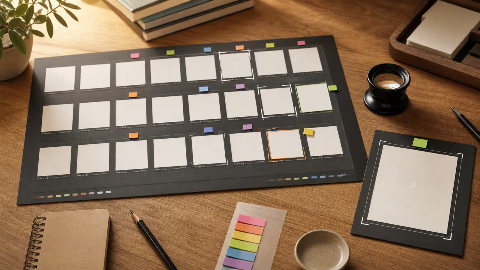
One generated image can look convincing because there is nothing beside it. A contact sheet changes that. When several variants sit together, the useful image is easier to separate from the merely attractive one. You can see which picture actually matches the brief, which one has the clearest subject, which one wastes the crop, and which one quietly adds a problem that would be missed in isolation.
Variant review is not a hunt for the prettiest accident. It is a review habit. The contact sheet gives you enough distance to judge the work as a set of choices instead of reacting to the first image that feels polished. It belongs near AI image quality checks and prompt iteration logs because selection, editing, and reuse are separate steps.
Compare Like With Like
A contact sheet is only fair when the variants are trying to solve the same problem. If one image is a square close-up, another is a wide editorial hero, and a third changes the subject entirely, the review becomes taste shopping. You may still find an image you like, but you will not learn which prompt choice worked. Keep the subject, use case, safety boundary, and major crop stable long enough to compare outcomes.
This is especially important for page images. A guidebook hero has to carry a topic at card size, leave room for cropping, avoid fake text, and support the page promise. If every variant changes all of those variables at once, the contact sheet becomes noisy. A better round asks for the same core scene in several interpretations. Then you can judge which interpretation has the strongest hierarchy, cleanest background, and least risky detail.
The goal is not to make the model repeat itself. Small differences are useful. A variant might place the subject slightly higher, quiet the background, simplify props, or change the light direction. Those differences are reviewable because the underlying brief is stable. When a variant wins, you know it won because of visible choices rather than because it answered a different assignment.
Write The Criteria Before The Favorite Appears
The strongest selection habit is to name the criteria before looking at the images. A short review sentence is enough. For an article hero, the criteria might be that the subject reads at thumbnail size, the top third stays quiet for layout, no readable text appears, and the image avoids brand-like marks. For a sequence, the criteria might include consistent camera height, repeated palette, and stable character or object design.
Prewritten criteria protect the review from charm. AI images often win attention with texture, glow, symmetry, or a dramatic prop that has nothing to do with the page. If the brief asks for a restrained planning image, a cinematic scene may be wrong even if it looks expensive. If the brief asks for a neutral product-style image, a package with fake seals or official-looking labels should fail immediately. The criteria keep the review attached to the job.
This also makes feedback easier to share. Instead of saying one image feels better, you can say it keeps the subject clear, leaves usable negative space, and avoids fake typography. That kind of note helps a designer, editor, or future prompt pass understand the decision. It also pairs well with image review handoffs because the selection record is already written in visible terms.
Separate Selection From Editing
A contact sheet is for choosing the best candidate, not fixing every candidate. If you try to edit six images at once, the workflow turns muddy. Pick the variant with the strongest structure first. Then use an edit brief to preserve what works and change only the next visible problem. The edit briefs guide is useful here because it keeps the winning variant from being overwritten by a full reprompt.
Selection notes and edit notes should sound different. A selection note explains why one image is worth keeping. An edit note explains what should change next. The first might say that a variant has the clearest subject and safest blank background. The second might ask to remove one distracting object, reduce contrast in the corner, or preserve the crop while changing the surface material. Mixing those notes often causes drift.
Do not rescue a variant that violates the boundary. If the image includes a fake logo, an identity-like face, a misleading chart, or a documentary-looking claim the page cannot support, reject it. Polishing a risky image wastes time and may normalize the very problem the brief was supposed to avoid. Contact sheets help because a safer alternative is usually visible beside the tempting failure.
Keep The Rejections Useful
Rejected variants still teach. A rejected image might reveal that the prompt invited too many props, left room for fake text, used a camera angle that made the subject confusing, or asked for a style that pulled the result toward brand confusion. Write the rejection reason in plain visual language. If several variants fail for the same reason, the next prompt should address that reason directly.
This is where contact sheets become more than a mood board. A good review record might say that three variants added unreadable labels, two made the subject too small, and one had strong composition but copied the reference too closely. Those notes make the next round narrower. They also prevent the same mistake from returning a week later when nobody remembers why the first batch failed.
The notes do not need to be elaborate. They need to be useful enough to support reuse. That is why contact sheets connect to prompt iteration logs . A small record of prompt, variant, selection reason, rejection reason, and final edit is often more valuable than saving every image. It preserves judgment, not just output.
Review Sets As Sets
Contact sheets matter even more when the final work needs several images. A single strong image can still clash with the rest of a shelf, deck, or article series. Place candidates beside existing approved images before deciding. Look for consistent crop, palette, light direction, subject scale, and level of detail. The guide on building a cohesive visual set depends on this kind of side-by-side review.
Set review also exposes repetition. Six images may all be competent and still rely on the same desk, the same blank card, the same plant, or the same overhead angle. Repetition can create cohesion, but it can also make a site feel thin. The contact sheet lets you decide where repetition is helpful and where the prompt needs a different subject, viewpoint, or material.
Before publishing, inspect the chosen image on its own again. The contact sheet helps with comparison, but the final image still has to survive the page context, responsive crop, alt text, file naming, compression, and disclosure decision. Selection is only one stage. It is the stage that keeps the rest of the work from starting on the wrong image.