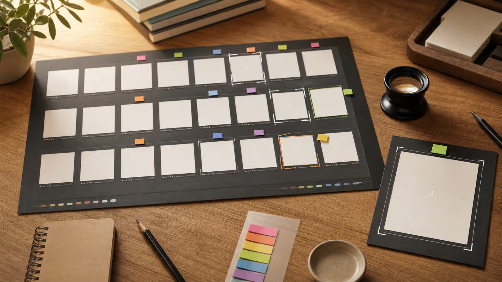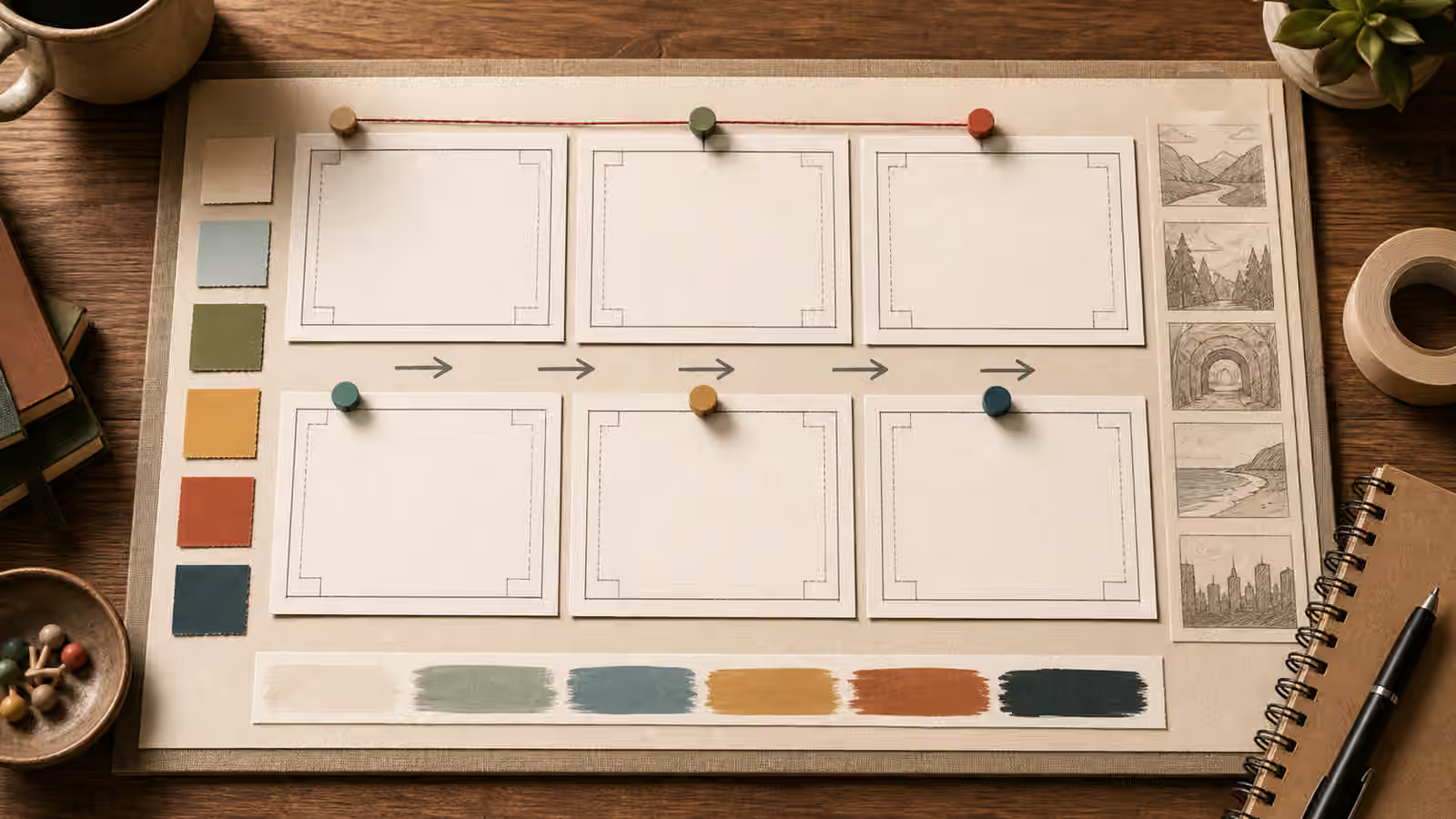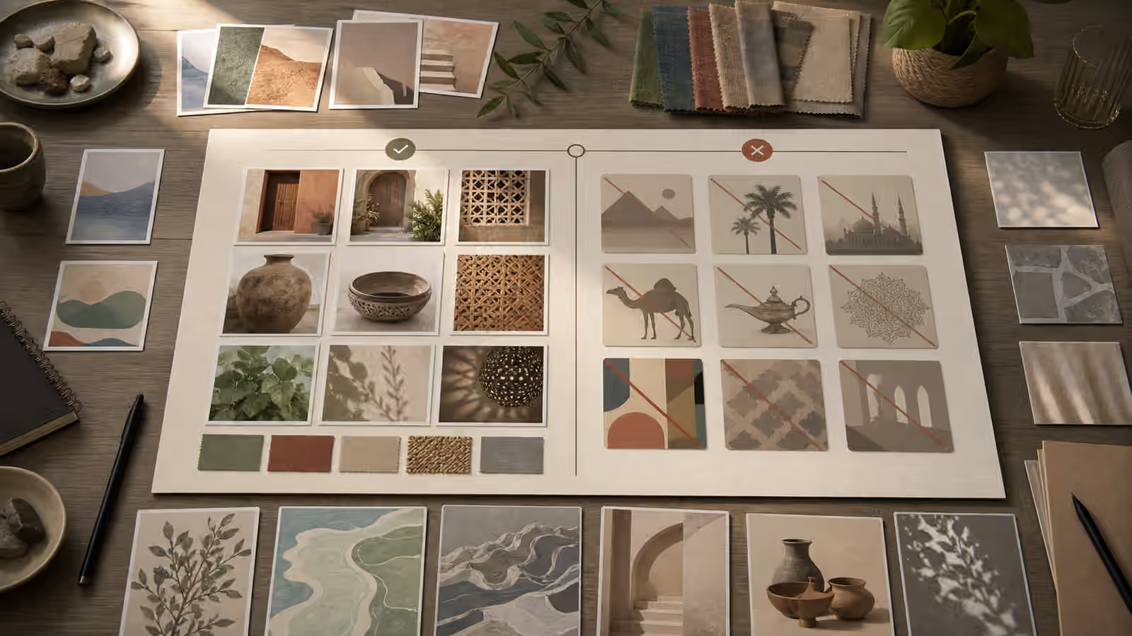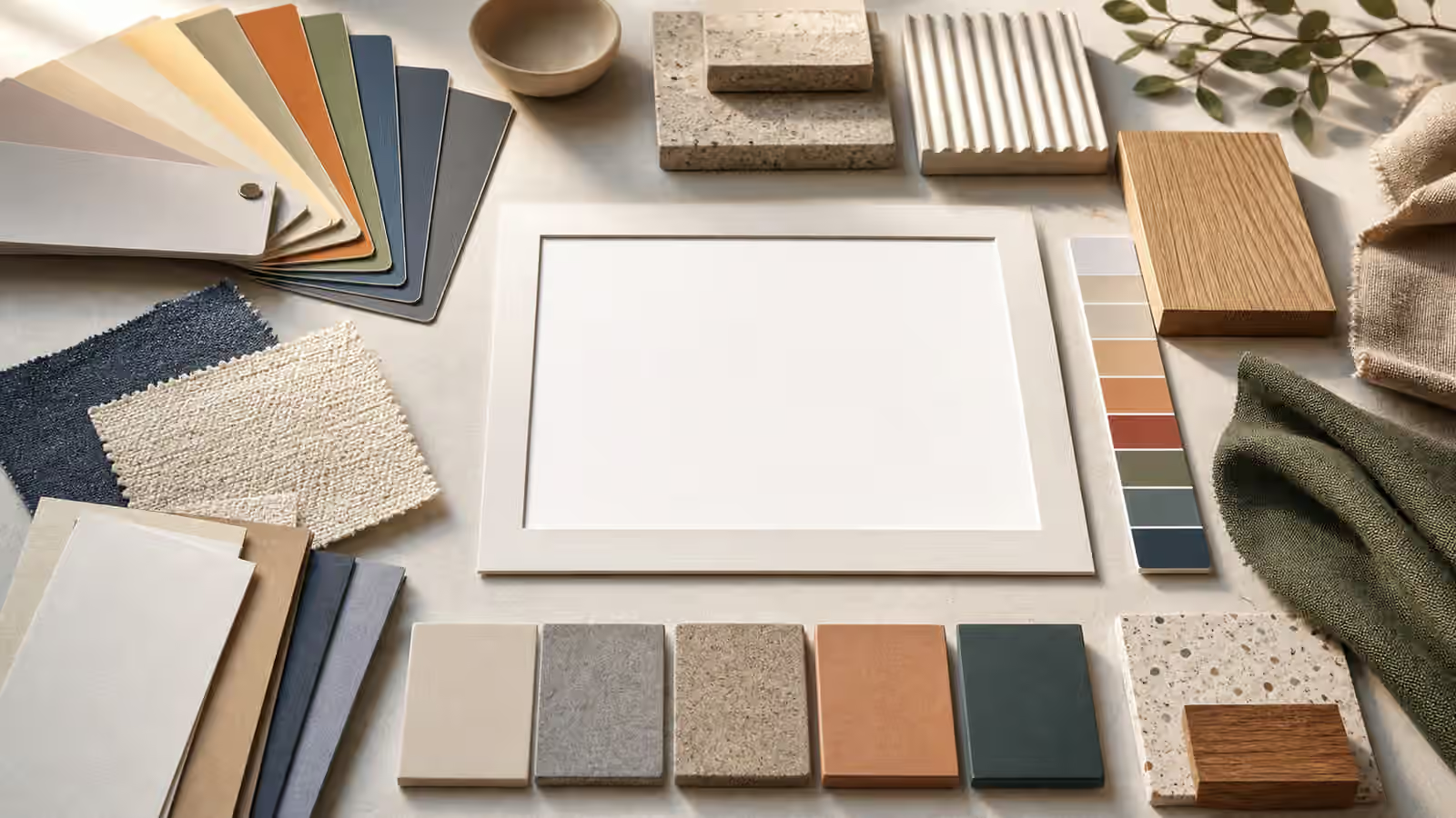
Color and texture are often where a generated image begins to feel either intentional or generic. A prompt may name the right subject and still produce a forgettable image because every surface is smooth, every color is equally saturated, and every object looks as if it came from the same vague studio. Better palette and material language gives the model a visible structure to follow. It also gives the editor a cleaner way to review the result.
This guide sits between lighting words , style without stealing , and building a cohesive visual set . Lighting tells the image how color is seen. Style language describes the broad medium or visual tradition. Cohesion keeps a group of images related. Palette, material, and texture are more concrete. They describe what the viewer can point to: a muted green card, a matte ceramic cup, a rough linen cloth, a brushed metal tool, a translucent glass tile, or a warm paper background.
Palette Is a Constraint, Not Decoration
The most common palette mistake is asking for a mood instead of naming visible color relationships. Calm, premium, playful, cozy, futuristic, and natural can all map to many different palettes. A model may respond with a familiar cluster of colors that looks polished but does not support the page. A better prompt names the dominant colors, the accent, and the background role. For example, an educational desk scene might use warm off-white paper, soft gray shadows, muted teal accents, and one small coral marker. The palette is not just pretty. It tells the image which elements should lead and which should stay quiet.
Color prompts work best when they leave hierarchy intact. If every object is a strong accent, the viewer has no clear path through the image. If the background is as saturated as the subject, the subject may disappear at thumbnail size. For article heroes and guidebook images, a limited palette often helps because the image must coexist with titles, cards, and page chrome. A prompt can ask for one dominant neutral field, one supporting color family, and one restrained accent. That is more usable than asking for vibrant colors everywhere.
Palette should also match the subject’s promise. A guide about safety boundaries can use clear contrast and caution shapes without becoming alarmist. A guide about food texture can use warm highlights and natural surfaces without inventing fake packaging. A guide about image delivery can use restrained export tiles and format-like shapes without readable file labels. The palette should help the reader recognize the topic faster, not make the page feel louder.
Materials Make Objects Believable
Material language tells the model what things are made of. It is more specific than style and often more useful. Matte paper, glazed ceramic, raw linen, cork, brushed aluminum, frosted glass, unfinished wood, recycled cardboard, stoneware, woven cotton, translucent vellum, and powder-coated metal all imply different edges, highlights, shadows, and textures. When a prompt omits material, the model may average everything into a smooth plastic-like surface.
Materials should be plausible for the object. A wooden notebook, a glass towel, or a soft fabric ruler may appear interesting, but those mismatches can distract from the page. There are times when surreal material changes are intentional, but Visual Prompt Lab guidebook imagery usually benefits from practical objects. If the scene is a planning desk, paper, pencil, ceramic, fabric swatches, and matte cards make sense. If the scene is a product-neutral mockup, blank paper labels, glass bottles, cardboard cartons, and matte plastic caps may make sense. Plausibility is part of quality.
Material choices also reduce the temptation to ask for brand style. Instead of naming a famous design house or a protected product universe, describe broad materials and construction. Ask for unbranded matte packaging, natural paper texture, simple geometric forms, soft studio light, and original color blocking. The copyright and trademark guide explains why brand-confusing outputs are risky. Material language gives you a safer vocabulary for specificity.
Texture Needs Scale
Texture is only useful when its scale matches the crop. In a wide room shot, tiny paper fibers may not matter. In a close product detail, they can make the surface feel tactile. A prompt that asks for texture without scale may produce noisy surfaces everywhere. A better prompt says where the texture belongs and how visible it should be. Fine linen weave on the foreground cloth, subtle paper grain in the background, smooth glazed ceramic on the cup, and a lightly rough stone sample on the side are all controlled requests.
Texture also affects image compression and readability. Very busy backgrounds can become muddy after resizing, compression, and display on small screens. If the image will be used as a hero, keep the background texture broad and quiet. If the image will be a close detail, make sure the subject is still recognizable after the texture appears. The AVIF and WebP guide covers delivery, but the prompt itself can help by avoiding unnecessary surface noise.
Good texture prompts often use restraint. The goal is not to make every object tactile. The goal is to give important surfaces enough character to avoid blandness while keeping the image legible. A ceramic cup can have a subtle speckled glaze. A notebook can have a paper grain. A background can have soft plaster texture. If all three become equally prominent, the scene may feel gritty rather than clear.
Finish Changes the Light
Surface finish describes how material handles light. Matte, satin, glossy, polished, brushed, frosted, translucent, rough, soft, and porous are not interchangeable. A glossy object creates sharper highlights and reflections. A matte object diffuses light. Frosted glass softens edges. Brushed metal catches light in directional streaks. Rough stone breaks highlights into small irregular patches.
Finish language connects directly to the lighting guide. If you ask for glossy black objects under hard light, expect bright reflections and deep contrast. If the page needs a calm instructional feel, matte and satin finishes under soft side light may be easier to use. If an object should remain unbranded, glossy reflections can accidentally create logo-like marks or false labels, so simpler matte surfaces may be safer.
Finish can also carry meaning. Matte paper feels editorial and quiet. Polished metal can feel technical. Raw wood can feel handmade. Frosted glass can feel clean and modern. These associations are broad, not fixed. Use them to support the subject, then check the result instead of assuming the word worked.
Keep Palette and Style Separate
Palette is not the same as style. A muted palette can appear in photography, collage, watercolor, 3D render, flat illustration, or editorial still life. If you mix palette, medium, era, and artist references into one vague phrase, the model has to guess which part matters most. Separate them in the prompt. State the medium first, then subject, then palette, then materials, then lighting and constraints.
This separation makes revisions easier. If the first result has good materials but the palette is too loud, change the palette and keep the rest. If the palette works but the surfaces look plastic, revise the materials. If the materials are right but the image feels flat, adjust lighting. This is the same one-change habit described in Editing One Thing at a Time , applied to visual traits.
A reusable color and material note can be short: warm off-white background, muted teal and charcoal support colors, one small clay accent, matte paper, soft ceramic, natural linen, subtle grain, no readable text, no logos. That note can travel across guidebook images while the subject changes. It creates cohesion without copying a brand, artist, or protected look.
Review the Output Like a Material Board
After generation, inspect the image as if it were a small material board. Can you identify the main color field, the accent, and the quiet background? Do the materials make sense for the objects? Is the texture visible where it helps and quiet where it would distract? Are there accidental labels, fake logos, or brand-like markings? Does compression turn the texture into noise? Does the palette still work at thumbnail size?
If the answer is unclear, revise one layer at a time. Simplify the palette before changing the subject. Replace plastic-like surfaces with named materials before adding more style. Reduce background texture before increasing contrast. The strongest prompts often sound plain because they name what the viewer can see. That plainness is useful. It gives the image a material reality without leaning on imitation, hype, or vague taste words.