Learning visuals sit close to trust. A classroom, workshop, training room, certificate, badge, roster, grade sheet, lab exercise, or smiling student group can imply that instruction happened and someone approved it. That may be true for a real course with real documentation. It is not true for a generated image made to support a page. The prompt should keep that difference visible.
A useful classroom or training image can show setting, materials, posture, flow, accessibility, and practice. It does not need to invent a school, credential, attendance record, diploma, ranking, or official approval. If the page is about a real institution, use approved imagery. If the image is conceptual, keep it fictional, blank, unbranded, and clear about its illustrative role.
Prompt The Learning Setup
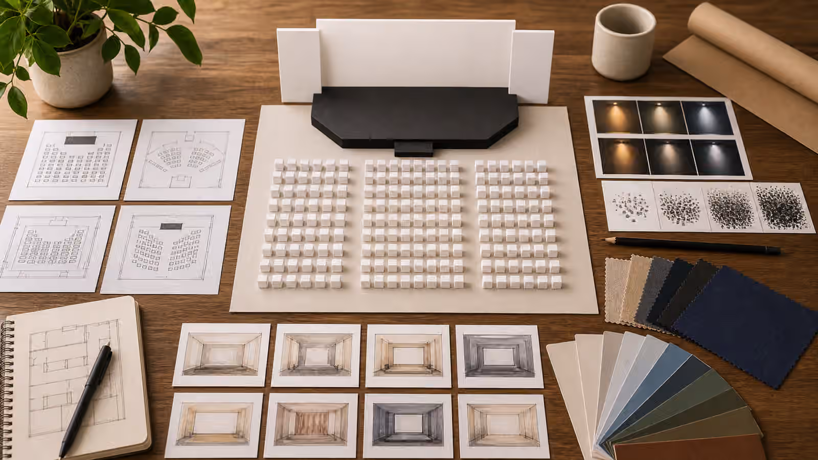
Begin with what learning activity the image should support. A workshop page may need tables arranged for discussion, blank practice cards, material trays, soft room light, and a facilitator’s empty station. A guide about study habits may need a desk with notebook shapes, calm lighting, headphones, a timer-like object without numbers, and a clear surface. A training article may need seats, demo props, and a projection glow without readable slides.
These details help the reader understand the learning context without pretending that a specific class happened. They also make the image easier to review. You can inspect whether the seating makes sense, whether the materials match the topic, whether the crop has room for the page, and whether the image avoids false proof.
Educational Infographics focuses on labels and factual diagrams. Classroom visuals are different because they often show social setting and authority. Still, the same principle applies: do not let generated pixels carry facts that belong in reviewed copy.
Keep Credentials Out Of The Frame
Certificates are visually tempting because they signal completion. They are also claims. A generated certificate can imply training, qualification, attendance, compliance, continuing education, safety approval, or institutional endorsement. Even a blank certificate shape can be misread if the surrounding context looks official. For most guidebook visuals, it is better to show learning materials rather than completion documents.
Avoid diplomas, seals, ribbons, official-looking stamps, badge lanyards, grade books, transcripts, rosters, class rankings, school letterheads, and ID cards. If a certificate-like shape appears as part of a planning desk, keep it clearly blank and secondary. Do not use it as the hero subject. If real certification matters, use real reviewed materials and make sure the surrounding page explains what is and is not being claimed.
This is similar to Event and Venue Prompts . Event images can invent attendance. Training images can invent completion. Both should favor setup, layout, and atmosphere over proof.
Treat Children And Students Carefully
Images of children, students, classrooms, therapy rooms, tutoring sessions, and youth programs need extra restraint. Do not ask for identifiable children, school uniforms that suggest a real institution, name tags, classroom rosters, report cards, disciplinary scenes, medical or disability claims, or emotional vulnerability used as decoration. If young people are not essential to the page, consider objects, desks, room layouts, or non-identifiable figures instead.
If people appear, keep them generic and non-identifiable. Use distant figures, silhouettes, hands arranging materials, or adult learners when that fits the topic. Avoid close faces and testimonial-like expressions. Children and Family Scene Prompts gives a broader privacy boundary for minors and family contexts.
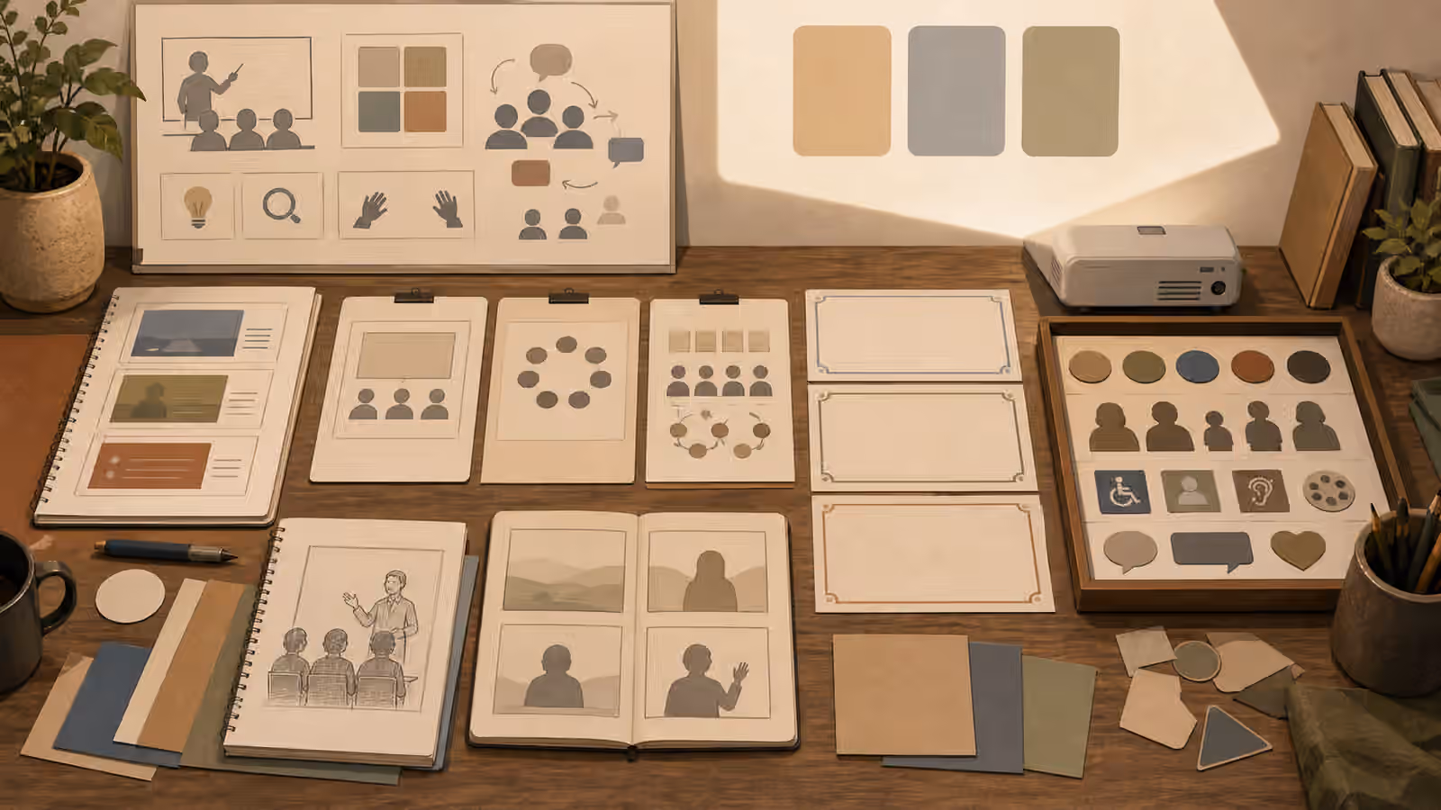
Accessibility cues should also be handled carefully. It is useful to show clear pathways, readable contrast in materials, quiet seating zones, caption-ready screen space, or multiple ways to participate. It is less useful to turn disability into a token symbol or imply that a program has been audited for accessibility if it has not. Accessible Visual Briefs helps shape those details before the prompt reaches the model.
Avoid Fake Screens And Slides
Training rooms often contain slides, dashboards, whiteboards, worksheets, and screens. Generated versions tend to produce gibberish that looks like instruction. They can also invent data, procedures, safety steps, test questions, or policy statements. Ask for blank boards, soft projection light, abstract diagrams without labels, or materials turned slightly away from the camera. If the page needs exact words, add them later as real text.
This matters most in technical, health, legal, safety, and financial education. A fake slide about first aid, wiring, medication, security, taxes, or legal rights can mislead. A generated worksheet with nonsense is not harmless if it looks official. Keep high-stakes instructional content out of the image, or make the image clearly conceptual.
Interface Mockups Without Fake Screenshots offers the parallel rule for screens: show structure without pretending to capture a functioning product or record. Training visuals should show learning structure without pretending to contain reviewed curriculum.
When a page must show a screen, treat it like scenery rather than content. A soft rectangle of light, blank slide frame, or abstract diagram card can establish the classroom without asking viewers to read it. That choice is also friendlier to translation, accessibility, and future updates. Real lesson wording can live in HTML where it can be edited, cited, and described. The generated image can stay focused on attention, room flow, and materials.
Review The Authority Signals
Before publishing, ask what the image seems to certify. Does it imply a real class, licensed teacher, official school, enrolled students, completed course, passed exam, safety training, professional credential, or institution endorsement? If yes, and that claim is not real, revise the image. Remove certificates, badges, names, official marks, close student faces, and readable slides.
Then review ordinary image quality. Are hands coherent? Are room objects plausible? Are screens blank? Is the crop quiet enough for the page? Are people secondary to the learning setup? Does the image support the article’s promise without becoming proof of attendance or achievement?
Strong classroom visuals often show preparation rather than outcome. A table of blank lesson materials, a calm room setup, or a practice station can invite learning without manufacturing credentials. That is the right kind of restraint for generated education imagery.
That restraint also keeps the image evergreen. A blank workshop table will still make sense after the curriculum, platform, or course title changes. A fake certificate or dashboard will age quickly and may keep implying approval long after the page has moved on.