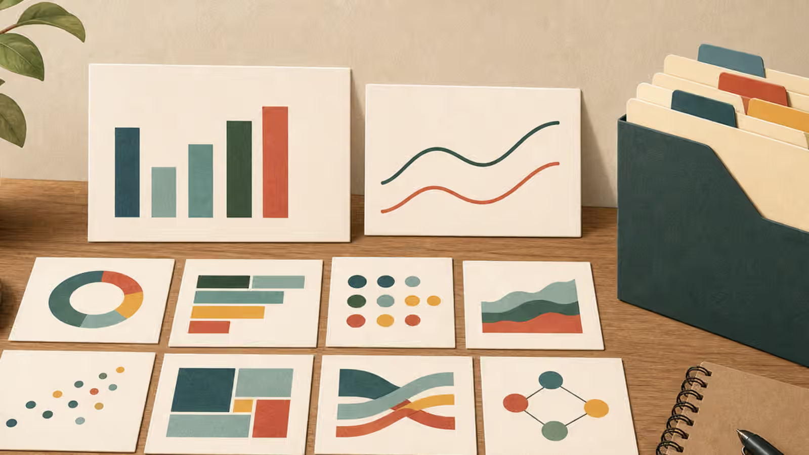
Chart-like imagery is tempting because it signals analysis quickly. A few bars, a line, a grid, and a bright annotation can make a page feel organized before the reader has examined a single claim. That same speed is the problem. If the image model invents labels, axes, or numbers, the visual can imply evidence the page does not have.
The safest habit is to separate conceptual data visuals from exact charts. A generated image can suggest analysis, planning, comparison, or review. It should not fabricate the measured result. When a page needs real data, render the chart with a charting tool, a spreadsheet, or code that uses the actual source data. Use generated imagery around that chart only when it remains clearly illustrative.
Decide What Kind Of Visual You Need
Before prompting, ask whether the page needs a real chart or a chart-inspired illustration. A real chart answers a data question. It has measured values, labels, scales, units, and a source. A chart-inspired illustration sets a mood or explains a workflow. It may show blank cards, abstract bars, line shapes, review tools, and color swatches, but it does not ask the reader to believe a number.
This distinction sounds obvious until a model returns something plausible. A fake axis can look authoritative. A made-up percentage can feel convincing at thumbnail size. A line trending upward can imply success even when the article is only about planning. The AI Image Quality Checks guide already asks you to inspect text, logos, physics, and context. For chart-like visuals, add a stricter question: does any shape or label imply a specific claim that the page has not supported?
If the answer is yes, simplify the image. Ask for unlabeled bars, blank cards, axis-free diagram tiles, abstract comparison shapes, or a data review desk with no readable text and no numbers. The point is not to hide information. The point is to avoid invented information.
Prompt Relationships, Not Measurements
A responsible chart-like prompt describes purpose and shape without pretending to know exact values. For a guide about research workflow, you might ask for blank chart cards beside a notebook, color swatches, and a ruler. For a guide about comparing options, you might ask for three unlabeled cards arranged from simple to complex, with neutral shapes rather than rankings. For an analytics article hero, you might ask for a conceptual analysis desk with empty grid panels and review marks made from simple shapes.
That language gives the image a job. It can signal comparison, organization, or measurement without fabricating the outcome. It also reduces the chance of unreadable chart text, strange numerals, and imaginary brands. The same principle applies to Educational Infographics : if labels and relationships must be exact, do not rely on a generated bitmap to carry them.
The most useful prompts include explicit boundaries. Ask for no axes, no labels, no numbers, no fake statistics, no readable text, and no interface screenshots. If you need space for real labels later, ask for clean blank panels and generous margins. If you need a background for a real chart, keep the generated image separate from the chart itself so the exact data remains editable and reviewable.
Keep Exact Data Out Of The Image Model
Generated chart art should not be the source of truth for medical results, financial performance, legal timelines, safety incidents, public rankings, scientific findings, or any other claim where readers may rely on the numbers. Even when the topic is low stakes, exact data deserves a controlled rendering path. The chart should come from the dataset, not from a prompt.
This does not make AI-generated imagery useless around data. It can create a neutral header for a methodology article, a conceptual illustration for a comparison guide, or a background card for a lesson about reading charts. The difference is that the generated image stays outside the evidence chain. The actual chart, table, or calculation remains in text, code, or a verified graphic.
If you combine generated visual material with real data, keep the layers separate. The generated part can provide paper texture, desk context, blank frames, or symbolic tools. The real chart can sit as an HTML chart, SVG, canvas, or exported graphic from a trusted tool. That way a reader, editor, or developer can inspect the data layer without decoding a decorative bitmap.
Review The Implied Story
Even unlabeled shapes can tell a story. A steep upward line suggests growth. A collapsing bar suggests decline. A red segment suggests warning. A green segment suggests success. Those cues can be useful, but they can also distort the page if they point in a direction the article does not support.
Review the visual at several sizes. At card size, does the image imply a ranking? Does it suggest that one option is safest, fastest, or most profitable? Does a warning color make the subject look dangerous without cause? Does the composition place one object as the obvious winner? If the page is only about how to build a prompt or inspect a chart, the image should not smuggle in a conclusion.
Captions help here. A caption can say that the image is a conceptual illustration of data review rather than a chart from measured results. Alt text can describe the visible objects, such as blank chart cards and unlabeled bars, without implying exact values. The Alt Text and Captions guide covers that publishing layer, while Image SEO explains how filenames and surrounding copy can stay useful without becoming keyword stuffing.
Use The Right Tool For The Promise
A chart-like generated image is strongest when the promise is visual atmosphere, workflow, or concept. It is weakest when the promise is proof. If a reader needs to compare numbers, give them a real chart. If a reader needs to understand that the article is about analysis, a carefully constrained generated image can help.
The boundary is practical, not precious. You are not banning bars, lines, grids, or analysis desks. You are choosing not to let a model invent evidence. Prompt for blank shapes when the image is conceptual. Render real data with real data tools when the image is evidentiary. Then describe and caption the result so the reader can tell which kind of visual they are seeing.