The angle of an image decides what the viewer believes they are looking at before they notice palette, props, or style. A low angle can make a chair feel monumental. An overhead angle can make the same chair feel like an object in a planning diagram. A close crop can turn a tool into a texture study, while a wider shot can explain how the tool is used. When an AI image prompt ignores viewpoint, the model still chooses one. It may simply choose a viewpoint that does not serve the page.
Visual Prompt Lab already treats composition as a practical publishing decision. Camera angle and lens language sit just before that decision. They describe where the imaginary camera is, how close it is to the subject, how much space the viewer can see, and how objects relate to each other in depth. Those choices make a generated image easier to crop, easier to review, and easier to repeat across a group of assets.
Start With Viewpoint, Not Style
Many weak prompts jump from subject to style without giving the image a viewpoint. “A clean illustration of a desk” can become an overhead flat lay, an eye-level room view, a close product crop, or a dramatic corner shot. None of those are wrong in isolation, but only one may fit the article, lesson, or social cover you are making. If the image needs to teach layout, overhead may be best. If it needs to make a tool feel usable, an eye-level three-quarter view may help. If it needs to show texture, a close detail crop may do more than a beautiful wide scene.
A useful prompt names camera distance in plain language. Close-up, medium shot, wide shot, overhead flat lay, eye-level view, low angle, high angle, three-quarter view, and straight-on product view are more dependable than vague words such as cinematic or dynamic. Those vague words may influence the output, but they also leave too much room for the model to invent a shot that fights your layout. When you can describe where the camera is, you can review whether the image obeyed the brief.
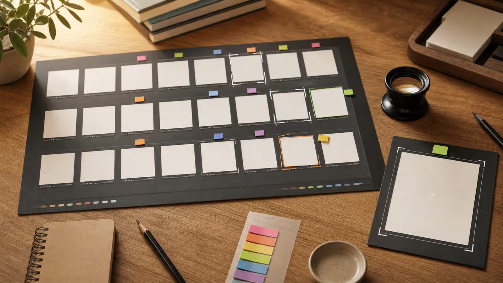
The simplest test is to imagine the image without its style. If it became a rough pencil thumbnail, would the shot still make sense? A prompt for a guidebook hero might say that a blank image card sits in the center, viewed from above, surrounded by crop frames and swatches. A prompt for a product-neutral mockup might say that three unbranded containers sit at eye level on a plain table, with enough side space for a headline. Those instructions are not decorative. They tell the model which visual problem the image is solving.
Camera Distance Changes Meaning
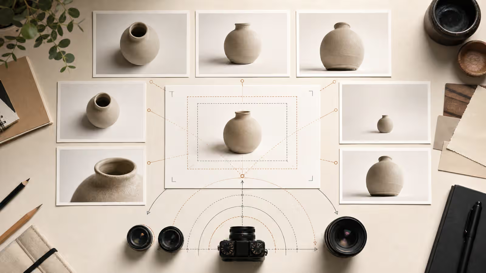
Camera distance controls how much context enters the frame. A close-up is useful when surface detail matters. It can show brush texture, grain, fabric weave, condensation, tool edges, or the quality of a material. It is less useful when the reader needs to understand scale or use. A close-up of a chair leg may be visually rich, but it does not explain a room plan.
A medium shot is often the safest default for article images because it gives the subject room to breathe without losing context. It can show the object, the hand using it, the surface it rests on, and a quiet background. A wide shot is stronger when environment is part of the promise. Interior prompts, classroom scenes, workshop images, and process visuals often need a wider view because the reader must see relationships between objects.
Distance also affects perceived honesty. Extreme close-ups can make ordinary objects feel more luxurious than they are. Very wide shots can hide small failures that matter, such as malformed hands, confusing labels, or strange object counts. The AI image quality checks guide is useful after generation, but a thoughtful camera distance reduces some problems before they appear. If hands are irrelevant, do not request a hand-heavy close-up. If the subject is an object, let the object be the subject.
Lens Words Are Useful When They Describe Visible Effects
Lens language can help, but it works best when it names an observable result. Wide-angle language suggests more space and more perspective exaggeration. It can make a small room feel open, but it can also bend edges and distort objects near the frame. Telephoto language compresses depth and can make backgrounds feel closer to the subject. Macro language points toward tiny detail and shallow focus. Portrait lens language often implies a natural-looking subject with background separation.
The point is not to collect camera jargon. The point is to choose words that match the image’s job. If you are making a guidebook hero about a desk process, overhead flat lay may be clearer than a shallow-focus macro shot. If you are making a social cover where one object must read at thumbnail size, a simple medium shot with a clean background may outperform a dramatic wide-angle scene. If the model keeps producing distorted shelves, warped rooms, or objects with strange proportions, simplify the lens language and state that the perspective should be natural and undistorted.
Depth of field is another place where moderation helps. A softly blurred background can separate a subject, but too much blur can erase useful context. For instructional images, ask for enough background clarity to understand the setting. For decorative hero images, a softer background may be fine if the subject remains clear. When an image needs to support search intent, the viewer should not have to guess what the blurred objects mean.
Height and Angle Shape the Reader’s Relationship to the Subject
Camera height carries a subtle point of view. Eye-level images feel approachable because the viewer meets the subject directly. Overhead images feel analytical and organized because the viewer is above the scene. Low angles can add drama or importance, but they can also make ordinary topics feel inflated. High angles can make scenes feel observed or arranged. Straight-on views are useful for products, diagrams, shelves, posters, and any scene where symmetry or comparison matters.
For Visual Prompt Lab work, overhead and eye-level views are often the most practical. Overhead views suit prompt cards, swatches, notebooks, ingredient boards, export tiles, and planning desks. Eye-level views suit objects, rooms, product-neutral mockups, and scenes where the viewer needs a natural sense of scale. Low angles should be used deliberately. They can be effective for architecture or a dramatic cover, but they may feel odd for calm educational material.
This is where camera choices meet the advice in Describe the Shot, Not the Vibe . Instead of asking for a powerful image, ask for a low-angle view of a tall unbranded tool silhouette against a simple background. Instead of asking for a calm image, ask for an overhead desk scene with evenly spaced blank cards, soft side light, and ample negative space. The second version gives the model something to render and gives the editor something to judge.
Perspective Needs Guardrails
Perspective is one of the places where generated images can look impressive at first and unreliable on inspection. Tables may tilt in impossible ways. Shelves may not align. Room corners may bend. Repeated objects may change size without a reason. A prompt cannot prevent every failure, but it can reduce ambiguity. Ask for natural perspective, straight vertical lines where relevant, a stable horizon, and an undistorted subject when geometry matters.
For interiors, name the camera position in the room. A corner view, straight-on wall view, doorway view, or overhead floor-plan-like view creates different expectations. The interior prompts guide covers room details, but the camera position decides whether those details are visible. If the page is about layout, a wide corner view may help. If the page is about material choices, a closer straight-on vignette may be better.
For product-neutral visuals, perspective should not create false claims. A low-angle bottle can make it feel heroic; an overhead arrangement can make it feel like a planning object. If the item is fictional or illustrative, keep it unbranded and avoid official-looking labels. If the image could be mistaken for evidence of a real object, add disclosure and simplify realism. Camera language is powerful because it feels photographic. That power makes the safety boundary more important, not less.
Build a Reusable Shot Note
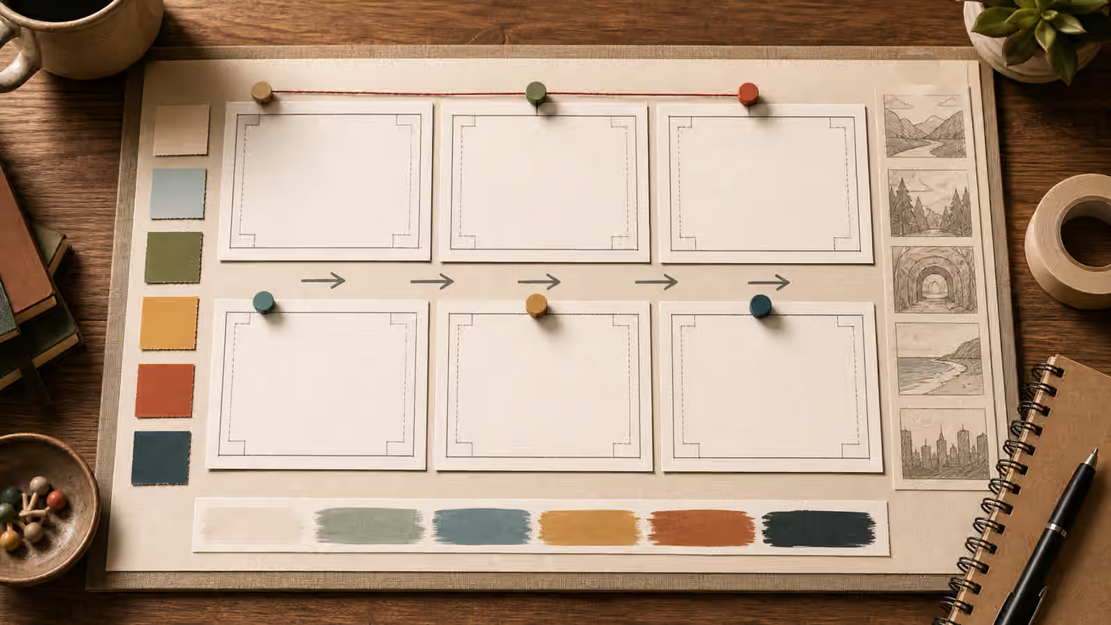
A reusable camera note is short. It might say: overhead flat lay, centered subject, quiet corners, soft side light, no readable text, no logos. Another might say: eye-level three-quarter product-neutral view, medium distance, natural perspective, shallow background only, blank label surfaces. These notes travel from prompt to prompt because they define the image’s job rather than one exact picture.
When you keep an iteration log, record the camera choice separately from the subject and style. The prompt iteration logs guide is useful here because it keeps successes from becoming accidents. If a particular overhead crop worked for one guidebook image, you can reuse the camera note while changing the objects, materials, and color palette. If a wide-angle room kept distorting furniture, you can retire that note or add stronger perspective constraints.
The final review is simple: can you name the camera distance, height, angle, and depth after looking at the image? If not, the image may still be attractive, but it is not yet controlled. A strong visual prompt does not need technical camera precision. It needs enough viewpoint language that the result can be made, reviewed, improved, and used without guessing what happened.