Before-and-after layouts are powerful because they make a claim quickly. A reader sees two panels and assumes there is a sequence, a cause, and a result. That is useful when the comparison is real and documented. It is risky when the images are generated, because the format can make a concept feel like proof.
Visual Prompt Lab treats comparison images as editorial tools, not evidence generators. A side-by-side image can help explain a design direction, a prompt refinement, a lighting change, or a layout decision. It should not imply that a person, place, product, room, medical condition, legal record, repair, or environmental scene changed in the real world unless that change actually happened and the visual record is authentic.
Name The Job Before The Split Screen
The first question is not how dramatic the difference should be. The first question is what the comparison is allowed to show. A prompt refinement comparison can show the same unbranded object under vague lighting on one side and clearer lighting on the other. A composition comparison can show a cramped crop beside a more useful crop. A style comparison can show broad genre differences without copying a named artist or brand. These are visual lessons. They do not claim that a real outcome occurred.
This distinction changes the prompt. Instead of asking for a before-and-after transformation, ask for a conceptual side-by-side study. Use phrases such as blank review cards, illustrative comparison, prompt iteration study, design planning desk, or concept panels. Those words keep the image closer to a teaching artifact. The viewer sees that the comparison is about choices, not proof.
The Prompt Iteration Logs guide is a natural partner here. If you are comparing generated outputs, the useful record is the prompt, the change you made, the output you kept, and the reason. The comparison image can introduce that habit, but the actual explanation belongs in text where it can be precise.
Avoid Evidence Cues
Certain visual cues make a generated comparison feel documentary. Timestamps, measurement marks, official forms, medical chart styling, surveillance angles, address markers, repair invoices, customer names, map pins, and realistic device screenshots all push the reader toward believing the image records an event. If the event did not happen, those cues should not be in the image.
The same concern applies to dramatic subject matter. A generated skin-care comparison, weight-change image, flood cleanup scene, workplace accident repair, product performance result, financial dashboard, or courtroom document can easily mislead even when the page text says it is illustrative. The format has already done persuasion work before the caption arrives. If the topic carries real-world stakes, use abstract planning cards, diagrams, material samples, or neutral object studies instead of simulated proof.
For data-adjacent visuals, read Charts and Data Visuals Without Fake Numbers . The same rule holds: conceptual visuals can explain structure, but exact claims belong in verified data, authored copy, or real documentation. A side-by-side chart-like image with invented values is not safer because the numbers are hard to read. It is worse, because it borrows authority while dodging review.
Compare One Change At A Time
A comparison works when the reader can see what changed. If the left side uses a different subject, crop, color palette, camera angle, lighting, and background, the comparison becomes noise. The viewer may enjoy the more polished panel, but they will not learn which decision mattered.
Keep the subject stable and change one visible property. For a lighting lesson, keep the object, crop, and background the same while changing light direction or softness. For a composition lesson, keep the subject and palette stable while changing framing. For an editing lesson, keep the original useful parts visible and change one requested element. The guide on Edit Briefs uses the same discipline: preserve what works, then name the change.
This habit also makes generated images easier to review. If the right panel accidentally changes the object count, introduces a fake logo, or turns a blank package into something brand-like, you can catch the drift quickly because the intended difference is narrow. If everything changed at once, the problem hides inside visual excitement.
Use Captions To Set The Limit
The caption should tell the reader what kind of comparison they are seeing. A useful caption might say that the image is a conceptual prompt study, an illustrative design comparison, or an AI-generated example of crop planning. It should not imply a real result, a tested improvement, or an actual customer outcome.
Alt text should follow the same boundary. Describe the visible comparison cards or scene elements without adding claims about success. “Two blank comparison cards on a review desk” is safer than “a failed image corrected into a successful image” unless the surrounding example truly documents that workflow. The Alt Text and Captions guide covers this distinction in more detail, but the principle is simple: description should not make the generated image sound more factual than it is.
Disclosure matters most when the format could be mistaken for evidence. The Disclosure and Content Credentials guide explains provenance signals, but you do not need a complex system to begin. Place plain language near the image when origin changes interpretation. If a generated side-by-side visual is only a concept, say so.
Choose Safer Visual Structures
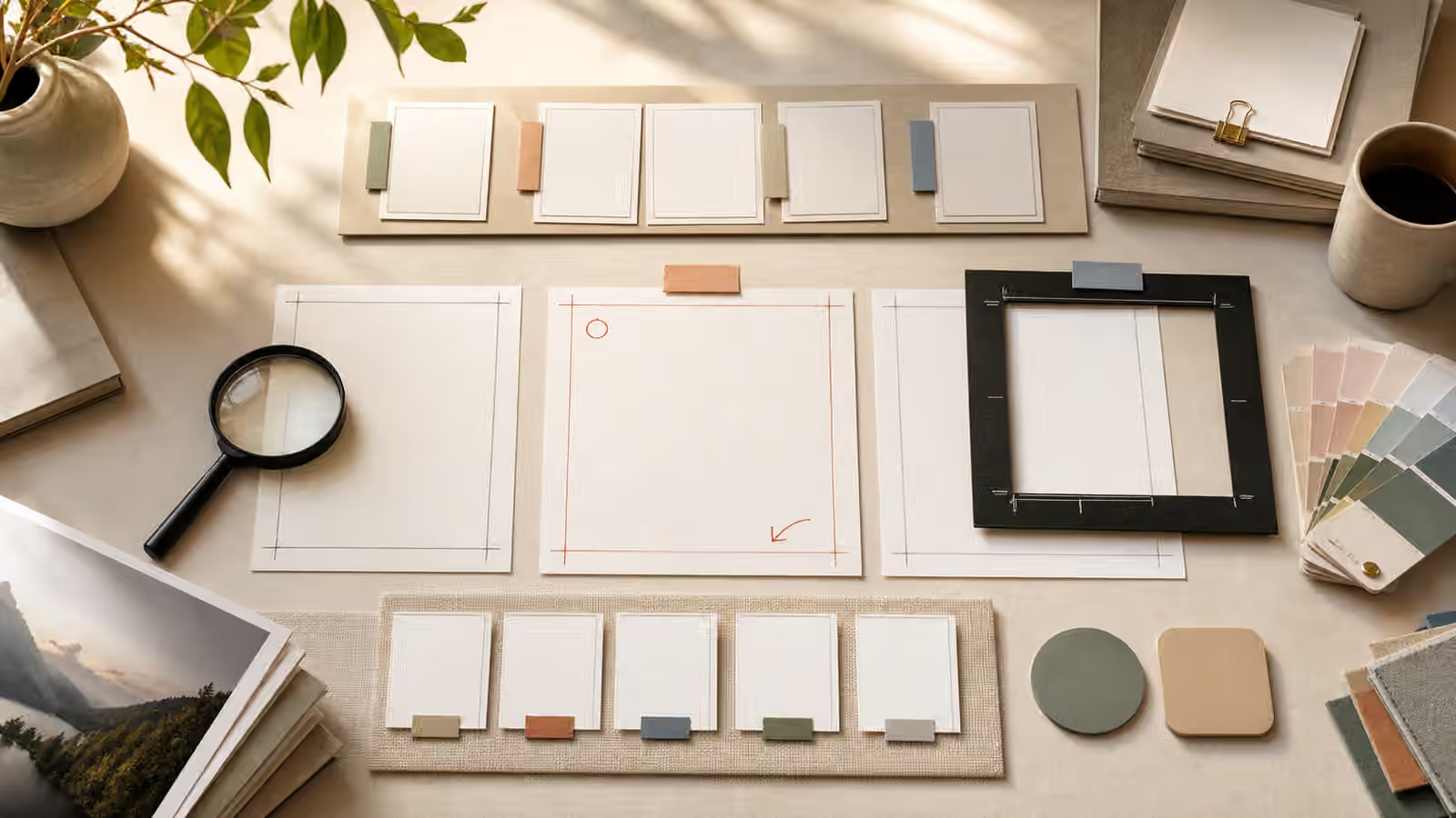
Physical planning scenes are often safer than full-scene simulations. A desk with two blank cards, crop guides, swatches, and a magnifier reads as an editorial artifact. A split-screen photo-realistic apartment renovation reads like a real renovation. A pair of unlabeled object studies reads as a prompt exercise. A realistic patient image reads like a health claim. When the subject gets sensitive, move one level more abstract.
For product or interface work, keep the comparison unbranded. Blank packaging, neutral component blocks, material samples, and crop frames can communicate design choices without inventing a product claim. The guide on Product Mockups Without Fake Brands is useful because brand-like details often sneak into comparison visuals. A fake logo on one side can make the whole comparison feel like a market claim rather than a visual lesson.
If you need real before-and-after evidence, generated images are the wrong tool for the evidentiary part. Use real photographs, real measurements, real captions, and appropriate permissions. Generated visuals can still explain the method around the evidence, but they should not replace the record.
Review The Reader’s Likely Assumption
Before publishing, step back and ask what a hurried reader would believe after seeing only the image and headline. If they would assume that a transformation happened, but the transformation is fictional, revise the image or the surrounding copy. If they would assume that the comparison is a teaching aid, the visual is doing its job.
Run the usual AI Image Quality Checks as well. Side-by-side images invite small failures: inconsistent shadows, accidental text, strange repeated objects, mismatched perspective, and hidden logos. A comparison image with a technical flaw can be confusing even when it is ethically safe. A comparison image with a false evidentiary signal can be worse than confusing. It can teach the reader to trust something that was only generated.
The strongest comparison prompts are modest. They say what changed, keep the scene reviewable, avoid proof cues, and leave factual claims to real evidence. That restraint does not make the image dull. It makes the image usable.