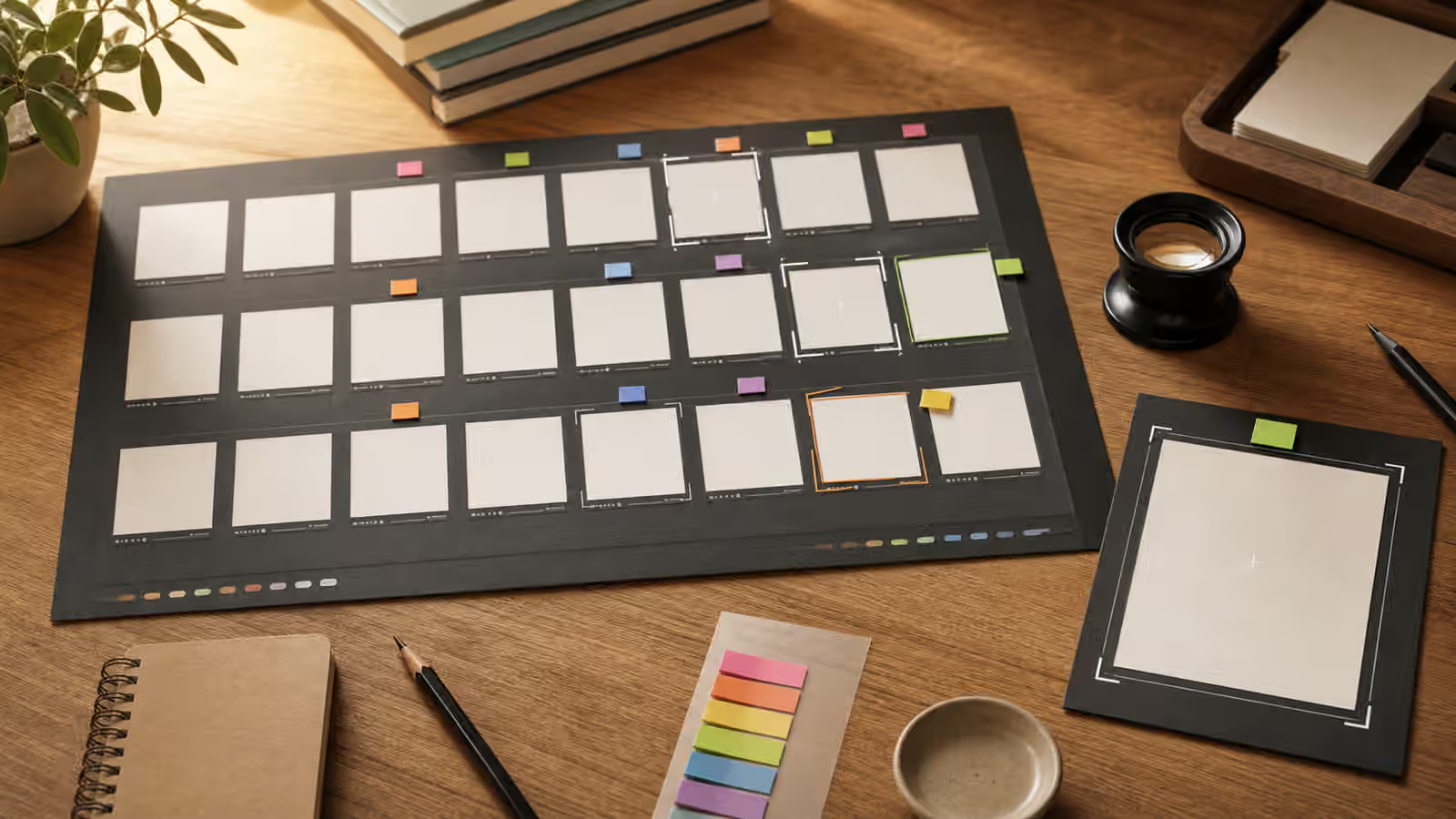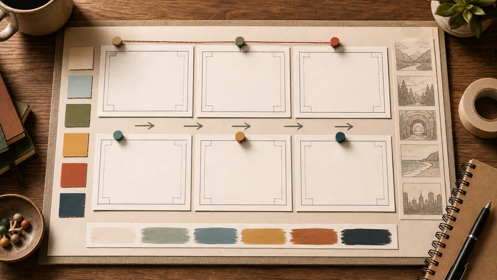
The background of a generated image is rarely neutral. It decides whether the subject feels isolated, usable, noisy, staged, practical, luxurious, cheap, clinical, or confusing. When a prompt only names the subject, the model must invent a surrounding world. That invention may be attractive, but it may also fill every corner with props, texture, fake labels, dramatic lighting, and detail that gives the page no room to work.
Good background prompting is a layout skill as much as an image-generation skill. A guidebook hero, article card, social cover, or product-neutral illustration usually needs a subject and a place for the eye to rest. It may need space for a title outside the image, a crop that survives mobile cards, or a margin that keeps the subject from crashing into an edge. The composition basics guide explains hierarchy and safe zones. This guide focuses on the quieter half of that work: the surface, depth, and empty areas around the thing the reader is meant to notice.
Treat the Background as a Subject
Many prompts mention background only at the end, as if it were a cleanup instruction. “On a clean background” is better than nothing, but it still leaves a large decision open. Clean could mean a white studio sweep, a beige wall, a polished table, a soft outdoor blur, a sparse room, a paper texture, or a flat illustration field. Each one creates a different reading. A glass jar on a white studio sweep feels like a product listing. The same jar on a kitchen counter feels domestic. The same jar on a desk with swatches feels like a design study.
The background should answer the same question as the subject: what job is this image doing? If the image supports a tutorial, a simple desk or work surface may be enough. If it introduces an article about visual planning, a board with blank frames and soft crop guides can make the topic visible without using readable text. If it serves a social thumbnail, the background may need a strong value contrast and fewer small details. A background is not filler. It is the visual context that tells the viewer how to read the subject.
Prompts become more reliable when they describe background surface, distance, and detail level. A matte paper background behaves differently from a glossy table. A shallow room background behaves differently from a flat color field. A soft plaster wall behaves differently from a busy shelf. You do not need technical art vocabulary, but you do need visible nouns. “Warm matte paper surface with subtle grain and no objects behind the subject” gives the model more useful direction than “minimal aesthetic background.”
Negative Space Is Planned Room
Negative space does not mean empty space with no purpose. It is planned room around the subject. It helps the viewer find the important object, gives the image breathing room after cropping, and prevents small cards from becoming visual noise. In generated images, negative space often has to be requested directly because models tend to fill a frame with objects. They have been trained to make pictures feel complete, and a complete picture often means a lot of visible material.
Useful negative space prompts name where the quiet area should sit. A guidebook hero may need open space above and to the right of the subject. A square card may need a centered subject with quiet corners. A thumbnail may need the subject on one side and a simple background field on the other. The phrase “generous negative space” helps, but “large quiet area on the upper left, with the subject in the lower right third” is easier to review.
The quiet area still needs a material. A blank region can be warm paper, soft wall, shallow sky, muted fabric, unfocused foliage, a clean tabletop, or a simple illustrated color field. If you leave it undefined, the model may add floating shapes, decorative marks, fake words, extra tools, or texture that competes with the subject. The goal is not a dead area. The goal is a quiet area that belongs to the image.
Texture Can Help or Harm
Background texture is useful when it gives an image a physical feeling without stealing attention. Paper grain, faint plaster, soft fabric, blurred wood, and subtle shadow can keep a generated visual from feeling sterile. Texture becomes a problem when it creates noise at small sizes or looks like accidental text. Dense shelves, scattered notes, faux-interface panels, fake labels, and repeated tiny marks can make an image unusable even if the subject is correct.
Texture scale matters. A close detail crop can handle visible fibers or stone grain. A wide hero image usually needs broader, quieter texture. If the background will sit behind a card title or near dense page chrome, ask for low visual noise. If the subject is pale, keep the background slightly darker or warmer so the edges remain readable. If the subject is dark, a lighter matte field may do more than dramatic lighting.
This is where background prompting connects to color, material, and texture prompts . Material words make the quiet area specific. A warm off-white paper field is different from a white void. A muted blue fabric panel is different from a blue gradient. A soft plaster wall is different from a flat digital backdrop. Specific materials create restraint without making the image feel generic.
Crop Before You Generate
Background and negative space decisions should happen before generation, not only during editing. If the image will become a wide article hero, ask for a wide composition with safe margins. If it will become a square card, ask for a centered or balanced square-friendly arrangement. If it may appear in both places, ask for extra margin around the subject and a background that remains coherent when cropped.
The article hero image and social thumbnail guides both depend on this habit. A hero image can afford more horizontal breathing room, while a thumbnail needs simple shapes that survive compression and fast scanning. A prompt that asks for a beautiful scene without crop guidance may produce an image with the subject pressed against the edge or a crucial detail in a corner that disappears on mobile.
When reviewing a result, imagine two crops immediately. One wide crop tests whether the background carries the subject without feeling empty. One tighter crop tests whether the subject still reads when decorative margins disappear. If both crops fail, do not patch the image with more style. Regenerate with clearer crop and background instructions.
Avoid Backgrounds That Invent Evidence
Photographic realism can make a background feel like proof. A generated workshop, classroom, laboratory, storefront, hospital corridor, disaster scene, government office, or event venue may imply that something actually happened or that an organization is involved. This does not mean every realistic background is off limits. It means the prompt should avoid official-looking, location-specific, or evidence-like context unless the use is clearly illustrative and honestly disclosed.
For Visual Prompt Lab work, unbranded desks, abstract boards, generic rooms, blank cards, and simple material surfaces are usually safer than exact institutional spaces. A prompt about prompt planning does not need a real software interface. A prompt about safety boundaries does not need a fake crime scene. A prompt about product mockups does not need a recognizable store shelf. The what not to generate guide covers these boundaries in more depth, but background choice is often where the problem begins.
If a generated image includes accidental signage, logos, legible labels, official seals, or documents, treat the background as failed even if the subject looks good. Those details are not harmless decoration. They can create brand confusion, false provenance, or a distracting review burden. A quieter background is usually easier to defend and easier to publish.
Review the Image at the Size It Will Be Used
Background failures often disappear at full size and return at card size. A faint texture becomes grit. A decorative mark looks like text. A shelf becomes clutter. A subject edge disappears into a similar-colored wall. A quiet zone turns out to be too small after the image is cropped by a template.
The best review is practical. Look at the image as a hero, then as a small card, then as a cropped thumbnail. Ask whether the subject is still readable, whether the quiet area remains calm, whether the background supports the topic, and whether any accidental marks create risk. If the background needs explanation, it is probably doing too much. If the negative space looks accidental, give it material and location in the next prompt.
A strong background prompt can sound plain: one ceramic subject on a warm matte paper field, soft side light, large quiet area on the right, low texture, no readable text, no logos, enough margin for a wide crop. That plainness is an advantage. It gives the image somewhere to stand, gives the page room to breathe, and gives the editor a clear standard for saying whether the result worked.