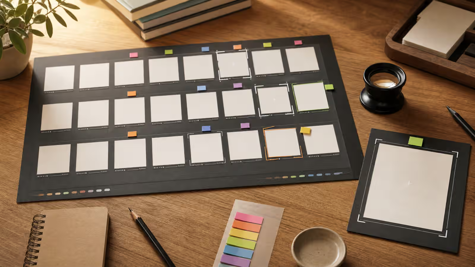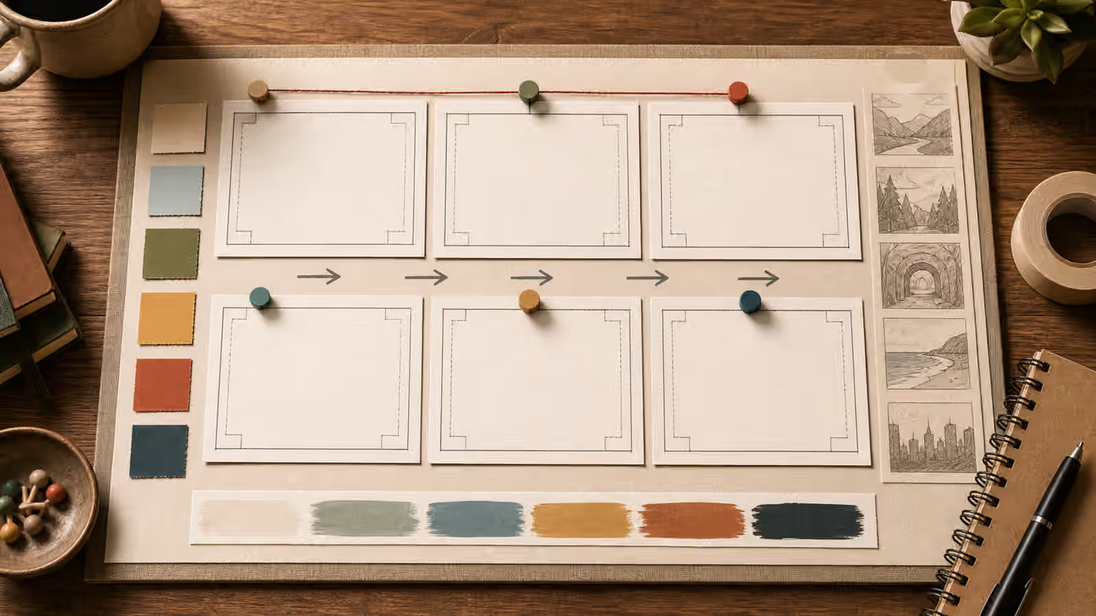
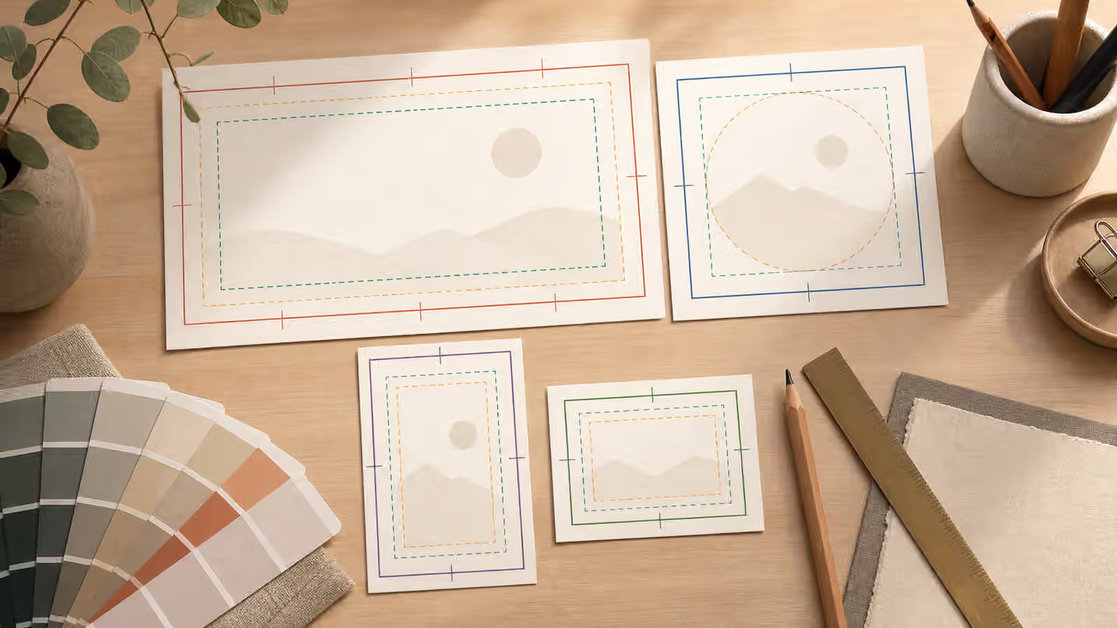
A generated image often enters a page as one file and then lives several different lives. It may appear as a wide article hero, a square card in a guidebook shelf, a narrow mobile crop, a social preview, and a small search result thumbnail. If the prompt only asks for a beautiful image, the model may place the subject exactly where the first frame looks best. That can be a problem when the page later asks the same image to survive a different shape.
Responsive reuse is not only a technical publishing issue. It starts in the visual brief. A prompt that names the intended crop, the safe margins, and the secondary uses gives the model a better chance to leave room where the page needs room. It also gives the editor a clearer review standard. Instead of deciding whether the image is attractive in isolation, you can decide whether it remains useful after the crop that readers will actually see.
Start With the Frame the Page Needs
The most useful crop decision is the first one. Before writing style words, decide where the image will have to work hardest. A homepage hero may need a wide composition with the subject sitting away from the edges. A guidebook card may need the subject to read inside a compact rectangle. A mobile page may stack the image above the title, making vertical balance more important than horizontal drama. A social thumbnail may compress the whole scene so aggressively that small props disappear.
This is where composition basics become practical. Rule-of-thirds language can help, but crop planning is usually more concrete than that. You are asking for subject placement, background density, and margin behavior. A prompt might ask for an editorial illustration of a ceramic object on a warm paper surface, framed wide with generous empty space around the object, keeping the object fully inside the center third so square and vertical crops remain readable. That is more useful than asking for an elegant minimal image.
The page context matters because each crop has a different failure mode. Wide images often fail when the subject is too small or too far to one side. Square cards often fail when the visual depends on a long horizontal relationship. Vertical crops often fail when important details live in the far left or right edges. Small thumbnails fail when the subject is made of many delicate parts. The prompt should protect against the crop that is most likely to damage the meaning.
Safe Margins Are Part of the Brief
Safe margins sound like a design production detail, but they belong in the prompt. Generated images frequently press objects close to the frame because that makes the composition feel full. A product sits nearly against the bottom edge. A face fills the upper third. A tool overlaps the border. Those choices may look polished in the first image and still make the asset fragile. The moment a responsive template trims ten percent from the side, the image feels broken.
The solution is to ask for padding as visible composition, not as a vague instruction. Words such as generous margin, clear border space, centered subject with breathing room, quiet corners, and no important detail near the edge all help. If the image needs a title overlay elsewhere, say where the quiet zone should be, even if the title will not be inside the image. The backgrounds and negative space guide covers that habit in detail. For responsive reuse, the same habit protects future crops.
Safe margins also reduce the temptation to patch an image later by stretching, filling, or cloning edges. Those fixes can work, but they often introduce soft artifacts, mismatched shadows, or strange repeated textures. When the crop requirements are known, it is usually cleaner to regenerate with stronger margins than to rescue a frame that was never built for reuse.
Plan for One Primary Crop and One Backup Crop
Trying to satisfy every possible aspect ratio can make a prompt muddy. A better approach is to choose one primary crop and one realistic backup crop. If the image is mainly an article hero, the primary crop may be sixteen by nine, with a square card as the backup. If the image is mainly for a vertical story, the primary crop may be four by five, with a wide preview as the backup. The prompt does not need a production spreadsheet. It needs enough crop information to make the composition resilient.
This is especially important for images with people, hands, tools, food, interiors, or diagrams. A human figure cropped at the wrong joint can feel accidental. A bowl of food cropped too tightly can lose the table context that makes it understandable. A room scene can collapse into a set of unrelated furniture corners. A diagram-like image may become useless if a label area or relationship line is cut off. Even when the image contains no readable text, the arrangement still carries meaning.
For guidebook work, I usually prefer a wide primary crop with a centered or slightly off-center subject, clear corners, and enough surrounding surface to make a square crop plausible. That does not make every image interchangeable, but it gives the editor options. It also keeps the generated image from being too dependent on one decorative edge detail.
Review the Image as a Set of Crops
Do not review only the full-size render. Make a quick mental crop or actual crop before approving the image. In a wide view, ask whether the subject still supports the article promise. In a square view, ask whether the subject remains legible without the far edges. In a small card, ask whether the image turns into texture. If the answer changes dramatically between crops, the prompt probably needs more margin, stronger subject shape, or a quieter background.
The social thumbnails and covers guide is useful here because thumbnail review is unforgiving. A visual that works at desktop width may fail once the image becomes a small rectangle beside competing posts. The same problem appears inside a site. A guidebook shelf, related guide card, and search result all compress the image into a quick recognition test. The crop is not a secondary use. It is often the first use a reader sees.
Cropping can also change the ethics of an image. Removing context may make a generated scene look more documentary than intended, or turn a fictional illustration into something that resembles evidence. If disclosure matters, keep it near the use, not only in a hidden production note. The image itself should not be cropped in a way that suggests official access, a real event, or a verified product photo when that is not what it is.
Use Output Format After Composition, Not Before
Fast delivery matters, and AVIF and WebP publishing can make generated visuals much lighter. But compression cannot fix a bad crop. Resize and encode after the composition is sound. If an image has tiny decorative marks, pseudo-text, dense shelves, or overly sharp texture, compression may make those flaws more noticeable. If the subject is clean, the margins are planned, and the background is quiet, the file usually survives both compression and reuse more gracefully.
A good responsive prompt is not complicated. It says what the image is, what frame it must serve, where the subject belongs, how much quiet space should remain, and what must be avoided. The visual result should feel natural, not like a template diagram. The planning simply keeps the useful part of the picture alive after the website does what websites do: crop, compress, resize, and show the image in more places than the original prompt imagined.