Alt text matters, but it cannot rescue every weak image. If the generated visual is cluttered, low contrast, dependent on color alone, or built around a confusing metaphor, the alt text becomes a repair attempt instead of a description. A better workflow starts earlier. The brief should ask for an image that communicates clearly before the caption, alt text, and surrounding page copy do their work.
Accessible visual prompting is not a separate decorative style. It is a habit of planning hierarchy, contrast, redundancy, crop, and context. It sits beside alt text and captions , but it starts before the image exists. The question is not only how to describe the image for someone who cannot see it. The question is whether the image itself is doing a clear, honest job.
Start With The Message, Not The Mood
An accessible brief begins by naming what the image must communicate. A hero image may need to show careful review, calm preparation, a practical tool setup, or a comparison between choices. If the prompt says only that the image should feel inclusive, clear, or friendly, the result may lean on generic symbols instead of visible structure. Mood words are not enough.
The message should be visible at more than one size. If the image appears in a wide hero, a small card, and a social preview, the central idea should survive all three. That usually means a strong subject shape, limited supporting props, and a background that does not compete with the main object. The guide on composition basics is useful because accessibility often begins with hierarchy.
This does not mean every image must be simple in the same way. A diagram, a room scene, and a product-neutral mockup can all be clear. The common thread is that the viewer should not have to decode a pile of decorative clues. If the image needs a paragraph to explain why it belongs on the page, the visual brief probably needs a stronger subject.
Do Not Rely On Color Alone
Color is useful for mood, grouping, and contrast, but it should not be the only carrier of meaning. If an image uses green for safe and red for risky, add shape, position, spacing, or texture cues. If a set uses color to distinguish categories, vary the forms too. If a crop relies on a subtle hue difference, review it in a small size and in grayscale before trusting it.
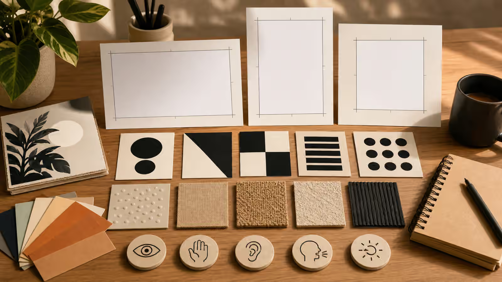
Generated images can make this harder because they often decorate everything with attractive palette variation. A prompt can reduce that noise by asking for distinct shapes, clear separation, and restrained color accents. For example, instead of asking for a colorful accessibility concept, ask for a central blank frame, high-contrast shape swatches, textured material samples, and quiet background space. The subject becomes readable without depending on a single hue.
This connects to color, material, and texture prompts . Texture and material should support recognition, not add clutter. A matte card, a smooth tile, a woven sample, and a dark outline can help separate objects. Too many textures can do the opposite. The brief should say which surfaces matter and which areas should stay plain.
Keep The Background Honest And Calm
Busy backgrounds make alt text harder and visual review weaker. If the background includes fake notes, tiny diagrams, invented labels, or symbolic objects that imply more than the page can support, the image becomes noisy and potentially misleading. A calm background is not empty decoration. It is a design decision that lets the important subject remain legible.
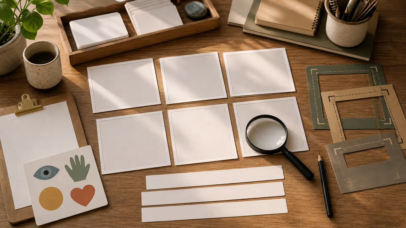
For generated images, background instructions should be explicit. Ask for quiet negative space, few props, no readable text, no logos, and no evidence-like documents. If the image is about planning, a few blank cards may be enough. If it is about a process, simple unlabeled shapes can suggest structure without inventing data. If it is about people, the background should not add identity clues, school marks, workplace logos, or private setting details.
The backgrounds and negative space guide helps here. Negative space is not just for headlines. It gives the viewer a place to rest and gives the page a cleaner reading order. An accessible brief treats quiet areas as part of the communication, not as a gap to fill with more symbols.
Avoid Stereotype Shortcuts
Accessibility imagery can fall into lazy shorthand. A prompt may ask for accessibility and receive medical symbols, heroic overcoming scenes, exaggerated devices, or generic silhouettes that flatten real experience into a symbol. Those shortcuts can be alienating even when the intent is positive. A safer brief names the practical visual problem instead of turning disability into decoration.
If the image is about readable contrast, show contrast tools. If it is about multiple ways to understand information, show shape, spacing, texture, and caption space. If it is about accessible workflow, show a review desk or design system materials. Do not imply that a product, page, or environment is accessible unless the image is conceptual and the surrounding copy is honest about that. Generated images should not create claims the project has not earned.
This habit is close to cultural context without stereotype shortcuts . In both cases, concrete scene details are better than symbolic costumes or badges. The more specific the visual task, the less pressure there is to use people as props for a broad idea.
Make Alt Text Easier To Write
A good accessible visual brief produces an image that can be described plainly. If the alt text has to explain hidden intent, apologize for confusing details, or ignore half the scene, the image is probably not doing its job. Before publishing, try writing one honest sentence about the image. If that sentence does not connect to the page promise, revise the image or choose another variant.
The alt text should not repeat the prompt. It should describe the image as delivered. This distinction matters because generated images often include unexpected details. If the brief asked for blank cards but the output contains fake scribbles, the alt text should not pretend the cards are blank. Better yet, reject or edit the image so the alt text can remain truthful.
Accessible prompting is a practical constraint, not a guarantee. It cannot make every image useful for every reader or every assistive setup. It can, however, reduce avoidable problems before the image reaches the page. Name the message, use more than color, calm the background, avoid stereotype shortcuts, and make sure the final image can be described honestly. That is a stronger starting point than hoping alt text can fix the visual later.