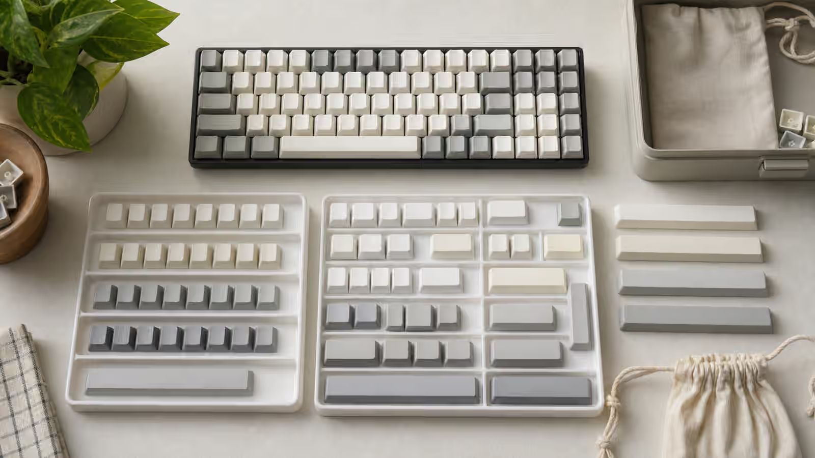
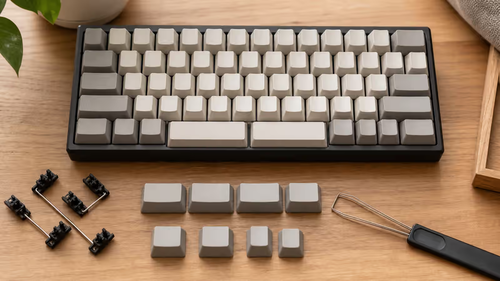
Keycap Profiles: Height, Row Shape, and Typing Feel
Keycap profile is easy to underestimate because it looks like a style choice. A low set seems tidy, a tall set seems dramatic, and a flat set seems simple. Then you type for a week and the profile becomes physical. It changes how far your fingers rise, how clearly each row announces itself, how the spacebar sits under your thumb, and how much of the keyboard’s sound comes from plastic rather than switches or case material. The same board can feel calm with one profile and tiring with another.
The broader Keycaps Guide explains materials, legends, and common profile names. Keycap Compatibility covers whether a set will fit your layout. This guide focuses on the shape question: what profile height and row sculpt do under your hands after the first few minutes of novelty have worn off. A profile does not have to be fashionable to be right. It has to fit the way you type, the way your keyboard sits on the desk, and the amount of row guidance you want from the caps themselves.
Profile is the top surface of the keyboard
Switches get most of the attention because they create the main press. The case and plate get attention because they shape sound and firmness. Keycaps are the part you actually touch. Their height, top shape, wall thickness, and row angle decide where each finger lands before the switch has done anything at all. That is why a switch you like can feel slightly wrong after a keycap swap. The switch did not change, but the approach to the switch did.
Height is the most obvious difference. A low profile keeps the fingers closer to the desk and usually shortens the sense of motion above the switch. A tall profile gives more plastic around the press and can make the keyboard feel more sculptural. Neither is automatically more comfortable. A tall cap on a low case can feel confident and easy to find. A tall cap on a thick case with the rear feet raised can make the keyboard feel like a small staircase. A low cap on a compact board can feel quick, while the same cap on a flat desk setup may feel too featureless for someone who relies on row landmarks.
The profile also changes how your fingers transition between keys. A deeply scooped top can hold the fingertip in place. A flatter top can make lateral movement easier. A spherical dish can feel centered and deliberate, while a cylindrical dish can feel familiar from many standard boards. These are small differences, but small differences matter on a tool used thousands of times a day.
Sculpted rows give your fingers landmarks
A sculpted profile uses different shapes for different rows. The number row, home row, bottom row, and top rows are not identical. Each row has its own height and angle, so the keyboard forms a shallow landscape under your fingers. Cherry, OEM, SA, MT3, and many other profiles are sculpted in different ways. They do not feel the same, but they share the idea that row shape should help the hand understand where it is.
That row guidance is useful if you touch type and want the keyboard to disappear. Your fingers can feel when they have drifted upward or downward because the caps meet them differently. On a normal staggered board, a well-matched sculpt can make the home row feel settled without looking down. It can also make the number row and function row easier to separate by touch.
The cost is flexibility. Sculpted profiles expect keys to stay on their intended rows. Move a key from one row to another and it may physically fit, but its slope will be wrong. This matters on compact layouts, remapped boards, alternate typing layouts, and keyboards with unusual right-side columns. A Delete key from the wrong row may not bother you visually, but your finger may notice the angle every time it reaches for it. The more you customize the map, the more row support becomes part of the buying decision rather than a detail to fix later.
Sculpted profiles can also exaggerate desk-fit problems. If your board is already tall, adding a high sculpted set may raise the home row enough that your wrists start to complain about the climb. That is not a flaw in the profile by itself. It is a mismatch between case height, desk height, tilt, and cap shape. The Keyboard Desk Fit guide is worth reading before blaming switches for effort that really comes from the keyboard sitting too high.
Uniform profiles trade guidance for freedom
A uniform profile uses the same key shape across rows. DSA and XDA are common examples, though there are many variations. The appeal is simple: every 1u key can move almost anywhere without row-angle mismatch. That makes uniform profiles friendly to alternate layouts, compact boards, ortholinear boards, macro pads, and people who frequently change firmware mappings.
Uniform caps can make a keyboard feel cleaner and more modular. If you use Colemak, Dvorak, Workman, or a personal layer-heavy layout, moving legends around is less awkward. If you prefer blanks, the row question becomes even quieter. A uniform set also simplifies spare keys because a loose 1u cap is not tied to a specific row in the same way.
The trade-off is that the keyboard gives less physical guidance. Some typists love the flat field because it feels open and quick. Others find it easier to drift away from home position, especially on compact boards where the edges and gaps are already reduced. A uniform profile can feel especially strange if you are coming from a tall sculpted board. The fingers look for row shape and find sameness instead.
Uniform does not mean low, and sculpted does not mean tall. A uniform profile can still be fairly high and broad. A sculpted profile can be low and restrained. The useful question is not the label. It is whether you want each row to teach your fingers where they are, or whether you want each key to be interchangeable enough for your layout experiments.
Tall profiles change sound and pace
Tall profiles add more plastic above the switch. They often have deeper cavities, thicker walls, and larger top surfaces. That can make a keyboard sound fuller, lower, or more resonant, though the result depends on material, switch, plate, case, and desk surface. A tall ABS set on one board may sound lively and rounded. A tall PBT set on another may sound hollow if the case below it is already echoing. Profile contributes to sound, but it is not a standalone sound recipe.
The feel difference can be just as important. Tall caps often encourage a more deliberate press because the fingers sit higher and the caps feel more present. Some people describe that as luxurious. Others describe it as slow. If you type quickly with light movements, a very tall profile may make the board feel larger than it needs to be. If you like a pronounced surface and a deep dish, tall caps can make each key feel easier to locate and more satisfying to press.
Large keys deserve extra attention. A tall spacebar changes the thumb position and can make the front edge of the keyboard feel higher. Tall stabilized keys can also emphasize rattle if the stabilizers are not tuned well. If a new profile makes the alphas pleasant but the spacebar clumsy, the issue may be the relationship between cap height and stabilizer behavior rather than the profile as a whole. The Complete Stabilizer Guide is the better next stop for that problem.
Low profiles and short travel are related, not identical
Low keycap profiles can make a standard mechanical keyboard feel quicker and less imposing, but they are not the same as a low-profile keyboard. A normal MX-style board with low caps still has standard switch travel and standard switch height underneath. A true low-profile board changes the switches, case, and often the keycap mount. The difference matters because the upgrade path and feel can diverge sharply.
On a standard board, lower caps can reduce the visual and physical bulk without giving up the familiar switch ecosystem. That can help if the keyboard feels slightly tall but you still want ordinary MX compatibility. On a true low-profile board, the whole format changes. Travel is shorter, cap choices may be narrower, and replacement compatibility can be more fragmented. The Low-Profile Mechanical Keyboards guide covers that separate category.
Low caps can also reduce the sense of row shape. That may be pleasant on a clean writing board and less pleasant on a shortcut-heavy compact board. If you rely on the keyboard to tell your fingers where the arrows, brackets, or navigation keys live, a lower and flatter surface may ask more from memory. If you prefer a quiet, direct surface, it may feel like clutter has been removed.
Match profile to layout and habits
The best profile choice starts with the board you actually use. A standard TKL or 75 percent board with familiar key positions can handle many sculpted profiles gracefully because most keys stay where the profile expects them. A compact 40 percent, ortholinear, split, or heavily remapped board may benefit from uniform caps because the physical layout is already asking for custom behavior. A full-size work board may favor calmer, lower profiles if you move between typing and mouse use all day.
Your typing force matters too. A heavy-handed typist may enjoy the stability and surface area of a taller sculpted cap, or may find that it makes bottom-out impact feel larger. A light typist may prefer lower caps because the movement feels more immediate, or may want a deeper dish because it provides confidence without increasing switch weight. If spring force is part of the puzzle, Switch Spring Weight explains why the same cap can feel different on a lighter or heavier switch.
Sound goals should stay realistic. If you want a quieter keyboard for shared space, changing profile can help shape tone, but it rarely solves volume alone. Switch choice, stabilizer tuning, desk surface, and typing force usually matter more. If you are chasing a particular tone, read the Keyboard Sound Profiles Guide and treat keycaps as one material in the chain rather than the magic part.
Try to test the shape, not the name
Profile names are useful shorthand, but they can become a substitute for observation. Two sets with the same broad profile name can differ in thickness, texture, dish depth, and manufacturing quality. Two profiles with different names can feel closer than expected once mounted on the same keyboard. Photos help with height, but they do not tell you how your fingertips will read the surface during ordinary work.
If possible, test a few keys before buying a full set. A small sampler, a friend’s board, a keyboard meetup, or even a single row of borrowed caps can teach more than a long comment thread. Pay attention to the home row, the number row, and the spacebar. Notice whether your fingers settle, whether you overshoot keys, whether the board feels taller than expected, and whether the profile makes you type harder or lighter.
When testing is impossible, choose based on the problem you are trying to solve. If your current board feels too tall, do not buy a taller profile because it looks good in photos. If your current board feels flat and easy to lose, a sculpted profile may help. If you keep changing layouts and moving legends, uniform caps may save frustration. If you love the feel of the current shape but dislike the sound or texture, stay near the same profile and change material or thickness instead.
A good profile becomes boring in the best way. You stop thinking about cap height and row shape because the board fits your hands. The keys are easy to find, the spacebar sits where your thumb expects it, the sound supports the build rather than dominating it, and the layout remains practical after the first week. That is the real test. Not the profile name, not the photo, and not the mythology around a particular shape, but whether your hands stop negotiating with the keyboard and simply type.