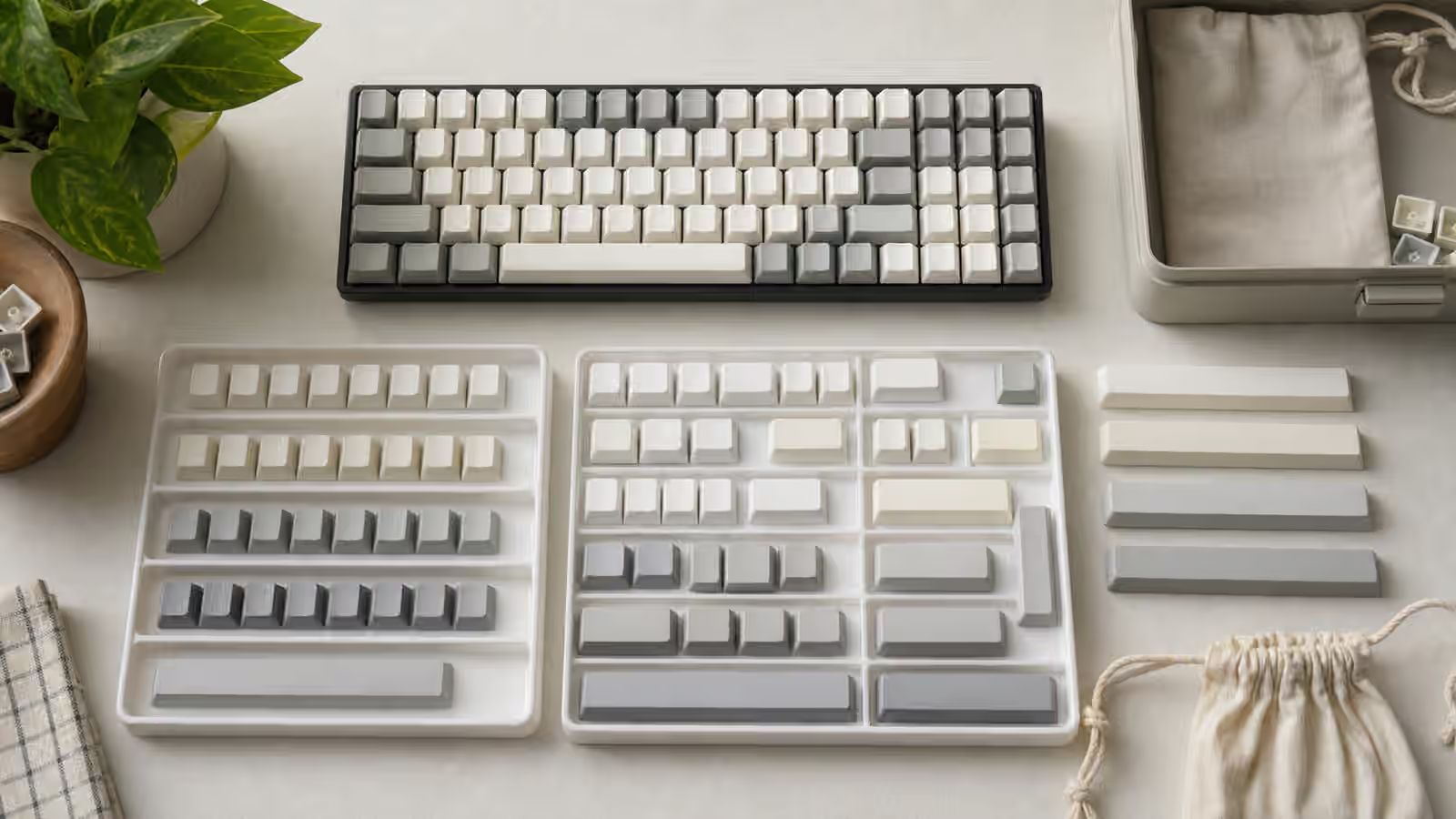
Keycap legends are easy to treat as decoration until they disappoint you. A set can have beautiful colors, a comfortable profile, and the right layout coverage, yet still feel wrong because the legends are too thin, too glossy, too crowded, or already starting to wear. The printed or molded mark on top of a keycap changes how the keyboard reads at a glance, how it ages, and sometimes how the plastic feels under your fingers.
The broader Keycaps Guide explains materials and profiles, while Keycap Compatibility covers whether a set will actually fit your board. This guide focuses on the surface: how legends are made, why some last longer than others, and how to choose a method that matches the way you use the keyboard. A legend method is not automatically good because it sounds premium. It is good when it suits the material, the design, the lighting, and your tolerance for wear.
What a legend has to do
A keycap legend has several jobs. It identifies the key, supports the visual rhythm of the board, and survives contact with fingers, oils, cleaning, and light. On a compact keyboard, legends may also show layer functions, media controls, or unusual modifier roles. On a work keyboard, they need to be readable without shouting. On a display build, they may be chosen more for color balance than for practical lookup. Those uses pull the design in different directions.
Readability is not only about size. A clean legend needs enough contrast against the cap color, enough spacing from the cap edges, and a type style that still looks clear on small plastic surfaces. Some novelty-heavy sets look good in photos but become busy on a desk because every key competes for attention. Other sets look plain online but work beautifully because the legends are calm, centered, and consistent across rows.
The texture matters too. Some manufacturing methods leave the legend as part of the plastic, so the top of the key feels uniform. Others add ink or coating on top, which can create a slight raised or slick area. That may not matter for occasional use, but it can become noticeable on home-row keys after months of typing. Wear is not just visual. It can be tactile.
Double-shot molding
Double-shot keycaps are made from two pieces or shots of plastic. One forms the legend, and the other forms the surrounding cap body. Because the legend is plastic rather than surface ink, it does not rub off in ordinary use. That durability is the main reason double-shot has such a strong reputation.
Double-shot ABS is common in premium enthusiast sets, partly because ABS can produce vivid colors and sharp molded legends. Double-shot PBT also exists, but the material is harder to mold cleanly, so the results depend heavily on the manufacturer. The best double-shot caps feel integrated, with legends that are crisp and properly aligned. Poorer ones can have uneven thickness, fuzzy edges, or legends that look slightly sunken or swollen.
The advantage of double-shot is permanence. If you type heavily and dislike the idea of legends fading, it is a reassuring method. The trade-off is design constraint. Every legend shape must be molded, so complex artwork, gradients, and many unusual sublegends are harder to execute. Multi-color kits can become expensive because each molded legend and color arrangement adds complexity. Double-shot is strong for classic legends and clean icon work. It is less flexible for painterly detail.
Double-shot also pairs naturally with shine-through designs when the legend plastic is translucent and the cap body is opaque. That is common on backlit gaming boards. The look depends on the keyboard’s LED orientation, keycap thickness, and legend placement. A shine-through cap can be practical in a dim room, but it often uses thinner walls or different materials than enthusiast non-backlit sets. If sound matters, remember that keycaps are part of the acoustic chain described in the Keyboard Sound Profiles Guide .
Dye sublimation
Dye sublimation uses heat to drive dye into the plastic surface rather than leaving a normal ink layer on top. It is most associated with PBT keycaps because PBT tolerates the heat involved and resists shine well over time. A good dye-sub set can age gracefully, with legends that remain legible because the dye sits within the surface rather than merely on it.
The method works best when the legend is darker than the cap. Dark dye on light PBT is the classic use case. Reverse dye-sub, where the cap surface is dyed around lighter legends, is possible but more demanding. It can produce striking colorways, but alignment, color consistency, and edge sharpness become harder. If a reverse dye-sub set is cheap, look carefully at real photos rather than only renders.
Dye-sub is excellent for flexible designs. It can handle sublegends, alternate alphabets, novelty artwork, and detailed symbols more easily than double-shot tooling. That flexibility is why many PBT sets use it for themed designs. The trade-off is that legend sharpness varies. Some dye-sub legends look crisp and calm. Others have soft edges or slight blur, especially on small symbols. The difference is not always visible in product thumbnails, so close-up photos matter.
Because dye-sub is usually on PBT, it often comes with a textured feel and strong resistance to shine. That makes it appealing for daily typing boards. It may not deliver the deepest, smoothest ABS color or the molded permanence of double-shot, but a well-made dye-sub PBT set is one of the most practical choices for a keyboard that will see years of use.
Pad printing, UV printing, and laser marking
Surface printing methods place the legend on top of the keycap rather than forming it from plastic or dyeing it into the surface. Pad printing is common on cheaper caps and some older boards. UV printing can create colorful artwork and novelties. Laser marking can burn, remove, or alter the surface to reveal a contrasting layer or create a visible mark.
These methods are not all equal, and none should be dismissed automatically. A lightly used macro pad, novelty accent key, or decorative escape key can work well with surface printing because it is not taking constant finger wear. A daily home-row alpha key is a harsher environment. If the legend sits on top of the cap, it can eventually polish, fade, or chip depending on the coating and use.
Laser-etched shine-through caps are common on backlit keyboards. The cap may have a translucent body covered by an opaque coating, with the laser removing coating where the legend should glow. This makes bright legends possible, but the coating becomes part of the wear story. Over time, heavy use can polish or thin the surface. The key may still function perfectly, but the visual aging can bother people who expect the keyboard to stay crisp.
Surface methods are useful when cost, color detail, or lighting matters more than lifetime legend durability. They are less appealing when you want a set that will look nearly the same after heavy typing. The decision should match the key’s job. A printed novelty on Escape is a small risk. Printed home-row letters on a main work board are a bigger compromise.
Front legends, side legends, and blanks
Legend placement changes the mood of a keyboard. Top legends are the default because they are readable from normal typing position and easy for guests to understand. Front legends move the marks onto the side facing the typist. They make the board look cleaner from above while still offering help when you lean forward. Side legends can be elegant on dark, simple builds, but they are less useful in low light and can be hidden by steep keyboard angles.
Blank keycaps remove the question entirely. They look calm and can encourage touch typing, but they are not practical for every layout. A full-size board with familiar positions is one thing. A compact board with layers, split Backspace, or unusual punctuation is another. If you are using layers heavily, the Compact Keyboard Layers for Daily Work guide will matter more than the legend style. A keyboard can be visually clean and cognitively messy at the same time.
Sublegends are helpful when they are restrained. Secondary legends for Mac modifiers, alternate languages, or layer hints can make a board more approachable. They can also clutter every key with information you rarely use. Before buying a set with many sublegends, imagine using it at desk distance rather than zooming in on a render. The best legends reduce hesitation. They do not turn the board into a reference poster.
Matching legend method to the board
For a daily typing keyboard, durability and calm readability usually matter most. Double-shot ABS, double-shot PBT, and good dye-sub PBT are all sensible, with the final choice depending on texture, sound, and color preference. For a quiet office board, thicker non-shine-through caps can help keep the tone controlled, especially when paired with the choices in Low-Noise Keyboard Setup . For a backlit board, shine-through legends may be worth accepting even if the cap feel and sound are not your favorite.
For collectors, the story changes. A set may be chosen because its colors, novelties, and theme are the point. In that case, manufacturing method still matters, but it is part of the art direction rather than only a durability decision. Dye-sub novelties can be beautiful. Double-shot legends can feel timeless. UV-printed accents can make sense if they are used sparingly and not expected to survive years of home-row abuse.
The useful buying habit is to look past the colorway name and ask how the legend is made, what plastic it uses, how the close-ups look, and whether the layout kit includes the keys your board needs. A perfect legend on the wrong row is still the wrong keycap. A beautiful novelty that replaces a missing 1.75u Shift will not solve compatibility. Legend quality is one piece of the larger fit problem.
Good keycap legends do not need to draw attention to themselves. They sit at the right contrast, survive the amount of typing you do, and support the board’s layout without visual noise. Once you know how the marks are made, product pages become easier to read. Double-shot promises molded permanence, dye-sub promises practical flexibility on PBT, and surface printing asks you to decide where wear is acceptable. The best choice is the one whose compromises match the keys you actually press.