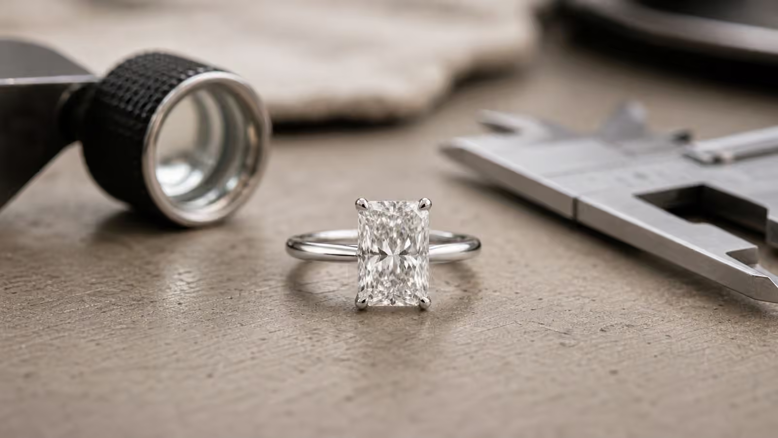
Diamond Cut Quality and Light Return in Engagement Rings
Cut quality is the part of diamond shopping that looks simple until you try to explain what your eyes are seeing. One stone seems awake from across the counter. Another has the same carat weight, similar color, and a clean report, yet it looks flatter under the same lights. A third flashes dramatically when it moves but goes dark when it faces you straight on. The difference is not magic, and it is not only size. It is how the diamond has been cut to handle light.
The broader 4Cs of diamonds introduce cut as one of the four major quality factors, but cut deserves slower attention because it controls the thing most people mean when they say a diamond sparkles. Color and clarity can be subtle once a stone is mounted. Carat weight is easy to name but not always easy to see. Cut is visible every time the ring moves through a room.
This is also where shoppers often confuse cut with shape. Shape is the outline: round, oval, cushion, emerald, pear, marquise, radiant, princess. Cut quality is the workmanship and proportioning that make that shape bright, balanced, and alive. A round brilliant and an oval are different shapes. Either one can be cut beautifully or poorly. The diamond shapes decision sets the personality of the center stone; cut quality determines whether that personality actually shows up.
What Light Return Really Means
Light return describes how effectively a diamond gathers light, reflects it inside the stone, and sends it back through the top toward the viewer. In a well-cut diamond, the facets work together like tiny mirrors arranged with purpose. Light enters through the crown, reflects across the pavilion, and exits through the top in flashes of white brightness and colored fire. In a weaker cut, light leaks through the bottom or sides, leaving dull areas that never quite wake up.
The visible result is usually described in three related ways. Brilliance is the white brightness that makes a diamond look clean and electric. Fire is the rainbow color that appears when light splits through the facets. Scintillation is the on-off sparkle pattern you see when the stone, the hand, or the viewer moves. A good engagement ring diamond does not need to maximize only one of these. It needs a pleasing balance, because rings are worn in motion and in many kinds of light.
Contrast matters too. A diamond should not be uniformly white like a piece of glass. It needs dark and light areas that switch as it moves, because that pattern gives the eye something to follow. The problem is not darkness itself. The problem is deadness: a patch that stays dull from angle to angle, or a center that looks sleepy while the edges do all the work. Good cut quality creates lively contrast. Poor cut quality creates leakage.
Why the Report Helps But Does Not Finish the Job
For round brilliant diamonds, grading reports often include an overall cut grade along with polish and symmetry. That cut grade is useful. It tells you that the diamond’s proportions and workmanship fall within a lab’s standards for light performance and finish. For many buyers, staying in the top cut-grade range is the simplest way to avoid obvious mistakes.
Still, a grade is a starting point rather than a beauty guarantee. Two diamonds with the same cut grade can look different because small changes in table size, crown angle, pavilion angle, lower-half facets, and overall patterning shift how light moves through the stone. Some stones lean toward crisp brightness. Some show more fire. Some have bolder contrast. A report can narrow the field, but your eyes still have to choose among real stones.
Fancy shapes make this even more important. Many non-round diamonds do not receive the same simple overall cut grade that shoppers expect from rounds. An oval report may give measurements, polish, symmetry, depth, and table, but it will not always tell you whether the bow-tie is gentle or heavy. An emerald cut report may describe the stone accurately without telling you whether its steps flash evenly. A cushion may have acceptable numbers and still show a facet pattern the wearer does not like. This is why the diamond grading report should be read alongside visual comparison, not instead of it.
Proportions Without Getting Lost in Math
Diamond proportions can become technical quickly, and some buyers respond by ignoring them entirely. That is understandable but risky. You do not need to memorize ideal tables or angles to shop well. You do need to understand what the main parts are doing.
The table is the flat facet on top of the diamond. A very large table can make a stone look spread out but may reduce fire or make the pattern feel glassy. A very small table can create a different balance of fire and brightness, but if the rest of the stone does not support it, the result can feel cramped. Depth tells you how much of the diamond’s weight sits below the top view. A stone that is too deep may face up smaller than its carat weight suggests. A stone that is too shallow may leak light and look watery.
The crown and pavilion angles are central to light return. If the pavilion is not angled well, light can escape rather than returning upward. If the crown is poorly matched, the diamond may lose fire, brightness, or balance. The girdle, the thin edge around the diamond, affects both durability and how the stone sits in a setting. A very thin girdle can be more vulnerable, while an overly thick girdle can hide weight where the eye does not benefit.
The practical lesson is not that every shopper must become a cutter. It is that numbers should raise questions. If a diamond looks smaller than its weight, check the measurements and depth. If it looks flat, ask about proportions. If two stones have similar grades but one costs more, compare how their dimensions and light behavior differ before assuming the more expensive one is prettier.
How to Compare Cut in Real Life
Jewelry-store lighting is designed to flatter diamonds. Strong spotlights make almost anything flash, especially when the stone is tilted. That does not mean showroom viewing is useless, but it should not be the only test. Ask to see stones in softer light, away from the brightest case. If possible, move near a window, under diffuse indoor light, and into a slightly shaded area. A strong diamond should remain lively outside the most theatrical lighting.
Compare stones side by side when the other factors are reasonably close. A one-carat diamond and a two-carat diamond will distract you with size. A warm stone and an icy stone may pull your attention toward color. The cleanest cut comparison uses similar shape, size, and color range so the light behavior can speak clearly. Move the stones slowly rather than waving them quickly. A fast motion can make weak sparkle look busier than it really is.
Look for brightness that reaches across the stone, not only around the rim. Watch the center. In many fancy shapes, especially ovals, pears, marquises, and cushions, the middle tells the truth. A little contrast across the center can be normal and attractive. A heavy dark band that never opens up may bother the wearer over time. In step cuts, look for even flashes that turn on and off in broad, clean steps rather than a flat window into the stone.
Video can help when shopping remotely, but it has limits. A well-shot comparison video under consistent lighting is useful. A single glamour video with the diamond rocking under a spotlight can hide problems. Ask for face-up views, slow movement, and lighting that does not make every stone look like a firework. If the seller cannot show the stone plainly, slow the purchase down.
Cut, Carat, and the Size Question
Cut quality and carat weight are often in quiet competition. Larger stones are tempting because the size is easy to understand, but a poorly cut larger diamond may look less impressive than a smaller lively one. The better-cut stone can appear brighter, whiter, and more present because light is returning through the top instead of leaking away.
Face-up size also depends on proportions. A diamond can carry weight in its depth, where the wearer does not see it, and still meet a popular carat number. Another stone slightly below that threshold may spread more gracefully and look nearly the same size from above. This is not a trick for buying the cheapest diamond. It is a reminder that a ring is worn face-up. The visible millimeters, brightness, and setting design matter more than the romance of a round number.
This is where a disciplined budget can actually improve the ring. If the choice is between a heavier stone with indifferent cut and a slightly smaller stone with lively performance, the smaller stone may feel more luxurious every day. If the wearer cares more about broad finger coverage than classic round brilliance, an elongated shape with strong light performance may give the presence they want without chasing weight for its own sake.
How Settings Change the Cut Conversation
The setting cannot fix a badly cut diamond, but it can support or undermine a good one. A classic prong setting leaves more of the stone open, which can make a well-cut diamond look airy and bright. A bezel or low basket can protect the stone and create smooth daily wear, but it may cover more of the edge and change how light reaches the diamond. The best choice depends on whether the wearer values maximum openness, low-profile comfort, or a particular design mood.
If the ring will use a halo, side stones, or a detailed band, center-stone cut still matters. Accent sparkle can make the whole ring look lively, but it can also distract from a center diamond that is not performing well. A bright halo around a sleepy center stone tends to make the center look weaker by comparison. The ring settings guide is useful here because the setting family changes not only style but also how the eye reads the diamond.
Profile height matters too. A very low setting may be comfortable and secure, while a taller setting may show more of the diamond and make room for a straight wedding band. Neither is automatically better. If you are weighing height and daily wear, the low-profile engagement rings guide helps connect the optical choice to the practical one.
Choosing the Stone That Keeps Looking Good
A good cut decision has a calm feeling to it. The diamond looks lively without needing the jeweler to keep moving it under perfect lights. The report supports what you see without asking you to ignore your own reaction. The proportions make sense for the weight. The setting shows the stone in a way that suits the wearer’s life.
Do not let cut become a hunt for a single perfect number. Diamonds are small objects with complex personalities, and two excellent stones can be beautiful in different ways. One may be crisp and bright. Another may throw more colored fire. A third may have bold contrast that makes it dramatic in motion. The right one is not only the one with the best line on paper. It is the one whose light keeps returning your attention after the first sparkle has passed.
When cut quality is strong, the rest of the ring has a better foundation. Color can be chosen with more confidence. Clarity can be judged by what the eye sees. Carat weight can be balanced against visible size. The setting can frame the diamond rather than compensate for it. That is why cut is worth slowing down for: it is the difference between a diamond that merely has good specifications and one that feels alive on the hand.